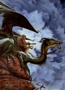
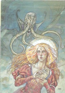
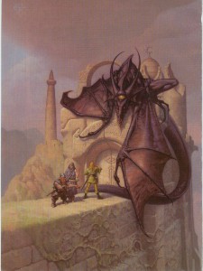
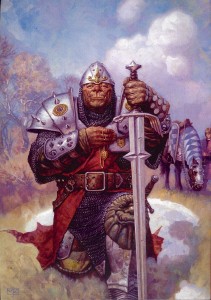
Archive for the ‘Art’ Category
The Best Dungeon Covers: 76-fin
June 8, 2012This is the second (and final) installment of my celebration of Dungeon magazine’s 200th issue (click here for the best cover art of the first 75 issues). The latter half of Dungeon’s print run was an interesting time for the magazine. It saw the rise of 3e and the founding of Paizo. Even more importantly though, it was in the pages of Dungeon that the ‘adventure path’ format was born – a series of adventures linked together by an overarching plot (taking characters from 1st level to 20th) – a campaign in serial form. Dungeon’s adventure paths set a new standard in the industry and the format proved so successful that Paizo was able to base their entire business around publishing them when WOTC cancelled the print versions of Dragon and Dungeon …and spin that achievement into their own version of D&D at least as successful as 4e (I wouldn’t hesitate to say that the Pathfinder rpg owes its existence to the development of the adventure path).
If Dungeon is 200 why stop at issue 150? As I mentioned in my retrospective on Dragon magazine covers, cover art lost its place of cultural primacy when the magazines underwent their digital rebirth (you can see a similar phenomenon with album art in the age of iTunes). Digital covers don’t serve the same function (a combination of product packaging and advertisement), and as a result have little influence on the gaming world – the equivalent of a vestigial organ. That might sound harsh, but it’s not an indictment of WOTC’s digital initiative (I think the accessibility, low cost, and portability of PDFs are great), just a lamentation for a lost art form. Let’s take a look at some of Dungeon’s best examples and remember a time when cover art was king (click on images for full size).
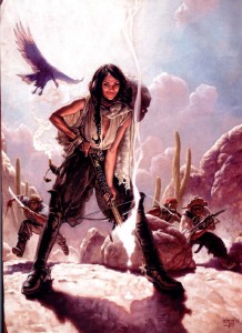
I fell in love with the cover to issue 80, by Mark Zug, the moment I laid eyes on it. The mash-up of D&D and the wild west is fantastic, irreverent and avoids descending into campiness. The two visual themes blend together so well that neither the hats nor the crossbows seem out of place (the magical bolt standing in for a smoking shotgun). But that’s not what draws the viewer’s eye immediately to the center of this piece – it’s the wicked smile of the character in the foreground (Tonja, the leader of a group of desert bandits in the adventure Fortune Favors the Dead). Imbuing a figure with real personality, as Zug has done, is extraordinarily difficult (that’s why portraiture is so demanding). That smile is so compelling I wonder how many people have overlooked that the bandit leader is supposed to be an NPC and used this cover as a character portrait.
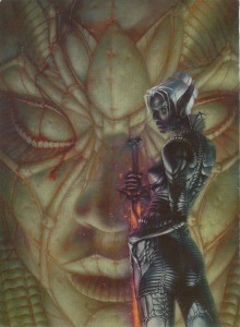
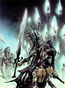
Another femme fatale, Laveth the daughter of Lolth, courtesy of Stephen Daniele for the cover of Dungeon 84. There’s a bit of cheesecake going on in this painting (especially that ‘America’s Next Top Model’ pose) but the artist’s ability to capture the essence of the drow so well elevates it above mere fan-service. Daniele is definitely channeling H.R. Giger’s biomechanical work here (always a good thing in my opinion), and it fits perfectly. Laveth’s armor looks like the chitinous shell of a spider, a great visual cue that not only ties the drow to the goddess of arachnids, but also reminds the viewer that everything about the dark elves is twisted, alien, and dangerous. The pale statue in the background, with clusters of spiders that look like bloody tears, is a nice touch as well.
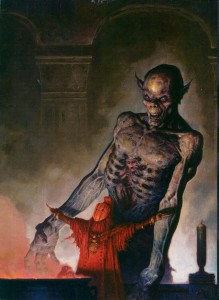
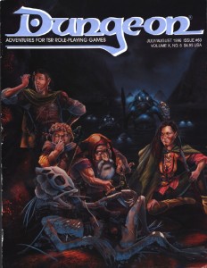
The cover for Dungeon 90 is, aside from his Dark Sun work, one of Brom’s best paintings (and there are a lot to choose from – Brom’s works have made it onto all but one of my lists of the best Dragon and Dungeon covers). It features a priestess of Loviatar and her undead ally. The devourer, rendered in pale ghostly tones is very much in (what I call) Brom’s ‘gothic mode’. The evil spirit is truly frightening, and the pathetic soul of a vanquished paladin trapped within its ribcage makes this cover a strong argument for why the devourer, added to the game during 3e, is an instant classic. What makes this painting one of my favorites among Brom’s work though, is the figure of the priestess. I love her blood red monochromatic color scheme, and the artist’s choice to give her a more exotic, non-European look is something you don’t see often in the art of D&D and it’s a refreshing departure.
It would have been easy to fill this list with nothing but Wayne Reynolds’ paintings – he created a tremendous number of Dungeon covers during the 3e period most of them were exceptional. While he still dominates this list, I opted instead for his best four (plus a bonus cover at the end). Even if you aren’t a Reynolds fan, you have to be impressed with the sheer volume of the work he put out during these years (and he still produces an impressive output for Paizo).
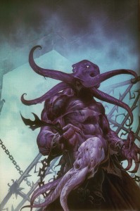
Reynolds’ cover for issue 94 features one of my favorite monsters, the craziest mind flayer villain of all time, Absterthelid, a creature with a taste for the brains of his own kind (a great idea made insane by a stat block that combined mind flayer and monk to take advantage of the mechanics of the extract brain special ability – truly a monster). Reynolds takes the classically cerebral image of the mind flayer and transforms it into a beast of physicality. The cast-off, brainless husk of a traditional mind flayer completes the image, giving the viewer everything they need to know about both Absterthelid and Reynolds’ larger than life approach to illustration.
Dungeon celebrated its 100th issue with ‘incursion’, an event spread between Dungeon and Dragon that saw the githyanki invading the prime material plane. It’s a very cool concept (one that I planned to incorporate into a long running Planescape campaign, but never got the chance to), and Wayne Reynolds’ painting of Vlaakith, the lich-queen of the githyanki is even cooler. Though her physical form is withered and mummified, Reynolds leaves no question as to Vlaakith’s arcane might. I especially like Reynolds’ disturbing take on the robe of eyes, a fitting accoutrement for a queen who sustains herself with the life force of her subjects. Reynolds sometimes gets flak for the awkward positioning of his female subjects, but in this case it works. Vlaakith’s pose reminds me of the contorted rigor mortis of Boris Karloff in The Mummy (and I’m happy Reynolds resisted the urge to make a ‘sexy undead’ – one of my pet peeves… female undead should be just as gross and gnarly as their male counterparts).
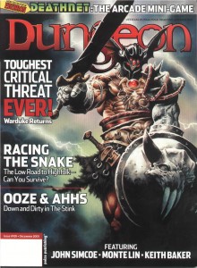
The cover for issue 105 is nostalgia heaven, plain and simple. Warduke was one of my favorite action figures growing up (him and Force Commander from the Micronauts ) so seeing him posing like he’s on the cover of an Iron Maiden album all but guaranteed I’d pick up a copy of the magazine. Reynolds not only does the venerable Warduke justice, he also gives him a few cycles of steroids – just in case your PC actually thought they could stand up to the ‘duke and survive.
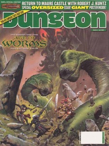
Reynolds’ cover for Dungeon 124 is at a different scale than he typically works, and it’s so energetic and vibrant it makes me wish he would use it more (spoiler: he uses it for the final cover and its excellent). This painting is a perfect snapshot of what I picture when the PCs are squaring off against huge foes. There is a real cinematic quality to the action, and the spectral image of Kyuss rising in the background almost makes it look like a movie poster (just imagine – The Age of Worms saga featuring the voice of Benedict Cumberbatch as Kyuss!).
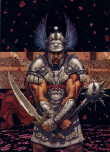
Marc Sasso invokes the blood soaked arena sands of a fantasy version of Rome for his cover of Dungeon 96. Sasso captures the high drama of the moment by keeping the viewer’s gaze in constant motion from one detail to the next: the gently falling roses foreshadowing the future spray of blood, the death motif of the armor, the grim look on the gladiator’s scarred face, and the telling inscription on the blade, ‘hate and kill’. Like Mark Zug’s bandit leader, this is the kind of painting that radiates personality and inspires player characters (and I’ve got the perfect miniature for it!), even if it wasn’t intended to.
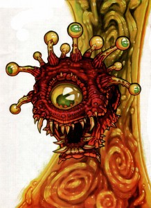
I love the thick, colorful lines and painterly style of artist Chuck Lukacs, so I had to include his beholder in this list. While issue 97 was the only cover he made for the magazine, his illustrations festooned both Dungeon and Dragon during the 3e period (and because his style is so distinct, are easy to recognize), and helped to define the look of the era. I’ve never seen a beholder rendered quite like this before, and I really dig the almost globular treatment of the protruding eyestalks.
This issue was also a major milestone for the magazine: it contained Life’s Bazaar, the opening chapter of D&D’s first adventure path. The rest, as they say, is history.
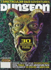
Other than the iconic monsters of the game, no other image can singularly sum up the dungeons of D&D as well as the green devil portal from the adventure Tomb of Horrors. Artist Dave Studer gives Erol Otus’ classic illustration the sculptural treatment for the cover of issue 116 and it is simply amazing. One of the things I really liked about the 3e hard covers (especially the Monster Manuals) was their sculptural design. By drawing on that aesthetic, Studer visually reminds us that the entirety of the game’s editions are our playground and a source of inspiration. I’m not sure how big the original is, but I can’t help but think it would make a kick-ass door knocker for my house.
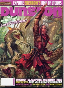
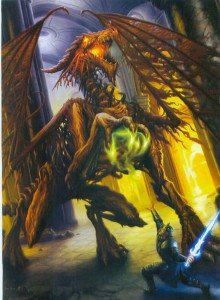
Artist Dan Scott never fails to impress me with the consistency with which he captures the spirit of adventure that defines D&D. This pair of Scott covers are perfect examples of that ability. Both capture an adventure in progress, and invite the viewer to fill in the story themselves – one of the highest achievements of fantasy illustration.
The cover of Dungeon 122 shows an elven rogue ambushed by lizardmen outside of their crumbling and vine choked, jungle temple. The great thing about this painting is how Scott tells the story through the use of his color palette. Aside from the violence, Scott’s choice of colors for the elf clearly mark him as an explorer and intruder while the naturalistically colored lizardmen are obviously native to this exotic land.
Scott tells the story of Dragotha the dracolich on issue 135 through the use scale. Again, the adventurer (a paladin this time) is clearly an intruder, only this time its David and Goliath retold. The adventurer is dwarfed not only by his opponent, but also by the massively pillared hall. Unless the paladin has some clever edge in this fight, the best he can hope for is a quick death.
As a side-note, while some might label the dracolich as one of D&D’s fringe monsters, I’ve always thought of it as part of the core brand. It was on the cover of both Pillars of Pentegarn, an endless quest book that helped draw me into the game, and Spellfire, one of the first D&D novels I read. It’s not surprising that I used a dracolich for my first real, recurring villain in the 2e game I ran in grade 8 and 9 (it lived in undermountain and its soul was eventually housed in a mechanical golem-like body).
The cover of Dungeon 146, by Tomas Giorello, is truly a beautiful painting and work of art. It wears its neoclassical inspiration on its sleeve, which isn’t a source you often see fantasy illustrators drawing from, and I love that. The sober colors, highly textural folds of fabric, and strong diagonal lines bring to mind David’s Napoleon Crossing the Alps. Giorello’s work is so nice to look at it’s easy to forget the kraken tearing through the wreckage of a ship in pursuit of the pirate captain. It’s really a shame that Dungeon had stopped the practice of dedicating a page of the magazine over to an unadulterated version of the cover art, Giorello’s work deserves it.
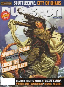
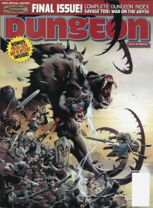
Dungeon 150, the final print issue. Wayne Reynolds’ cover, depicting the climax of the final adventure path of the magazine, seems appropriately cathartic for the occasion of the magazine’s cancellation. For the epic fight against Demogorgon, prince of demons, Reynolds pulls together all of the ‘iconics’ that Paizo used during their stewardship of Dungeon as stand-in adventurers for covers and illustrations. It sums up the body of work very well, and the iconics’ steadfastness in the face of the suicidal melee assures fans of the magazine that Dungeon will not go out with a whimper, but with a bang (fortunately we all know how well everything turned out for Paizo).
The Best Dungeon Covers: 1-75
April 23, 2012Last month marked the 200th issue of Dungeon magazine, which is quite a milestone (even if I do still mourn the loss of the Dungeons and Dragons print magazines), and as far as tabletop gaming magazines go, one that I think has only been achieved by White Dwarf and Dragon.
Just as I did to celebrate Dragon’s 35th anniversary last year, I thought I would go back through the archives and highlight the best examples of cover art Dungeon magazine has to offer (the best Dragon covers are here: 101-200, 201-300, 301-fin). Like my previous retrospective, it was difficult narrowing down favorites (and I have no doubt that others will disagree with my choices) especially since Dungeon covers, by nature of the magazine’s adventure oriented content, tend to favor my favorite subject matter – monsters.
I’ll admit up front that Dungeon has never held the same fascination for me as Dragon. While in print, I never had a subscription to Dungeon, since I wasn’t sure if future adventures would be suitable for my players, or ones I would be interested in running. However, I made a point of checking each instalment out, and bought more than a few. In retrospect, I can see that I used the latest issue of Dungeon as an excuse for a monthly visit to one of my neighborhood hobby stores, and seeing the covers of all these Dungeons now instantly takes me back to the Hobby Shack, Shooting Star Comics and Leisure World (come to think of it, there were a lot more comic and games stores back then). So even though I was never as devoted to Dungeon as I was to Dragon, the cover images are now the wallpaper in the background of many fond memories and gaming ‘firsts’.
Click on the images to view in full size.
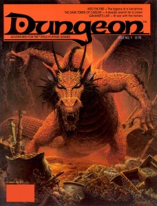
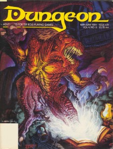
There’s no better place to start than at the beginning, and Dungeon started with a bang. I used to have a poster of this Keith Parkinson painting up on the door to my closet, where it remained until I left home for graduate school. I used to stare at that picture waiting to fall asleep, and it will always be the first image that comes to mind when I think of a dragon’s horde of treasure (I absolutely love the stolen galley in the background – now that is some serious loot!). The focus of the work, the red dragon Flame, would become one of Dungeon’s most iconic villains, appearing in several adventures, including issue 200’s Flame’s Last Flicker. Parkinson’s painting perfectly captures the majesty and menace of its subject, and I think this cover is at least as responsible for Flame’s notoriety as the adventure within (Into the Fire).
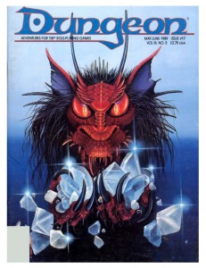
Flame next appeared on Carol Heyer’s cover for Dungeon 17. Heyer uses Parkinson’s cover as a model and zooms in for a focused portrait. I love how her work captures the covetous nature of dragonkind and the accusing stare she gives Flame tells the reader that it would be dangerous to come between the creature and its gems. Lately I’ve found myself missing the ‘tufted’ look of old-school red dragons, and this cover scratches that itch nicely.
This era of Dungeon featured a prolific number of cover paintings from Jennell Jaquays (then known as Paul). All of her work evokes a great sense of adventure, though piece each achieves this through a different emotional palette.
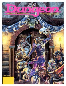
The cover of issue 14 is just so much fun it brings a smile to my face every time I look at it. This is the kind of madcap, funny/deadly encounter scene that memorable adventures are made of. The hamlet-esque wererat with the skull mask is awesome, but my favorite figure is the disgusted partygoer who has just realized the object of his amorous advances is a verminous monster. Its paintings like this that fostered my love of urban adventure in D&D.
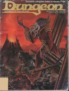
Her painting for Dungeon 24 abandons whimsy for a dark and moody atmosphere. The backdrop, with its crumbling columns and sinister volcano, is almost apocalyptic in tone – a suitable home for one of D&D’s most feared monsters to lord over. I have always liked this visual incarnation of the mind-flayer, with its gnarled, coral-like skin and skeksis style robes. It was a very popular look during the 2e days, but was replaced by 3e’s smooth skinned, cenobite attired version (also cool, but this version is my favorite). Besides having a great cover, this issue is important for another reason. It contains the adventure (which the cover depicts), Thunder Under Needlespire by a very young James Jacobs, a man who would later become Paizo’s editor in chief.
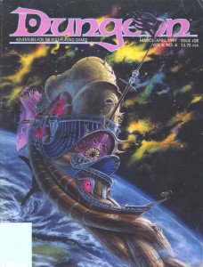
Although Jim Holloway’s art became synonymous with the Spelljammer setting, I don’t think anything he produced can touch Jaquays’ cover for Dungeon 28. The background nebula is not only beautiful it’s also a nice technical achievement and the best representation of the phlogiston that I have seen (if you’re not familiar with Spelljammer, that’s the flammable gas that makes up space in D&D). The crumbling Nautiloid hulk in the foreground drifting towards the planet has a very eerie, Event Horizon vibe to it (even though this issue predates that film by six years). The thing I like most about this painting though is that it sells Spelljammer as a legitimate setting for serious adventures – not just the boxed set with the giant space hamsters.
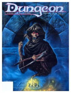
In addition to painting a cover that made the Dragon list, Bob Eggleton also created this piece for Dungeon issue 19. The summoned death is as frightening as it should be and the background done in cool blues gives the picture a mystical ambiance. The combination is perfect in capturing the spirit of one of my favorite magic items in the game, the deck of many things. The icing on the cake is that Eggleton styled the card in the painting after the deck of many things set that came as a bonus in Dragon a few months prior.
Thomas Baxa, the artist responsible for the cover of Dungeon 29, is something of a lightning rod for criticism of the 2e era’s art. Now, I’m not a fan of his work in general, but I don’t dislike it out of hand, and in spite of the haters, he has created some exceptional works in his career with Dungeons and Dragons (his undead illustrations are delightfully weird and gruesome). This painting, of an abishai being summoned by a cursed book, is his best. Baxa’s rejection of naturalistic colors in favor of bright (almost garish) reds and purples brings the painting into the realm of the surreal, and I can’t help but be reminded of Erol Otus. I’m not sure I would feel the same about his technique with a different subject, but a blighted text ripping open a gateway to the netherworld? This could easily be the cover of a Clark Ashton Smith collection.
The next covers I’ve chosen are linked not just by their nautical theme, but because they are fantastic examples of a painting’s ability to tell a story and engage the viewer to fill in the blanks.
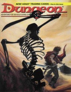
Issue 34 by Peter Clarke uses a reverse angle of the protagonist for a wickedly sinister horror movie composition. It’s not surprising then that the story this painting evokes plays out in my mind like a film: the adventurer tugs his rowboat ashore, unaware of the skeleton rising from the dunes behind him silently. With sand slowly spilling from its empty eye sockets, the undead beast raises its rusted scimitar and…
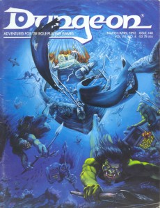
Alan Pollack’s cover for Dungeon 40 is less of a film and more of a perfect snapshot of movement frozen in time. Pollack uses the perspective so well, you can almost feel the pressure of the water around you as the koalinth hang suspended with their pilfered treasure (this is one of the only illustrations of these creatures I have seen). I also like the opportunistic sharks circling in for an easy meal. The need for dynamic composition in fantasy illustration is a point hammered home by art directors over and over – this is how it’s done.
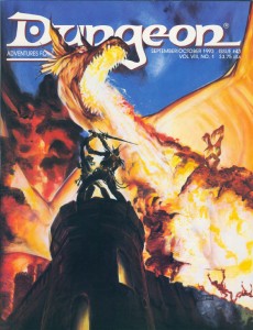
Another cover by Peter Clarke, for issue 43. Backlit by the fiery blast from an impossibly massive dragon, an adventurer and githyanki struggle for a fabled silver sword. Freaking epic. That is all.
Earlier, it may have sounded like I dissed Jim Holloway, but I really like his work in the right context (his style defined the Paranoia game, those Tales from the Floating Vagabond ads were awesome, and yes he had some great Spelljammer pieces as well). Case in point: this cover for Dungeon 60, overflowing with character. I have a tendency to take myself too seriously, and Holloway is the cure for that, reminding the viewer that the game is supposed to be fun. The best part about the humor in this painting is that it doesn’t descend to the level of a ‘joke’ cover. Instead, what I think Holloway captures here is how the game actually plays out at the table. You’ve got a disparate and loosely organized band of adventurers searching for treasure(and I love the implied relationships there – the swordswoman shooting daggers at the halfling for hamming it up), completely oblivious to the kuo-toa war party sneaking up behind them (who obviously made their Stealth or Surprise checks – depending on which edition of the game you’re playing). The bio-luminescence is a nice touch too. I’m not the only one who thinks this issue is boss – Outsyder Gaming wrote a whole series of articles on it.
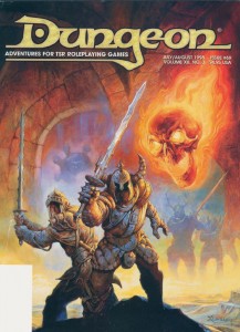
Jeff Easley only ever made a single cover for Dungeon magazine, issue 69, and I had to include it here. I don’t think it’s his greatest work (his dragon covers are much more impressive), but I included it for two reasons. First, it is just so Easley (if I can use that as an adjective). What I mean is it’s so indicative of his trademark style that you can tell it’s an Easley painting from a mile away. The highly sculptural figures, the plush rendering, the earth tones accented with bright colors… you know, so Easley (and let’s face it, an average day for Easley is a great day for anyone else). I also included this painting in the list because it showcases how different an animal a Dungeon cover is to one created for Dragon magazine. Dragon covers might have to portray a vague theme, but generally the artist is free to follow their instincts. Dungeon covers on the other hand are much more structured. Their function is to represent one of the adventures inside in a very literal and concrete way. The cover doesn’t just have to look good, but it also has to inform the viewer about the magazine’s content. Even a big name in the TSR art department can’t phone it in – this cover accurately depicts the Doom Brigade, one of the teams of antagonists from the adventure Sleep of Ages (a group of helmed horrors with two-handed swords and a flameskull in the service of an elder orb beholder).
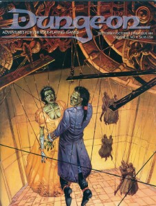
Undead and puppets, two creepy tastes that taste great together. Incredibly, this particular combination has been used for two Dungeon covers. First, on Dungeon 64 by Mark Nelson – who takes full advantage of his experience working on Clive Barker’s Hellraiser comic. It’s really the details in this painting that elevate it from creepy into a work of true horror: the intricate and painstakingly constructed clockwork marionette mechanism hints at the obsession of its creator; the desiccated flesh of the corpses contrasts against the finery of the puppets’ fancy dress; and the awkward way the dance partners are forced to hold one another brings the wrongness of the scene to a fever pitch.
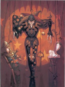
The second such unsettling cover is for issue 75, by Brom. While Brom’s early work for TSR (especially his Dark Sun illustrations) was very much in the vein of Frank Frazetta, this cover represents a shift in his style towards a darker, more gothic look. I love Brom’s work in any mode, but unfortunately I think this shift (combined with his independent success) took him off course from the branding of D&D as heroic fantasy. At the end of the 2e era, Brom’s work was found in fewer and fewer products, completely disappearing from D&D (except for the odd magazine cover) by the time 3e rolled out. There is a lot of talk lately about what the art of the next edition of D&D should include. If it is to be as inspiring as the art of earlier editions, then Wizards of the Coast needs to bring visionaries like Brom, and the other artists I have highlighted here, back into the fold. It’s worth the high price tag.
In the nest installment I’ll look at the latter half of Dungeon’s print run, the 3e era.
The Best Dragon Covers: 301-fin
July 8, 2011This is the last instalment of my celebration of Dragon magazine’s 35th anniversary, and I have to admit it’s a little bittersweet (part one is here and part two is here).
Roger Moore may have been my favourite editor, but my favourite era of the magazine is the time Dragon spent under the stewardship of Paizo publishing (with Eric Mona as editor). Paizo injected the magazine with this amazing youthful energy that made it exciting to read in a way that only an optimistic, upstart company can do. This batch of Dragons delivered consistently good material, with something in almost every issue that I wanted to incorporate into my game (it also presented a blend of ‘fluff’ and ‘crunch’ that suited my tastes perfectly – and I try and emulate on this blog). The only thing I can really hold against Paizo is that they stopped the practice of including a reprint of the cover art sans text in each issue.
And then it stopped. The cancellation of Dragon hit me pretty hard. My subscription had followed me through so many phases of my life; the thought of never getting another issue in the mail was very depressing. Yes, the online magazine has been much better than anticipated, and the incorporation of its material into both the character generator and the online compendium is tremendously useful to players and DMs alike (and would probably be impossible with a print version), but still, I think Dragon lost something when it went digital (call it gravitas). Especially the covers.
That’s not an indictment of the art, rather just an observation that in an online magazine, covers don’t really mean much (even more so that they don’t bundle the articles into a single pdf anymore). Electronic images seem so much more impermanent, without a physical presence, I quickly glance at them and scroll down the page, another ephemeral chunk of culture to be consumed without savouring. So, sadly, my celebration of Dragon covers stops with issue 359 (as usual click on the image for full size).
I mentioned Wayne Reynolds’ emergence in the last article, and if anything, his star grew even brighter during the Paizo days of Dragon, producing numerous covers and a spectacular 3.5e DM screen that was given away as a bonus with the magazine (that I’m still using). These are two of his best.
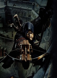
I always thought the repeating crossbow was a bit of a goofy weapon until two things changed my mind – an episode of Deadliest Warrior and the cover of Dragon 305. Rogues are one of my favourite characters to play and this painting perfectly sums up all the greatest features of the class. Lightly armoured, quiet as a shadow, and a face that leaves no doubt that this man is a scoundrel. I was the DM at the time so I never got to make this character in the game and had to settle for using this cover as my portrait in Neverwinter Nights.
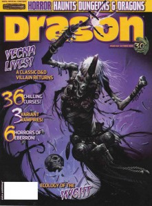
WAR might be known for big, bulky armour, and wall to wall action scenes, but here he displays his skills at rendering the undead (and check out his depiction of the Githyanki Lich Queen on the cover of Dungeon 100 if you need more proof). Vecna’s name has been in the game as a villain since (almost) the beginning, but there are few depictions of him. Not having a phonebook of visual precedents worked in Reynolds’ favour with this piece. Instead of wrapping the whispered one up in a big voluminous robe (the kind you associate with liches), WAR went for a more exotic, almost primitive look. It’s a choice that might bother some, but to me it makes Vecna look ancient and primal – more like a god and less like your garden variety undead spell-caster.
Marc Sasso probably had more Dragon covers during this era than any other artist. His style is definitely square in the ‘new-school’ of Wayne Reynolds, but as much as I admire WAR’s talents, I think that Sasso has a greater command of perspective that gives his paintings more depth.
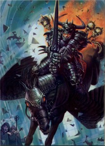
That kind of depth really isn’t in play for his cover of Dragon 312, but if an anti-paladin crashing through the stained glass of a temple on his nightmare mount while the clerics crap in their robes isn’t good enough for this list than I don’t know what is. I’ll admit I have a weakness for the little skulls moulded into the knuckles of the warrior’s gauntlets. This painting could just as easily be the cover for a metal album (and incidentally Sasso has made more than a few), which is just the place you want to go when depicting the over the top evil of an anti-paladin. I’m not what you would call a metal-head, but I’ve always had a soft spot in my heart for the aesthetic – especially vans airbrushed in full Frazetta mode (my family had a big van for years, but my father wouldn’t let us put so much as a bumper sticker on it).
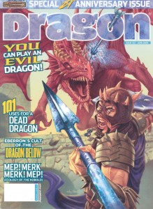
Sasso’s cover for Dragon 332 is less metal influenced, but a much better painting. I think it’s cool that he decided to go with a wild-eyed, lightly armoured, mercenary type as his Dragon slayer, rather than your traditional St. George figure. In my games at least, there were a lot more of the former than the latter. I also love his portrayal of magic – the spreading blue glow of arcane cold is subtle, but noticeable, and it fits the game accurately (in 3e, Red dragons take extra damage from cold attacks).
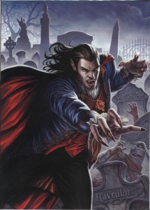
Dan Scott’s cover for Dragon 315 is memorable for me in so many ways. First, this issue, focusing on D&D’s ‘dead’ game worlds is one I go back to all the time, so it’s hard for me to separate my joy for the content of the issue when seeing that painting. Second, that’s a great depiction of Strahd. I’ve never used him in a game, but I’ve always been fascinated with him as a villain. He’s sort of like Dracula (OK, an exact clone of Dracula), a name that’s so big it’s nice to have as a legend but hard to put into an encounter and do him justice. Finally, the layout of this piece immediately brings to mind the covers of The Official Handbook of the Marvel Universe Book of the Dead series. I’ve mentioned my boundless love of the OHOTMU many times before on this blog, but when I got my first issue of the Book of the Dead as a birthday present in grade 7, I thought it was that much cooler than ever before.
The thing that makes Scott Fischer’s cover for Dragon 329 stand out is that it looks more like contemporary art than fantasy illustration. The composition, tone, and reference to Ingres’ Odalisque, make it seem like the kind of painting your partner would let you put up in your living room (I’m lucky enough to have a gamer for a partner so there wouldn’t be a problem either way). Except that it’s also a painting of a medusa that’s just turned a guy to stone (it’s hard to see with the logo, but he’s petrified with a look of absolute horror). It’s the visual equivalent of a song by The Jam – all poppy and melodic on the surface with dark and politically charged lyrics underneath.
Mind flayers are one of my favourite monsters (just look at the background image for this blog), so any cover that features one already has my attention. The cover of Dragon 330 by James Ryman actually shows one in the act of devouring some poor soul’s brain. When I was a kid, Bill Willingham’s back cover piece (which showed the same activity) for Descent into the Depths of the Earth, gave me the heebie-jeebies. Ryman’s cover is a worthy successor, and the longer I stare at it the itchier my scalp gets. The emotionless face of the illithid, contrasted with the sheer terror and pain of its victim works to demonstrate just how alien these things are.
Before Steve Prescott became Paizo’s go-to guy for their Pathfinder rpg, he made Dragon covers for them. I guess the art directors at Paizo like him for the same reasons I do – his versatility. I think these two covers are his best work for Dragon, and they also illustrate his ability to work at either end of the scale spectrum.
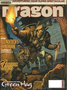
In his cover for Dragon 331 Prescott takes us to the gritty and personal street-level of adventuring. This is the kind of Nick Fury-esque adventurer that I dig. His gear is worn, and you can tell from the menagerie of weapons, climbing tools and odd mystical bits that this guy is a veteran of dungeon delving. But the best part of this picture is that Prescott is able to make the character look fully kitted out without crossing the line into parody like say, Citadel’s complete adventurer miniature.
A little more than a year later, Prescott’s cover for Dragon 344 takes us from the street to the epic and he doesn’t miss a beat. As the goddess of evil dragonkind, Tiamat is awesome. Possessing a head that represents each species of chromatic dragon, she seems a much more natural progenitor than Bahamut the platinum dragon does for the metallic dragons. The stand out feature of this painting is Prescott’s attention to detail. Each of Tiamat’s heads corresponds in shape and style to the models laid out by Todd Lockwood and Sam Wood in the Monster Manual. I’m a sucker for that kind of continuity. Artists’ styles change but you get the sense that the game world is alive when what they are depicting the same creatures (say what you will about the Dungeons and Dragons cartoon, but they did the same thing with their version of Tiamat – albeit with the 1e dragon models).
I DMed a long running planescape campaign for 3e, but my love of that setting began way back in high school when the boxed set was released. R.K. Post’s cover for Dragon features Planescape’s icon, the Lady of Pain. Even though her face appeared on almost every product in the line, there were only a handful of pictures that showed the Lady’s complete figure. I talked about R.K. Post’s style last article, and with a creature as creepy and enigmatic as the Lady of Pain, it’s a perfect pairing of subject and artist (if I was wealthy beyond imagination I’d commission Clive Barker to do a painting of her). When this issue came out, my Planescape campaign had concluded (so I couldn’t use the picture in-game), but this cover brought me right back there, my mind wandering the streets of Sigil all over again.
If Steve Prescott is versatile then Andrew Hou is an absolute chameleon. He seems to move effortlessly between the anime influenced style of the new school and a more traditional style of fantasy illustration. Looking at these two covers it’s hard to believe they are painted by the same artist… that one of them features the two-headed Demogorgon seems highly appropriate.
I’ve used golems as adversaries many times in D&D, and even though the rules for creating them as servants have been in the game since 1e, I have never played in a party where we crafted one. I’ve really wanted to, and my friends and I have come close a couple of times, but it just never happened. I had this issue of Dragon sitting on my computer desk for over a year, hoping that my players would be able to make use of it, but it wasn’t to be. Hou’s cover for issue 341 was never very far away when I was preparing for game sessions, its newly forged iron golem full of the promise of an iconic aspect to D&D wizardry. It’s a shame 4e has no decent golem crafting rules.
Hou’s cover for Dragon 357 is a great painting of Demogorgon (I am so glad Paizo returned Demogorgon to his baboon headed self, and didn’t use the hyena version from the Book of Vile Darkness). For some reason the style reminds me of old movie posters, full of dark atmosphere and the distant drums of action. I can just see it tucked away in the corner of an old video store (Queen Video if you’re in Toronto)… ‘Prince of Demons ‘, with animation by Ray Harryhausen, featuring a band of adventurers suddenly transported to another dimension where they witness the endless carnage and turmoil that is the abyss!
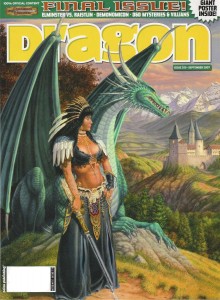
And here it is, the final cover, Dragon 359. I’m not actually that crazy about the Larry Elmore painting. There’s something jarring about the strange outfit the woman is wearing that irks me, but that electro-sword is cool, the green dragon (in reference to Dragon magazine’s first issue) is a nice touch, and as always he has created a background more beautiful than most artists’ foregrounds. Besides, it’s the last issue – its cover would deserve a place of honour even if it was a blank page.
As an afterthought, I wonder how fantasy illustration has been impacted by Dragon going digital. Looking back at my favourite covers and researching the people who made them, I see that many prominent artists made a splash in Dragon before moving on to other things (many of whom are now the primary illustrators of Pathfinder and 4e). As I mentioned at the start of the article, I haven’t been paying much attention to the digital Dragon covers, but is it occupying the same niche in the industry for artists that it once held? Hopefully it does, but if I am any indication, these new fantasy artists are not getting the attention that they deserve.
I Levelled Up!
July 5, 2011There are certain recognized milestones for a D&D character’s development – a wizard learns fireball, a fighter gets a second attack, a rogue trains a skill up to +20… when it comes to personal, real life development, the milestones come with less frequency and are certainly less impressive.
But I’m proud of myself anyway. My milestone? I created my first cover. Here’s the backstory. I’ve been posting my favourite Dragon magazine covers from different eras, saturating my brain with great art. One of the reasons I create my own pictures for the monsters I produce on this website is so that I can get back in the swing of drawing regularly again (an activity that I’ve associated with RPGs since I was a kid, but exercise less and less as I get older). It’s great practice that comes with its own built-in impetus (for a guy like me, that’s the best kind of impetus); I hate monster stat-blocks without an illustration. Reminiscing over those back issues of Dragon inspired me to begin experimenting with color in my pictures.
Meanwhile, while perusing the RPG Blog alliance, I noticed that Mark at Mithril and Mages was holding a contest to design a cover for his application, Treasure Book on Demand (a very cool program that randomly generates a whole book in pdf form, with treasures for every ‘hoard class’ in the Labyrinth Lord game – that’s the same as ‘treasure type’ in 1e D&D). He was looking for an A4 sized illustration in colour – just the thing I’d been experimenting with. I thought to myself, I could do that (in a fit of un-me-ness). And I did. Here’s what I made. And it won!
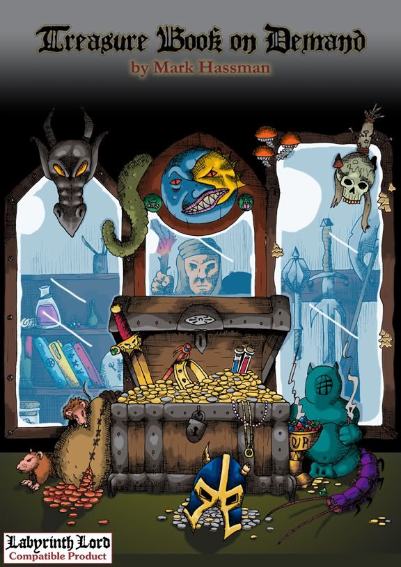
OK, there were only two people who entered, but Mark was classy enough to give us both first prize. That was awesome (and greatly appreciated), but the real milestone is that I was able to fill up that page with something, and even though I can already see a lot of things that I would like to change (I admit that time constraints made me rush the images that appear in the mirrors – and it shows), I’m very proud of the finished product. It was a lot of work, but like any adventurer who manages to make it out of the dungeon bruised, bleeding, but alive; I think I’ve learned a few tricks and expanded my skill-set.
For the basic design of the piece, I wanted a chest full of riches, with a set of mirrors reflecting different sorts of treasures (as a way to show how the Treasure Book can generate infinite combinations). Then I tried to jam in as much detail as possible, because in any haul, it’s the little things that are always the most exciting.
Seeing as Labyrinth Lord is a retro-clone, I went back to the old school masters for inspiration when gathering reference material (like I needed an excuse). Some of the tributes are obvious, others a little more obscure (especially the not-exactly D&D ones). For those who don’t like spoilers, I’m putting the sources of all the picture’s ‘Easter eggs’ in the comment section.
It might not be Dragon material, but it’s my fireball (or at least Melph’s minute meteors).
The Best Dragon Covers: 201-300
June 28, 2011As part of my ongoing celebration of Dragon Magazine’s 35th anniversary, I present the next instalment of covers, from issue 201 to 300.
These images represent quite a roller coaster ride through the ups and downs of Dungeons and Dragons. They bear witness to the development of the greatest settings the game has ever seen, the excesses and eventual decline of 2e, the demise of TSR, and the rebirth of the game in 3e under the ownership of Wizards of the Coast. Even though I had shifted to other games (namely Rifts) in the later days of 2e, I never strayed from Dragon (and even if I wasn’t in a campaign I always thought of D&D as my game). The writing, the ideas, and especially the art were always a great source of inspiration and entertainment.
I also liked the feeling of belonging to a community of gamers that came with the subscription. Yes that need has been fulfilled by the large (and vocal) gamer presence on the internet, but I don’t think anything will replace the visceral presence of a stack of physical artefacts (he says without irony while typing away on his blog – seriously, I can love my blog and the immediate and widespread distribution it has while still mythologizing the printed word, can’t I?).
One of the less positive aesthetic developments during this era was the inclusion of more text on the covers, obscuring the art. Fortunately, Dragon editors helped to mitigate this by publishing the cover art as a full page spread within the magazine. Since I’m focusing on the art of the magazine, I’ve chosen to reproduce those images and not the actual covers, even if it looks a bit strange not to see the familiar Dragon logo (as usual, click on the image for full size).
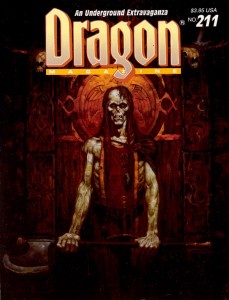
In the last article, I mentioned two of Brom’s fantastic Dark Sun images. He also painted a pair of covers for this run; two striking images of the undead. I always felt the first cover, for Dragon 211, was the perfect representation of a ju-ju zombie – an abomination created through life draining necromancy that retained some of its intelligence, could use weapons and had hard, leathery grey skin (and sadly hasn’t appeared in D&D since 2e). The halberd the creature wields also reminds me of old-school Citadel zombies (the ones armed with a cleaver-on-a-stick), which is a very good thing.
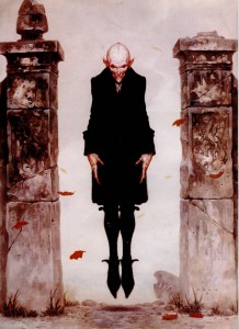
Brom’s second cover swings to the other side of the undead spectrum for Dragon 264, with a seriously creepy Nosferatu inspired vampire. Looking at the cover today, I continue to find Brom’s choice of vampire refreshing (in 1999 when this issue was published I was sick of Anne Rice copycats, today it’s the unmentionable ‘sparkly’ vampires of teen land). There is absolutely no question that Brom’s creation is a monster. With its rat-like teeth, beady eyes, and blotchy pinkish skin, the vampire is once again a living metaphor for the horrors of disease and the predatory nature of the aristocracy… not something to moon over and identify with.
Another artist whose name should be familiar from the last article is Jeff Easley. Like the previous run, Easley was incredibly prolific in producing Dragon covers from 200-300, but these two are my favourite. Easley has painted a lot of dragons (I would say he is a master of the subject), but I think the cover to issue 225 stands out. Maybe it’s because I’ve got Caravaggio on the brain, but I love the dramatic impact of the dark, almost black tone. It really sucks you into the picture. Plus, I always appreciate it when an artist chooses to paint a dragon that doesn’t breathe fire. It’s a lot harder to visualize lightning breath, and as cool as King Ghidorah is, I’d rather have this as the go-to mental image whenever I think of blue dragons. Also, I’m not sure why undead and dragons go together, but apparently they do… and its unadulterated badassness.
In tone, Easley’s cover for Dragon 254 is the polar opposite, and its naturalistic palette makes it seem almost like a landscape – which helps to suspend disbelief when you realize just how enormous that giant is. This cover echoes traditional fantasy renderings of giants which put into perspective just how small D&D giants are. I’ve never used a gargantua, or goriostro or similar sized monster in D&D, but I’ve always wanted to, and every time I look at this painting I feel like smacking myself for not designing that adventure yet.
There was a stretch during the middle of this run when every cover featured the magazine’s namesake. Now dragons are very cool (half of my favourite covers have them), but after a while it starts to get predictable (and if I recall, the letters column had some complaints about it). Fortunately, there are artists who can take any cliché and breathe new life into it. These covers still have the power to make me look at dragons in a different way.
R.K. Post is most well-known for his work setting the visual style for the Alternity game, but he also made several Dragon covers. The thing I love about his painting for issue 241 is how Post takes a well-travelled narrative (sneaking up on a sleeping dragon) and makes it as dark and full of twisted lines as his art. In this cover you cannot be sure of anything. The fighter in the foreground is cloaked in shadow, drawing a cruel looking blade. Is he the hero of this tale, or the villain? Instead of reclining on a bed of stolen riches, this dragon lays on a mighty tree, with which it blends seamlessly, like a creature of nature. It’s also nice to see a bard as part of the action, something you don’t often witness in D&D illustration.
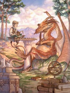
If I could use a single word to describe Tony DiTerlizzi’s cover for Dragon 242 it would be ‘charming’. DiTerlizzi helped bring the Planescape setting to life with his incredible ink and watercolour pictures. Most of those were dark and sketchy, as suited the down and dirty flavour of Sigil, but here DiTerlizzi shows us he can also work with a lighter palette and more refined lines. It’s also full of whimsical little details that ensure I’ll never get bored of looking at it – the dice on top of the D&D books, the strange orrery, and especially the dragon’s tiny spectacles. This painting helps to remind me that dragons aren’t just dumb brutes there to blindly rip apart adventurers. They are some of the most intelligent creatures in the game, have their own goals, and just maybe, indulge in the occasional game of chess.
The next pair of covers each feature paintings with interesting mounts and riders. I’ve never had the chance to play a character with a special mount (I’m usually the DM for our gaming group), but these pictures hold enough inspiration that I feel left out.
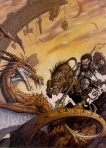
Matt Wilson is now the co-owner of Privateer Press, but in the nineties he did a bit of work for TSR, including this cover for Dragon 245. Dwarves aren’t one of those fantasy races you usually associate with cavalry, but once you see a dwarf knight on a razor tusked boar pulling a St. George, you know it’s right. Looking at this painting today, I also find it interesting to see the proto-vision of the style that would one day be associated with the Warmachine game.
I mentioned veteran Dragon artist Fred Fields last article, and you can see how much his style changed over the years from Frazetta-like heroic fantasy to a gritty photo-realistic one. When Dragon 248 came out (1998), I was playing a lot of Rifts, so I had a natural inclination to like the genre crossing for its cover (the goggles, for flying without a canopy are a nice touch). Of course in Rifts you can be a dragon, so my friends and I would joke that the guy with the machine gun was actually the dragon’s familiar.
I know a lot of people hate them, but I have always loved psionics in D&D (yes, even in 2e when they were obviously broken, but who didn’t love rolling for wild talents?). One of my favourite issues of Dragon covering the subject was 255, with a stunning watercolour cover by Rebecca Guay (I liked the issue so much it’s the only time I ever wrote to the magazine – and I had my letter published in 259!). I love the almost medieval look of her lines, and the light washes of paint make the image look ethereal – perfect qualities to depict a psionic struggle between heroine and mind flayer. This battle could easily be taking place in the physical world, the mental plane, or a blending of our perceptions of the two.
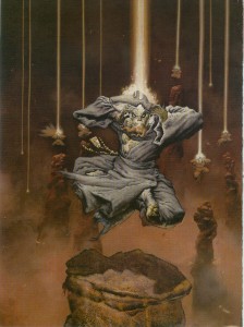
I was ignorant or Mark Zug’s work until I looked up the artist of these two long-time favourite Dragon covers. Besides depicting an awesome bat-creature acting as a guardian of a magically sealed doorway, Zug’s cover for Dragon 271 also contains a hidden message spelled out in those runes. I’ve never figured out what it says, but I like knowing that there’s a mystery to be solved. It’s this kind of Easter egg that moves a painting from being a fantasy illustration to a specifically D&D one.
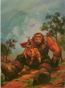
Nothing signifies the transition to 3e more than this cover for Dragon 275. Yes, the magazine had switched over to the new edition in the previous issue, but Zug’s painting of a noble half-orc paladin summed up the shift in the game’s philosophy without words – no more boundaries.
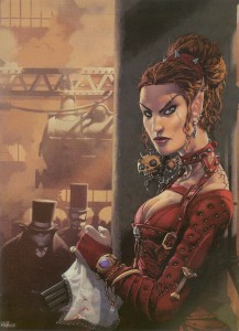
There is so much to dig about Kev Walker’s cover for Dragon 277, the multi-barrelled pistol concealed under a lace handkerchief, a badass elf in studded leather, locomotives, Victorian fog, and you have to love that half-orc with the righteous mutton chops in the background. If you have ever wanted to play a steampunk version of D&D, this painting is it.
I mentioned my love for psionics, so it’s no surprise that I included Paolo Parente’s cover for Dragon 281 in this list. It’s doubly hard to make a visual representation of mental power, both because psionics by their nature, have far few optical effects than traditional magic, and also because there isn’t a deep well of reference material for artists to plumb. Parente takes these limitations and grinds them into the ground. This picture of a group of Githzerai in meditation (as well as Rebecca Guay’s), present the best argument for the place of psionics in a fantasy setting.
The rise of 3e is also the rise of artist Wayne Reynolds. Like Brom with Dark Sun, WAR (as he signs his pieces) was responsible for the visual style of Eberron (and with all the covers and large color illustrations he did for other 3e products, it could be argued he helped define the style of the edition itself). No run of Dragon covers that includes 3e material could be complete without a WAR painting. His work always has a dynamic sense of action that really energizes me and makes me want to start rolling dice now. I also like this piece for the things it doesn’t include: ‘boob windows’ (to use Wundergeek’s term) and adventure inappropriate clothing – art crimes WAR has definitely been guilty of in his body of work.
In the next instalment I’ll look at the bittersweet final years of Dragon.
The Best Dragon Covers: 101-200
June 15, 2011This month Dragon magazine reaches two milestones: its 400th issue and its 35th anniversary. To celebrate, they’re looking back on the magazine’s storied history and the WOTC website has created an online gallery featuring the cover art of Dragon’s first 100 issues. The covers of Dragon are a great source of gaming inspiration, and feature some of the best talent in fantasy illustration. The art was so good that TSR often reused it in its other products (which drew its share of criticism but never bothered me – it made me feel like an ‘insider’ when I recognized a painting from Dragon). For me the covers also signify something in addition to great art. My interest in Dragon magazine grew as I made the transition from player to dungeon master, developing into a very long subscription and culminating in what some would call an obsession (well, anyone who’s seen the boxes of magazines on my book shelves).
There are some excellent covers in those first 100 issues (seriously, check them out now), including Denis Beauvais’ incredible series of chess themed paintings (probably my all-time favourites), but I missed out on most of them. The very first issue of Dragon that I owned was number 87, indefinitely borrowed from my school library (don’t tell Baythorn Public School). Sure, later I acquired many pre-100 issues, but it wasn’t quite the same. I read the back issues with the eyes of a collector. When my monthly copy of Dragon came in the mail though, I absolutely devoured every page. And when I wasn’t reading, those covers stared up at me from my pile of gaming books spread across my mom’s kitchen table.
So I’m joining the celebration and over the next couple of weeks I’ll showcase some of the magazine’s stand-out covers – post issue 100. These are images that for one reason or another have stuck with me over the years, and flipping through my collection today they still have an emotional impact. It was nice to have the excuse to get reacquainted with some old friends (as usual, click on the pictures to see them full size).
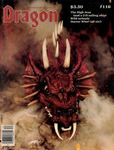
Issue 116 featured an amazing scratch-built model of a red dragon by Peter Botsis. I really love the combination of miniature painting and smoke effects – the three-dimensionality somehow makes it seem more real to me than a traditional painting. It took me a decade and a half of waiting, but in University I was finally able to combine dry ice and miniatures for my own tabletop game (thanks to a friend who works at a lab) – although instead of dragon smoke it simulated the fetid miasma of the Hive for a Planescape campaign.
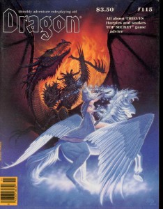
The cover of issue 115, the Antagonists by Denis Beauvais (of the chess covers) is truly a classic. Many of his covers featured the struggle between good and evil, but what I love about this painting is how the composition engages the viewer by putting them on the side of light, confronting the demonic forces of darkness face to face (almost daring you to open the cover and face the dangers within). I’m pretty sure that’s the first time I ever saw bladed wolverine style armguards as well, a look that surely influenced artists like Brom and Wayne Reynolds. Oh, and it was so badass that Ral Partha immortalized it in miniature form.
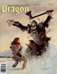
A frost giant skeleton bursting out of a snow bank hardly seems subtle, but my favourite parts of the cover of issue 126 by Daniel Horne are the small details that move your eye around the page and tell a story without words. The skeleton’s missing finger, the sword lodged in its armour, the ineffectual scattering of arrows, the empty quiver, and finally, if you look very closely, you can see that the last arrow gives off a slight glow… an arrow of undead slaying perhaps? It’s also nice to see a female character dressed appropriately for adventuring.
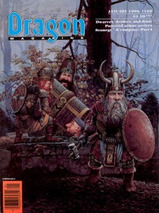
Dragon 127 and 129 are both Keith Parkinson paintings and both were reused in more than one TSR product (the Big Stash – the one with the dwarves, I remember being included in a Forgotten Realms calendar I got for my birthday when I was a kid). Parkinson was a master of atmosphere and the paintings’ multiple appearances are a testament to that. With his painterly style and slice of life (fantasy life that is) subject matter you can’t help but be drawn into the D&D game world with these covers.
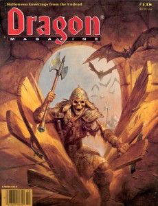
I’ve mentioned before how much I like Jeff Easley’s dragons, but the cover of Dragon 138 shows that he can do just as well depicting the undead. I really dig the earthy palette of this painting – it reminds me of a freshly churned grave (in true horror movie style with a rotting up-thrust hand of course). Dragon’s October issues had a long tradition of following a Halloween theme, and I always looked forward to them.
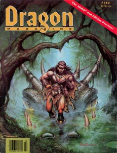
Fred Fields did a lot of work for TSR, but this cover for Dragon 142 stands out for two reasons. The first is purely nostalgic. This issue of Dragon marks the transition from 1e to 2e D&D. I was buying every issue in the local games store by then and it was soon after this that I got my subscription. The other reason I love this picture is that it represents a scene that every dungeon master has wanted to spring on his players, the classic ‘that hill you are sitting on is actually a dragon’ (which just beats out ‘that cave you walked into is actually a monster’s mouth’). I never managed to pull that one off, even though I set an adventure with a black dragon in a swamp shortly after this came out.
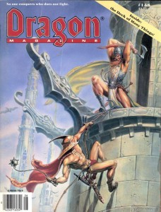
I enjoy the cover of Dragon 148 by Ned Dameron for similar sentimental reasons. This issue was awesome because it had a cardstock insert of the infamous magic item, the deck of many things. I immediately inserted it into the campaign I was running (totally disrupting it with excessive amounts of magic) and that meant keeping this issue on hand. There’s something to be said of the hard bitten everyman adventurer of old school art, but to a scrawny kid getting ready to enter high school for the first time, these were the kind of larger than life demigods that I wanted to play (I rooted for the guy with the Morningstar, since I thought he was a thief, and they were my favourite class).
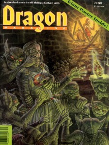
It might be the sense of dread evoked by the sickly green glow reflecting off of the bugbears’ scales (actually I’m not exactly sure what they are, but I always assumed they were bugbears because of their ears and sneaky disposition), but it’s probably just the expression on the little bastard’s face in the bottom right corner that makes me love this cover for Dragon 152 by Paul Jaquays. When I was a kid, I played with a guy whose character was always running off and trying to steal all the treasure. I wanted him to get his just desserts, like the subject of this painting.
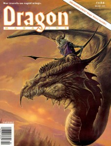
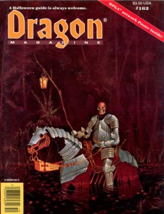
There’s not more of a reason why I like the cover of Dragon 154 by Bob Eggleton other than I think it looks like an awesome monster combination. Earthtones and undead definitely feel right together… A theme picked up by Michael Weaver for Dragon 162 (surprise, another Halloween issue). The more I stare at this painting the more I feel haunted. The hollow, rusted armour, the emotionless disembodied head, the lonely fall colouration – for some reason it all reminds me of the ravine near my mother’s house (not that its filled with the restless dead, it’s just that certain parts of the ravine had a definite character that I see in this cover).
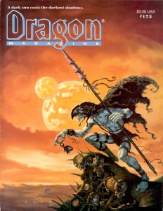
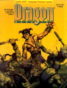
Gerald Brom’s unique paintings captured the brutal savagery of Frank Frazetta and infused them with a dark edge that twisted everything into an alien form – a style that was absolutely perfect for the Dark Sun setting. In fact, Brom’s style is so synonymous with Dark Sun that Wayne Reynolds paid obvious tribute to his work with the covers of the 4e revamp of the game world. Brom made two Dark Sun themed covers for Dragon, issues 173 and 185. The first issue, with the belgoi, had me sold on Athas, and I bought the boxed set soon after. Brom’s work was also immortalized by Ral Partha, although they used the belgoi as a model for their gith shaman.
Larry Elmore is one of the giants of fantasy illustration, and he painted a lot of covers for Dragon magazine, but looking back through my collection I have to admit that most of them didn’t really jump out at me as exceptional (unlike his product and book covers for which his reputation is well deserved). Most of Elmore’s covers were just pretty women standing idly in front of a scenic backdrop. They were well executed technically, but they didn’t inflame my imagination. Unlike those paintings, the cover of Dragon 200 lives up to Elmore’s exceptional Dragonlance work… plus it had a hologram (in the eighties if you wanted to jazz something up you made it glow-in-the-dark, in the nineties it was holograms).
In the next instalment I’ll look at Dragon’s covers post 200.
Tribute to Jim Roslof (1946-2011)
March 24, 2011Old-school D&D artist Jim Roslof passed away last weekend, and given the influence early D&D art has had on my predilections, I would be negligent if I didn’t join other bloggers in paying tribute.
Wizards of the Coast have put together a thoughtful collection of memories and comments from Roslof’s friends and colleagues that is worth reading. In particular, they draw attention to his work as TSR’s art director, during which time he assembled the artistic super-team of Caldwell, Easley, Elmore, Holloway, Parkinson, and Truman. It’s an interesting story, but I’m going to focus on his work as an artist.
I have to admit up front that Roslof wasn’t my favorite artist growing up. I didn’t dislike his work, but Roslof wasn’t a name that I made a point of learning (yes, D&D artists were the first artists whose names I bothered to learn). It could have been because he often didn’t sign his works (making it harder to associate a name with him), or that his style wasn’t as immediately recognizable as an Otus or Elmore, or even that he wasn’t an artist my older brothers (who introduced me to D&D) drew my attention to. But in researching this post, going back over all the illustrations Roslof contributed to D&D products over the years, I noticed how many I remembered but had not attributed to him. When I think of D&D, it is many of Roslof’s images, still lodged in the deep recesses of my gray matter, that call out for reflection.
James Maliszewski at Grognardia has an excellent post on Roslof’s TSR cover paintings (including, in an earlier post, the iconic cover to The Keep on the Borderlands), and Mortellan at Greyhawkery showcases Roslof’s epic Thor vs. the midgard serpent illustration. Those are great pictures, but instead I wanted to focus on Roslof’s numerous black and white interior spot illustrations. These are just the kind of pictures that I mentioned earlier. They probably aren’t the illustrations that come to mind as people’s favorite, but they are immediately recognizable, and represent the visual building blocks that make up D&D.
I present in chronological order the illustrations of Jim Roslof (as usual click on the image to see it full size).
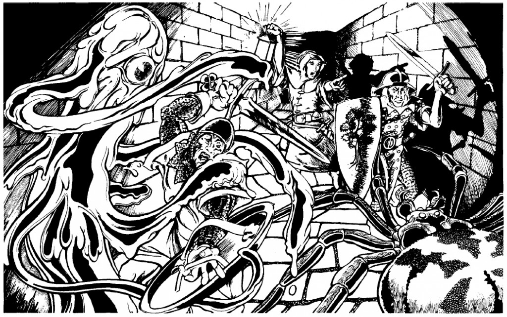
Roslof is well known for his cover painting of Queen of the Demonweb Pits, but he also did interior illustrations for the module as well, including this one depicting a yochlol and spider attacking a party of warriors. The thing I like about this picture is the focus on the party’s light source. Not only does it instantly tell the story of D&D (bringing light into the dark, unknown depths where horrible things live), it’s also a good example of game play (light sources and their durations being especially important in early D&D).
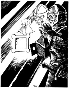
The next picture is one of my favorites that I found, although I have a hard time articulating why. It could be because The Ghost Tower of Inverness (which Roslof also painted the cover for), was one of the modules my older brother owned, and years of pouring through that booklet adds weight to all the pictures held within. It could be the play of light and shadow again. Or it could just be that the fighter pictured looks like the kind of hard bitten bad ass you wanted your character to be. He might not be superhumanly strong, but the set of his jaw, and the careful way he’s inspecting that door, give you the impression he’s seen his share of danger and bloodshed. Maybe I’m reading too much into this drawing, but I’ve always associated this guy with Nick Fury.
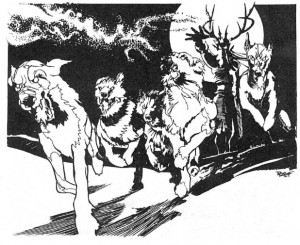
Roslof may have done all the illustrations for the Greek pantheon in Deities and Demigods, but since my mind had already been colonized by the Hercules cartoon those aren’t the images that stick with me – it’s his depiction of the master of the wild hunt unleashing his hounds. Everything works in this picture: the full moon, the sinister face hidden by shadow, the movement of the dogs. Just like the folk tales, when you see that on the horizon you don’t pull our your sword +1/+3 vs. shapeshifters (I don’t know why I choose that sword – I guess I always found it funny), you turn tail and run. Which, incidentally, is exactly what I did when I encountered him in an uber high level adventure a friend made for me in public school (well my characters didn’t run, they jetted away on flying carpets – uber high level remember).
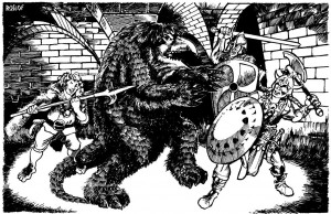
As I mentioned, Roslof is most well known for the cover of The Keep on the Borderlands, but this illustration of a party attacking an owlbear graced the cover page of that module. For me this has always been the iconic image of the owlbear (I do like what Paizo did with the creature for their Kingmaker adventure path), and even though I’ve stared at this picture thousands of times, it wasn’t until today that I realized the fellow gleefully getting ready to stick the monster with his bill-hook is a halfling. I guess I was always focused on the creature (its about to rip that shield away and gut that barbarian with its razor sharp beak – or so I’ve always thought).
![]()
Finally, I wanted to mention the module Baltron’s Beacon. Not my favorite adventure (that may be because I’ve never actually played through it and hadn’t even seen it until the nineties), but its worth noting because it’s the only book where Roslof has the sole interior art credit. The illustrations are great in this module, especially the player handouts (like they did with Tomb of Horrors and Expedition to the Barrier Peaks). I wanted to end with Roslof’s only two-page spread, depicting a party fighting a group of undead lizard men. As far as I know it’s the first picture of its type that TSR published. Is Jim Roslof responsible for pioneering the ‘wall of action’ style of fantasy illustration? Who knows? But I can easily imagine this picture catching the eye of a young Wayne Reynolds when it was published in 1985.
As a post script I should also mention that I’m incredibly jealous of Jim Roslof’s cool signature. Not the coolest signature in the world (that honor goes to Bill Willingham), but infinitely hipper than my own.
H.P. Lovecraft, Allan Moore and the Underdark
March 2, 2011I’m pretty late to the game when it comes to Yuggoth Cultures and Other Growths, by Allan Moore. It was released as a three issue comic in 2003 by Avatar Press, and I remember seeing it in the comic stores at the time, thinking it looked very cool, and then promptly forgot all about it. The issues were collected together and released as a trade paperback in 2006, and yet again I missed out. It wasn’t until last week that I stumbled onto a reference to the comic and so I finally checked it out.
The title is a allusion to H.P. Lovecraft’s Fungi from Yuggoth, his collection of 36 sonnets (I know Lovecraft has deific status amongst gamers and can do no wrong, but to tell you the truth I’m not really a big fan of his sonnets and poetry). Moore imagined himself as taking cuttings from those fungi (stealing ideas here and there if you will – but there’s no shame in that), and culturing them to see what could be grown. It’s a great metaphor, and in general it works. It reminded me of a concept album in comic book form – you might not like every song on the record, but you dig where the band was going with it.
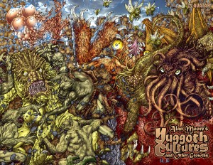
Just check Juan Jose Ryp’s wraparound cover (click on it for the full size)! The frenetic action, crazy colors and hyper detail are perfect for the madness inducing subject matter (I see Cthulhu, Nyarlathotep, a gug, a pack of ghouls, a flying polyp, and of course mi-go). As ideal as that picture is for a blog about monsters, it’s not the piece I wanted to write about.
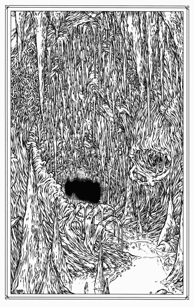
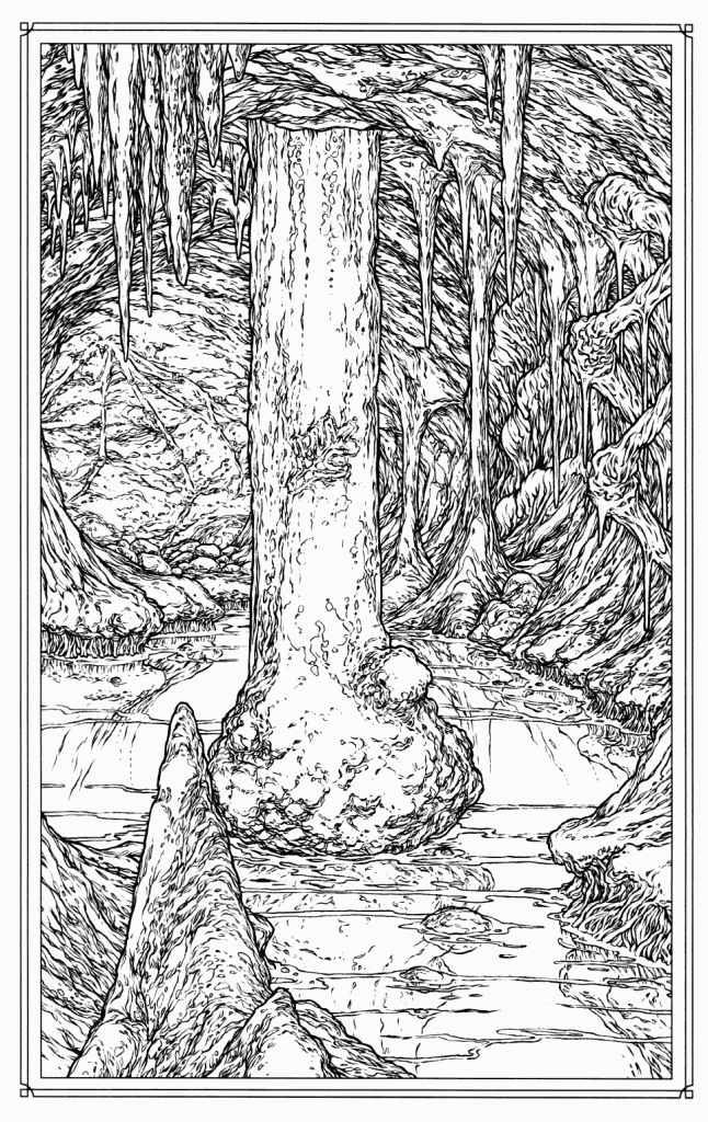
In the same issue Ryp also illustrates Moore’s poem, Zaman’s Hill, with two pieces that are the perfect representation of the underdark, maybe even the platonic ideal of the underdark (of which all other underdarks are shadows). My penchant for hyperbole aside, when I flipped to this page I was immediately struck by the thought, ‘so that’s what the underdark looks like’ (click on the pictures to see for yourself). And that’s a bit odd, since 25 years of D&D illustrations haven’t made me think that. Considering that the underdark plays such a huge role in the imagination of D&D, there are very few visual representations of it (there are many pictures of the creatures that live there though). That’s probably because there just aren’t that many landscapes in D&D illustration in general (even though Larry Elmore was clearly a master of the style). And that makes sense. Monsters are just more interesting (I am obsessed with them) and more immediate then the places which spawn them. But a great picture can transcend that generalization and I think that Ryp’s does.
In the D&D game I currently play in, my character the Jack of Clubs and his companions are working their way through a 4e adaptation of The Night Below boxed set. We’ve fought all manner of subterranean beasts (troglodytes, trolls, grell, and a behir) and I’ve never had trouble playing out those epic struggles in my mind. But when it comes to the underdark itself I feel as though my mind’s eye has formed only a crude backdrop against which our adventures play out. These pictures have changed that. My imagination is already filling those unsettling caverns with chanting Troglodytes, the maddening psionic hum of illithid mind-song, and the glittering trails of abolethic mucous chariots. The next time someone in your game wants to know what the underdark looks like, you have your answer.
But that’s not all. Yuggoth Cultures made me realize that the fungi’s spores are still spreading, sending out shoots and occasionally, twisting back together. Many of Lovecraft’s ideas are so pervasive in popular culture they sometimes come about full circle to meet each other face to face. Way back in Dragon 324 (when you could still hold the magazine in your hands) James Jacobs had a great article on Lovecraft’s influence on D&D where he specifically mentions the Lovecraftian influence on the creation of the underdark… and that’s how a pair of pictures in a comic completely unrelated to D&D come to perfectly represent one of the game’s greatest locales. Two mutant growths, sired from the same rhizome, but cultured in entirely different mediums, turn out to be twins.
The Goblin
February 18, 2011 Goblins are weak pathetic creatures that spend most of their short lives throwing themselves onto adventurers’ swords. It’s hard to argue with that, especially since goblins have always occupied the lowest rung of the monster ladder (just a smidge above kobolds) across all editions of Dungeons and Dragons (and given the influence of D&D, many other rpgs and computer games as well). Take a look at David Trampier’s goblin from the 1e Monster Manual. Don’t get me wrong, I like this picture (especially that clean pen and ink style of his), and the goblin seems a little threatening, but his facial expression almost makes him look worried – and he should be, he’s about to be magic missiled to death. After about third level, goblins become a joke. So much so, it’s even used to comic effect in Neverwinter Nights: Hordes of the Underdark (the joke being that you have to be reminded that to your average zero level schmoe, a goblin is still dangerous).
Trampier’s goblin is good art, but it isn’t great art. For me, great art in an rpg has to either completely inspire you (sometimes suggesting an idea, or a snippet of a narrative that compels you to fill in the blanks), or blow your mind open to a new possibility. Incredibly enough, there is a picture of a goblin that does just that. Back during the 2e days, when my friend and I encountered the picture below (click on it to see it in its full glory!), it totally changed what we thought goblins could be in the game. It wasn’t a picture of a goblin, it quickly became the goblin.
A little history. I first encountered Sam Rakeland’s painting in 2e’s The Complete Book of Humanoids (although it was first used for basic D&D’s module cover, Assault on Raven’s Ruin). I have a lot of love for this book. Back in the day, using its rules, I played a misguided lawful good minotaur, my friend played an alaghi druid, and we even ran an adventure where everyone was a mongrelman living in the sewer. None of us ever played a goblin, but that picture made us fear them again.
All grown up (relatively), there’s a lot I could say about why I like this painting: the use of oils gives it a nice tactile quality, the dynamic pose directly threatens the viewer, the colors suggest the kind of cold, dark, hard bitten cave life I imagine goblins to have… but that’s academic. The savage ferocity of the creature made an immediate and indelible impression on my teenage self. It reminded me that goblins were monsters, not just 1-1 HD things that could inflict 1-6 hit points of damage. I mean look at that thing, I think your name level paladin just cowered behind his shield and crapped in his armor… from a goblin! It made such an impression, that any time we fought goblins afterward; we always wanted to know if we were tackling any old goblin, or the goblin. We never did fight the goblin, but I can’t say my characters really regretted that.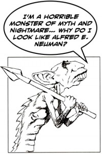
Looking at the digital paintings that grace the electronic pages of Dragon and Dungeon now, I wonder if there’s any room in D&D for this kind of illustration anymore. These days, art directors are very concerned with maintaining a certain look for all the creatures, to help maintain visual cohesiveness and develop D&D as a brand. This approach has some clear advantages to it, the most obvious being that everyone agrees on what a goblin looks like. It educates the audience to D&D’s visual language so that every picture doesn’t have to set out what a goblin looks like. The audience knows and you can just throw goblins into an action scene and the viewer still gets it. I hope that it also ensures we never see another illustration like the one for the salamander in 2e’s Monstrous Compendium (probably my most hated D&D illustration of all time). On the downside, it also leads to illustrations that have a sameness to them (something I’ve talked about before), and flattens out individual style. Maybe it’s because I’m old and jaded, or I’m too high on nostalgia, but flipping through Dragon (I guess ‘key-ing’ is more appropriate, but that’s another rant) I haven’t seen the likes of the goblin in a long time. And that’s too bad, because I think D&D needs great art, not just good, technically adept art that makes you think ‘cool’. It needs art that’s going to blow the minds of teenagers sitting around the kitchen table and leave them remembering the images until they’re old and jaded and complaining about the pictures in the tenth edition of the game.
Then again, maybe I’m getting too worked up about a painting of some 1-1 HD canon-fodder… just try telling that to the goblin.
Notes on the Artist
Far be it for me to wax hyperbolic about the painting without mentioning the artist, who it turns out is something of a mystery (in that he doesn’t really exist).
Sam Rakeland is credited in The Complete Book of Humanoids with the painting (and his signature is pretty clear), and according to the Pen and Paper RPG Database, he also did some other covers and interior pieces for TSR in the nineties, but then his work stops. I was a little disappointed, since I was hoping to see what he had been working on lately. In my quest to find some kind of gallery or homepage, I stumbled across the Internet Speculative Fiction Database, who list Sam Rakeland as a pseudonym of artist Rick Berry. I’m not familiar with Rick Berry but it turns out he’s a prolific cover artist and I’ve seen his work on bookstore shelves for the last twenty years. You can read more about him on his page here.
I can only imagine he used a pseudonym to keep his rpg and book cover work separate… maybe he was a longtime rpg fan and had always wanted to make some material for D&D, who knows? If anyone does know more, I’d love to hear.
Of course my teenage self couldn’t help pointing out to my adult self that he recognized great art, even when it was hidden behind a false name.
Alternate Histories
January 21, 2011Alternate histories and rpgs have a long relationship, one that has moved beyond settings (say, like the alternate weird west of Deadlands), to the games themselves. Let me explain. A popular trend in the internet fuelled ‘old-school renaissance’ of role-playing games is to imagine (and then create) the games that ‘could have been’ but weren’t made. You’ve got the B/X Companion (the imagined continuation of the Moldvay/Cook Basic and Expert D&D rules which were abandoned in favor of the BECMI sets), Adventures Dark and Deep (a hypothetical version of 2E D&D if Gygax had stayed with TSR), Spellcraft and Swordplay (a game that adheres to the original Chainmail combat conventions instead of the ‘alternate’ D20 mechanic presented in OD&D), even Stellar Battles (a ‘what-if’ scenario that has Gygax making an RPG of Star Wars in the early 80s and then losing the license).
Now there’s a lot I like about the old-school (the art for one, most obviously), but there’s a lot I don’t like as well (player vs. DM relationship, highly idiosyncratic systems, rules that rely on arbitrary DM fiat), and since the old-school rules are the thing I have the most problem with I’m not all that interested in these systems (I do admire the passion that goes into these projects though). That said, I really like the idea of taking an already existing idea or product and tweaking some of the facts as a way of re-imagining it and making something new (probably why I was such a huge fan of the What If? series from Marvel). It’s a great source of inspiration for monsters and adventures – another tool in a DM’s kit that’s not to be ignored (and the complete premise of the excellent Star Trek reboot).
The thing that got me thinking about all this alternate history and re-imagining was a post over at the Rue-Morgue website that directed me to artist Sean Hartter’s blog and this old post where he created a series of alternate reality movie posters. Here are a few highlights (click on them for a bigger picture), but I strongly recommend checking out the post and seeing all he has to offer (he’s selling them as full-blown posters as well). 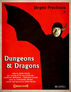
First we’ve got an 80s live action movie of the Dungeons and Dragons cartoon, starring Jurgen Prochnow (the captain from Das Boot, also collectively known, along with Edward James Olmos, and Bryan Adams, as ‘my people’) as Venger. Written by the guy who gave us Dirty Harry and Conan the Barbarian, with trippy, synth (probably too loud) background music by Tangerine Dream. If this movie had been made I can totally see it replacing The Sword and the Sorcerer in my childhood mythology.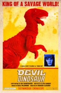
The next poster asks the question: what if Ray Harryhousen’s pet project wasn’t Greek mythology, but Jack Kirby monster comics? The answer, an awesome vehicle for a pre-Michael Jackson Corey Feldman with an epic score by Basil Poledouris (hmm, another Conan connection), is Devil Dinosaur.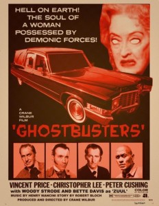
Then comes a much more serious and early version of Ghostbusters, starring the greatest actors of 60s era horror, with a very freaky Bette Davis as Zuul (Bette David eyes indeed). It only makes sense such a pedigree would be rounded out with a writer like Robert Bloch (the man behind Psycho).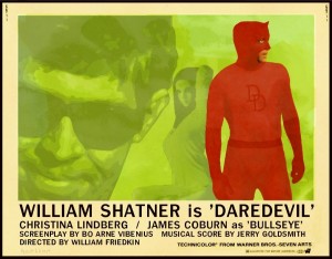
The next poster has nothing to do with monsters, but I had to include it because I’m always bugging my friend about liking Daredevil so much (I shouldn’t make fun, especially since my favorite hero is Dr. Strange, so I’m in no position to be throwing stones, but what are you going to do?). It stars William freakin’ Shatner… need I say more? I will anyway. This movie would have Daredevil bare-knuckling in a 70s hell’s kitchen, and with Friedkin at the helm (who did the Exorcist and Cruising), you know it would be a much grittier New York than we saw Ben Affleck in, filled with violence, vice, and exploitive nudity (a pre-imagining of Marvel Knights maybe?).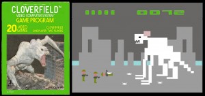
The last entry isn’t really a poster but the package for the Atari 2600 game for Cloverfield, if those two cultural artifacts had come about in the same era. This one cracks me up, because as anyone who’s ever played the E.T. game knows, what you see on that screen shot would have been the whole game (though I don’t think it’s possible for any game to be worse than E.T.).
Like a lot of great art, these pictures do so much with very little (visually, obviously a lot of thought went into the era appropriate style and credits). In my own way, I guess I’m so jazzed up about re-imaginings and alternate histories, because that’s one of the things I’m trying to do here. You could call Monsters of the Hyborian age a ‘what-if’ scenario where the creators of 4e D&D went back to one of the literary inspirations of the game instead of distancing themselves from it.
