Last month marked the 200th issue of Dungeon magazine, which is quite a milestone (even if I do still mourn the loss of the Dungeons and Dragons print magazines), and as far as tabletop gaming magazines go, one that I think has only been achieved by White Dwarf and Dragon.
Just as I did to celebrate Dragon’s 35th anniversary last year, I thought I would go back through the archives and highlight the best examples of cover art Dungeon magazine has to offer (the best Dragon covers are here: 101-200, 201-300, 301-fin). Like my previous retrospective, it was difficult narrowing down favorites (and I have no doubt that others will disagree with my choices) especially since Dungeon covers, by nature of the magazine’s adventure oriented content, tend to favor my favorite subject matter – monsters.
I’ll admit up front that Dungeon has never held the same fascination for me as Dragon. While in print, I never had a subscription to Dungeon, since I wasn’t sure if future adventures would be suitable for my players, or ones I would be interested in running. However, I made a point of checking each instalment out, and bought more than a few. In retrospect, I can see that I used the latest issue of Dungeon as an excuse for a monthly visit to one of my neighborhood hobby stores, and seeing the covers of all these Dungeons now instantly takes me back to the Hobby Shack, Shooting Star Comics and Leisure World (come to think of it, there were a lot more comic and games stores back then). So even though I was never as devoted to Dungeon as I was to Dragon, the cover images are now the wallpaper in the background of many fond memories and gaming ‘firsts’.
Click on the images to view in full size.
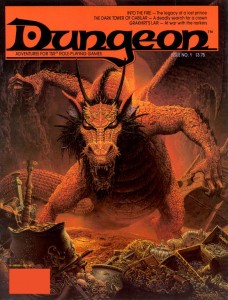
There’s no better place to start than at the beginning, and Dungeon started with a bang. I used to have a poster of this Keith Parkinson painting up on the door to my closet, where it remained until I left home for graduate school. I used to stare at that picture waiting to fall asleep, and it will always be the first image that comes to mind when I think of a dragon’s horde of treasure (I absolutely love the stolen galley in the background – now that is some serious loot!). The focus of the work, the red dragon Flame, would become one of Dungeon’s most iconic villains, appearing in several adventures, including issue 200’s Flame’s Last Flicker. Parkinson’s painting perfectly captures the majesty and menace of its subject, and I think this cover is at least as responsible for Flame’s notoriety as the adventure within (Into the Fire).
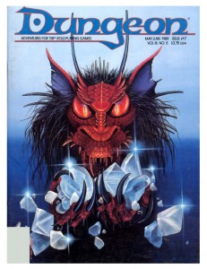
Flame next appeared on Carol Heyer’s cover for Dungeon 17. Heyer uses Parkinson’s cover as a model and zooms in for a focused portrait. I love how her work captures the covetous nature of dragonkind and the accusing stare she gives Flame tells the reader that it would be dangerous to come between the creature and its gems. Lately I’ve found myself missing the ‘tufted’ look of old-school red dragons, and this cover scratches that itch nicely.
This era of Dungeon featured a prolific number of cover paintings from Jennell Jaquays (then known as Paul). All of her work evokes a great sense of adventure, though piece each achieves this through a different emotional palette.
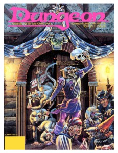
The cover of issue 14 is just so much fun it brings a smile to my face every time I look at it. This is the kind of madcap, funny/deadly encounter scene that memorable adventures are made of. The hamlet-esque wererat with the skull mask is awesome, but my favorite figure is the disgusted partygoer who has just realized the object of his amorous advances is a verminous monster. Its paintings like this that fostered my love of urban adventure in D&D.
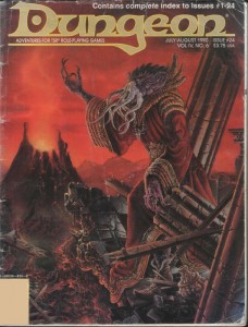
Her painting for Dungeon 24 abandons whimsy for a dark and moody atmosphere. The backdrop, with its crumbling columns and sinister volcano, is almost apocalyptic in tone – a suitable home for one of D&D’s most feared monsters to lord over. I have always liked this visual incarnation of the mind-flayer, with its gnarled, coral-like skin and skeksis style robes. It was a very popular look during the 2e days, but was replaced by 3e’s smooth skinned, cenobite attired version (also cool, but this version is my favorite). Besides having a great cover, this issue is important for another reason. It contains the adventure (which the cover depicts), Thunder Under Needlespire by a very young James Jacobs, a man who would later become Paizo’s editor in chief.
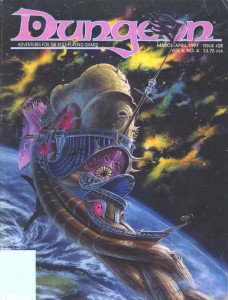
Although Jim Holloway’s art became synonymous with the Spelljammer setting, I don’t think anything he produced can touch Jaquays’ cover for Dungeon 28. The background nebula is not only beautiful it’s also a nice technical achievement and the best representation of the phlogiston that I have seen (if you’re not familiar with Spelljammer, that’s the flammable gas that makes up space in D&D). The crumbling Nautiloid hulk in the foreground drifting towards the planet has a very eerie, Event Horizon vibe to it (even though this issue predates that film by six years). The thing I like most about this painting though is that it sells Spelljammer as a legitimate setting for serious adventures – not just the boxed set with the giant space hamsters.
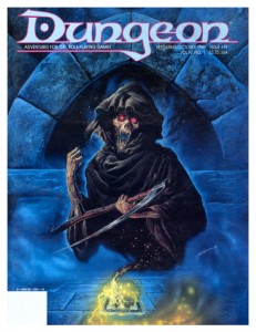
In addition to painting a cover that made the Dragon list, Bob Eggleton also created this piece for Dungeon issue 19. The summoned death is as frightening as it should be and the background done in cool blues gives the picture a mystical ambiance. The combination is perfect in capturing the spirit of one of my favorite magic items in the game, the deck of many things. The icing on the cake is that Eggleton styled the card in the painting after the deck of many things set that came as a bonus in Dragon a few months prior.
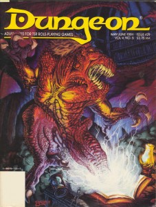
Thomas Baxa, the artist responsible for the cover of Dungeon 29, is something of a lightning rod for criticism of the 2e era’s art. Now, I’m not a fan of his work in general, but I don’t dislike it out of hand, and in spite of the haters, he has created some exceptional works in his career with Dungeons and Dragons (his undead illustrations are delightfully weird and gruesome). This painting, of an abishai being summoned by a cursed book, is his best. Baxa’s rejection of naturalistic colors in favor of bright (almost garish) reds and purples brings the painting into the realm of the surreal, and I can’t help but be reminded of Erol Otus. I’m not sure I would feel the same about his technique with a different subject, but a blighted text ripping open a gateway to the netherworld? This could easily be the cover of a Clark Ashton Smith collection.
The next covers I’ve chosen are linked not just by their nautical theme, but because they are fantastic examples of a painting’s ability to tell a story and engage the viewer to fill in the blanks.
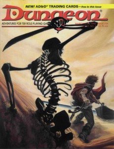
Issue 34 by Peter Clarke uses a reverse angle of the protagonist for a wickedly sinister horror movie composition. It’s not surprising then that the story this painting evokes plays out in my mind like a film: the adventurer tugs his rowboat ashore, unaware of the skeleton rising from the dunes behind him silently. With sand slowly spilling from its empty eye sockets, the undead beast raises its rusted scimitar and…
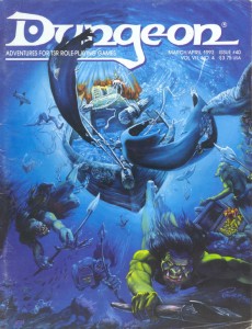
Alan Pollack’s cover for Dungeon 40 is less of a film and more of a perfect snapshot of movement frozen in time. Pollack uses the perspective so well, you can almost feel the pressure of the water around you as the koalinth hang suspended with their pilfered treasure (this is one of the only illustrations of these creatures I have seen). I also like the opportunistic sharks circling in for an easy meal. The need for dynamic composition in fantasy illustration is a point hammered home by art directors over and over – this is how it’s done.
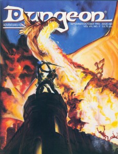
Another cover by Peter Clarke, for issue 43. Backlit by the fiery blast from an impossibly massive dragon, an adventurer and githyanki struggle for a fabled silver sword. Freaking epic. That is all.
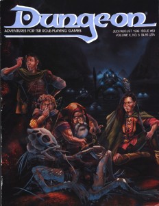
Earlier, it may have sounded like I dissed Jim Holloway, but I really like his work in the right context (his style defined the Paranoia game, those Tales from the Floating Vagabond ads were awesome, and yes he had some great Spelljammer pieces as well). Case in point: this cover for Dungeon 60, overflowing with character. I have a tendency to take myself too seriously, and Holloway is the cure for that, reminding the viewer that the game is supposed to be fun. The best part about the humor in this painting is that it doesn’t descend to the level of a ‘joke’ cover. Instead, what I think Holloway captures here is how the game actually plays out at the table. You’ve got a disparate and loosely organized band of adventurers searching for treasure(and I love the implied relationships there – the swordswoman shooting daggers at the halfling for hamming it up), completely oblivious to the kuo-toa war party sneaking up behind them (who obviously made their Stealth or Surprise checks – depending on which edition of the game you’re playing). The bio-luminescence is a nice touch too. I’m not the only one who thinks this issue is boss – Outsyder Gaming wrote a whole series of articles on it.
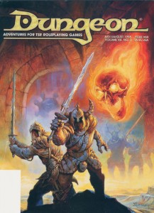
Jeff Easley only ever made a single cover for Dungeon magazine, issue 69, and I had to include it here. I don’t think it’s his greatest work (his dragon covers are much more impressive), but I included it for two reasons. First, it is just so Easley (if I can use that as an adjective). What I mean is it’s so indicative of his trademark style that you can tell it’s an Easley painting from a mile away. The highly sculptural figures, the plush rendering, the earth tones accented with bright colors… you know, so Easley (and let’s face it, an average day for Easley is a great day for anyone else). I also included this painting in the list because it showcases how different an animal a Dungeon cover is to one created for Dragon magazine. Dragon covers might have to portray a vague theme, but generally the artist is free to follow their instincts. Dungeon covers on the other hand are much more structured. Their function is to represent one of the adventures inside in a very literal and concrete way. The cover doesn’t just have to look good, but it also has to inform the viewer about the magazine’s content. Even a big name in the TSR art department can’t phone it in – this cover accurately depicts the Doom Brigade, one of the teams of antagonists from the adventure Sleep of Ages (a group of helmed horrors with two-handed swords and a flameskull in the service of an elder orb beholder).
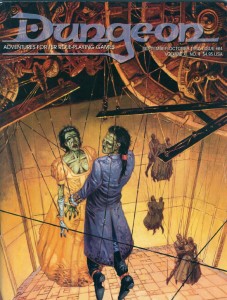
Undead and puppets, two creepy tastes that taste great together. Incredibly, this particular combination has been used for two Dungeon covers. First, on Dungeon 64 by Mark Nelson – who takes full advantage of his experience working on Clive Barker’s Hellraiser comic. It’s really the details in this painting that elevate it from creepy into a work of true horror: the intricate and painstakingly constructed clockwork marionette mechanism hints at the obsession of its creator; the desiccated flesh of the corpses contrasts against the finery of the puppets’ fancy dress; and the awkward way the dance partners are forced to hold one another brings the wrongness of the scene to a fever pitch.
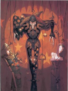
The second such unsettling cover is for issue 75, by Brom. While Brom’s early work for TSR (especially his Dark Sun illustrations) was very much in the vein of Frank Frazetta, this cover represents a shift in his style towards a darker, more gothic look. I love Brom’s work in any mode, but unfortunately I think this shift (combined with his independent success) took him off course from the branding of D&D as heroic fantasy. At the end of the 2e era, Brom’s work was found in fewer and fewer products, completely disappearing from D&D (except for the odd magazine cover) by the time 3e rolled out. There is a lot of talk lately about what the art of the next edition of D&D should include. If it is to be as inspiring as the art of earlier editions, then Wizards of the Coast needs to bring visionaries like Brom, and the other artists I have highlighted here, back into the fold. It’s worth the high price tag.
In the nest installment I’ll look at the latter half of Dungeon’s print run, the 3e era.
Tags: Blather, D&D, Old-School
Pingback: D&D Cover Art: Desert of Desolation (1982 – 1983) | 2 Warps to Neptune