Posts Tagged ‘Old-School’
Classic Monsters: Coffer Corpse
May 25, 2012Note: ‘Classic’ is a pretty subjective term, when I use it here I mean to say: monsters that have survived through the editions of D&D that I think are cool. In this series of articles I look at the development of a classic monster over time and try to add a ‘crunchy’ piece of my own to the creature’s canon.
I’m posting this second  installment of Classic Monsters as part of The Going Last Gaming Podcast’s May of the Dead blog carnival. There has been a shameful shortage of undead on Ménage à Monster, and the blog carnival seemed like the perfect opportunity to rectify that (and a great excuse to write another article in this series – the eye of the deep was getting pretty lonely).
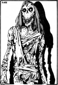
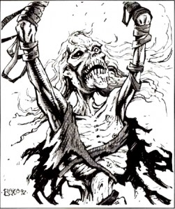
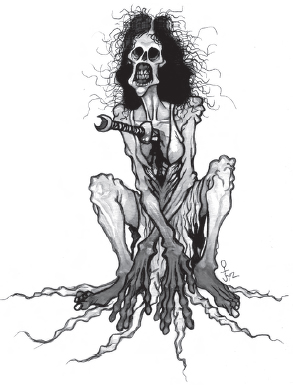
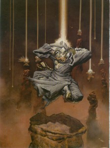
I first encountered the coffer corpse lurking in the pages of the Fiend Folio and was instantly drawn to the fantastic Russ Nicholson illustration (click on the images to view full size). While the coffer corpse doesn’t get the same kind of fan recognition as the death knight (also introduced in Fiend Folio), I’ve always felt its low power level and unique mechanics gave it a certain charm. Like the Monster Manual’s vampire and mummy, the coffer corpse was also one of the few undead creatures in the game whose background jived with the mythology of the restless dead in horror films. While arguably a little obscure, the coffer corpse’s great mechanics, art and story combine to make the monster a classic.
Origins
 Like many of the monsters in the Fiend Folio, the coffer corpse first saw print in the pages of White Dwarf as part of the ongoing Fiend Factory column (issue 8, 1978). In its infancy White Dwarf was a general gaming magazine with a focus on D&D, which makes sense given that Games Workshop (the company that produces the magazine) was at that time the UK distributer of the D&D game. Since the AD&D Monster Manual had only just been published in the UK, the creatures in the Fiend Factory column were created for the OD&D game.
The White Dwarf version of the coffer corpse sets out the parameters for all of the incarnations of the monster to follow. Cursed to undeath by incomplete or botched funeral rites (or as the author puts it, when a corpse fails to return to its ‘maker’), these animate corpses are often found floating on waylaid grave barges. The coffer corpse attacks by choking the life out of its victims, and can only be harmed by magic weapons (which inflict half damage). If the creature is struck with a normal weapon, it falls to the ground, apparently destroyed, only to rise up a round later in a display so horrible NPCs must succeed at a save vs. fear or flee in terror (the editor, Don Turnbull, notes at the end of the entry that this is probably an error and that PCs should also have to save vs. fear as well).
The coffer corpse was created by Simon Eaton, a name I’m not familiar with, as the only other credit I can find attributed to him is the witherweed (also featured in the Fiend Folio).
1st Edition
The coffer corpse was given an AD&D makeover for its inclusion in the Fiend Folio (and D&D canon). Its origins remained unchanged but a few of the monsters abilities were tweaked. Magic weapons do full damage to this version of the coffer corpse, and it falls to the ground if it is hit for 6 or more points of mundane weapon damage (instead of the ambiguous “if struck on the head” of the previous version). When the coffer corpse reanimates, all who are in melee must save vs. fear, not just NPCs. Additionally, the strangulation attack of the coffer corpse is upgraded from a simple 1d6 attack to one that inflicts automatic constriction damage each round, which is especially deadly since “nothing will release the grasp of the coffer corpse once it has locked its hands in place.”
2nd Edition
The coffer corpse next appears in 2e’s Fiend Folio Appendix for the Monstrous Compendium. While generally identical to its 1e incarnation, most of its abilities are expanded and explored in greater detail: this coffer corpse has resistance to some weapon types (magic slashing weapons inflict normal damage with no bonus, blunt weapons inflict full damage and piercing weapons inflict half damage), and it is possible to break free of its strangling grip (but with a strength of 20 it’s still very difficult).
The most important addition to the coffer corpse in 2e is an attempt to utilize the creature’s origins as a way for clever players to defeat it: “If the unfinished death ritual which binds the coffer corpse to undeath can be completed, the creature will be released and effectively destroyed.” The mechanics of how players might go about discovering and acting on this information is left to the DM’s discretion (and this bit is buried in the habitat/society section of the write-up), which is too bad since I think this is where the coffer corpse’s true potential as a classic monster lies.
3rd Edition
The coffer corpse never saw an official release for 3e. The Fiend Folio is generally regarded as a mixed bag and, in an effort to excise some of D&D’s sillier monsters from the game (the flumph is almost a clichéd example), many great monsters from this book, including the coffer corpse, were not updated for this edition of the game. However, Necromancer Games included the coffer corpse in their Tome of Horrors book, which updated just about every monster from 1e that WOTC had left behind (an admirable effort – though I think the carbuncle should have been abandoned to the dustbin of history). This version is more or less a direct translation of the coffer corpse from the Fiend Folio for 3e rules (damage reduction instead of immunity to normal weapons, and standard grab and constrict rules for the coffer corpse’s strangulation). It is a solid adaptation but, by sticking so closely to its 1e incarnation, I think it was a missed opportunity to expand and clarify the ‘unfinished funeral rite’ that the 2e version touched on (also, why they maintained the 25% chance for the coffer corpse to wield a weapon from previous editions is a mystery to me – the fact that the monster strangles people to death is what makes it interesting).
4th Edition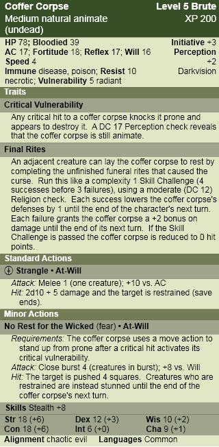
Not having a memorable appearance in 3e, and with 4e’s proliferation of low level skeleton and zombie breeds, it is hardly surprising the coffer corpse is absent from this edition. I do think that 4e’s skill challenge mechanic is particularly well suited to simulate the pitched struggle of a Cleric trying to complete funeral rites while the undead monster strangles her companion, which makes the coffer corpse the perfect candidate for entry into 4e’s canon.
Coffer Corpse
Barred entry into the afterlife by incomplete funeral rites, the coffer corpse is cursed to a restless eternity, its only desire to squeeze the hated spark of life from anything that crosses its path.
Lore
Religion DC 15: Although they superficially resemble zombies, coffer corpses aren’t animated through necromantic rituals, but are created as a result of a divine curse. Their deathlike grip is exceptionally strong, making escape all but impossible once the coffer corpse has wrapped its bony fingers around your throat.
Religion DC 20: Cursed by an incomplete funeral ritual, a coffer corpse is difficult to destroy, often springing back to life only moments after being felled. Only by completing the creature’s burial rites can the curse be lifted and the tortured soul granted peace.
Encounters
Coffer corpses can be encountered floating aimlessly in a waylaid funeral barge, slumped over a half dug grave, or lying in a coffin awaiting the completion of an interment ritual that never comes to pass. They are often part of a group of undead, created as part of the larger tragedy that interrupted the creature’s funeral.
Coffer Corpses in Combat
Every moment of existence is torture for a coffer corpse, so these undead monsters fight without regard for their own well-being. Even as they strangle and destroy they often liplessly whisper for release in their victim’s ear.
Pathfinder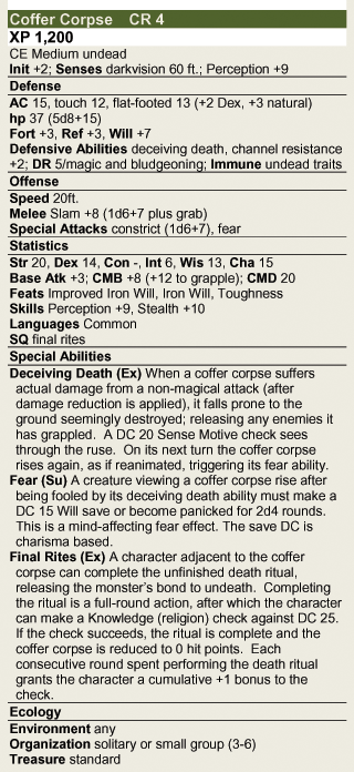
For those looking for a classic interpretation of the coffer corpse, Necromancer Games has updated their 3e book Tome of Horrors Complete, and the coffer corpse, for the Pathfinder game (and since its part of the OGL you can get this version at the Pathfinder System Resource Document). If you like the ideas in my 4e version of the monster though, I have used it as the blueprint for this Pathfinder translation of the coffer corpse that builds on the creature’s 2e presentation. The flavour text and lore from the 4e monster are system neutral enough to be used as is.
The Best Dungeon Covers: 1-75
April 23, 2012Last month marked the 200th issue of Dungeon magazine, which is quite a milestone (even if I do still mourn the loss of the Dungeons and Dragons print magazines), and as far as tabletop gaming magazines go, one that I think has only been achieved by White Dwarf and Dragon.
Just as I did to celebrate Dragon’s 35th anniversary last year, I thought I would go back through the archives and highlight the best examples of cover art Dungeon magazine has to offer (the best Dragon covers are here: 101-200, 201-300, 301-fin). Like my previous retrospective, it was difficult narrowing down favorites (and I have no doubt that others will disagree with my choices) especially since Dungeon covers, by nature of the magazine’s adventure oriented content, tend to favor my favorite subject matter – monsters.
I’ll admit up front that Dungeon has never held the same fascination for me as Dragon. While in print, I never had a subscription to Dungeon, since I wasn’t sure if future adventures would be suitable for my players, or ones I would be interested in running. However, I made a point of checking each instalment out, and bought more than a few. In retrospect, I can see that I used the latest issue of Dungeon as an excuse for a monthly visit to one of my neighborhood hobby stores, and seeing the covers of all these Dungeons now instantly takes me back to the Hobby Shack, Shooting Star Comics and Leisure World (come to think of it, there were a lot more comic and games stores back then). So even though I was never as devoted to Dungeon as I was to Dragon, the cover images are now the wallpaper in the background of many fond memories and gaming ‘firsts’.
Click on the images to view in full size.
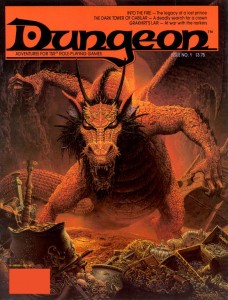
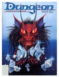
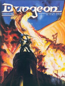
There’s no better place to start than at the beginning, and Dungeon started with a bang. I used to have a poster of this Keith Parkinson painting up on the door to my closet, where it remained until I left home for graduate school. I used to stare at that picture waiting to fall asleep, and it will always be the first image that comes to mind when I think of a dragon’s horde of treasure (I absolutely love the stolen galley in the background – now that is some serious loot!). The focus of the work, the red dragon Flame, would become one of Dungeon’s most iconic villains, appearing in several adventures, including issue 200’s Flame’s Last Flicker. Parkinson’s painting perfectly captures the majesty and menace of its subject, and I think this cover is at least as responsible for Flame’s notoriety as the adventure within (Into the Fire).
Flame next appeared on Carol Heyer’s cover for Dungeon 17. Heyer uses Parkinson’s cover as a model and zooms in for a focused portrait. I love how her work captures the covetous nature of dragonkind and the accusing stare she gives Flame tells the reader that it would be dangerous to come between the creature and its gems. Lately I’ve found myself missing the ‘tufted’ look of old-school red dragons, and this cover scratches that itch nicely.
This era of Dungeon featured a prolific number of cover paintings from Jennell Jaquays (then known as Paul). All of her work evokes a great sense of adventure, though piece each achieves this through a different emotional palette.
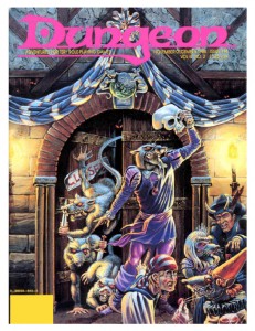
The cover of issue 14 is just so much fun it brings a smile to my face every time I look at it. This is the kind of madcap, funny/deadly encounter scene that memorable adventures are made of. The hamlet-esque wererat with the skull mask is awesome, but my favorite figure is the disgusted partygoer who has just realized the object of his amorous advances is a verminous monster. Its paintings like this that fostered my love of urban adventure in D&D.
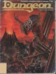
Her painting for Dungeon 24 abandons whimsy for a dark and moody atmosphere. The backdrop, with its crumbling columns and sinister volcano, is almost apocalyptic in tone – a suitable home for one of D&D’s most feared monsters to lord over. I have always liked this visual incarnation of the mind-flayer, with its gnarled, coral-like skin and skeksis style robes. It was a very popular look during the 2e days, but was replaced by 3e’s smooth skinned, cenobite attired version (also cool, but this version is my favorite). Besides having a great cover, this issue is important for another reason. It contains the adventure (which the cover depicts), Thunder Under Needlespire by a very young James Jacobs, a man who would later become Paizo’s editor in chief.
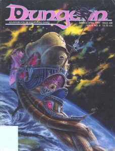
Although Jim Holloway’s art became synonymous with the Spelljammer setting, I don’t think anything he produced can touch Jaquays’ cover for Dungeon 28. The background nebula is not only beautiful it’s also a nice technical achievement and the best representation of the phlogiston that I have seen (if you’re not familiar with Spelljammer, that’s the flammable gas that makes up space in D&D). The crumbling Nautiloid hulk in the foreground drifting towards the planet has a very eerie, Event Horizon vibe to it (even though this issue predates that film by six years). The thing I like most about this painting though is that it sells Spelljammer as a legitimate setting for serious adventures – not just the boxed set with the giant space hamsters.
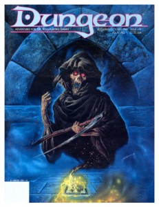
In addition to painting a cover that made the Dragon list, Bob Eggleton also created this piece for Dungeon issue 19. The summoned death is as frightening as it should be and the background done in cool blues gives the picture a mystical ambiance. The combination is perfect in capturing the spirit of one of my favorite magic items in the game, the deck of many things. The icing on the cake is that Eggleton styled the card in the painting after the deck of many things set that came as a bonus in Dragon a few months prior.
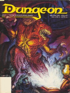
Thomas Baxa, the artist responsible for the cover of Dungeon 29, is something of a lightning rod for criticism of the 2e era’s art. Now, I’m not a fan of his work in general, but I don’t dislike it out of hand, and in spite of the haters, he has created some exceptional works in his career with Dungeons and Dragons (his undead illustrations are delightfully weird and gruesome). This painting, of an abishai being summoned by a cursed book, is his best. Baxa’s rejection of naturalistic colors in favor of bright (almost garish) reds and purples brings the painting into the realm of the surreal, and I can’t help but be reminded of Erol Otus. I’m not sure I would feel the same about his technique with a different subject, but a blighted text ripping open a gateway to the netherworld? This could easily be the cover of a Clark Ashton Smith collection.
The next covers I’ve chosen are linked not just by their nautical theme, but because they are fantastic examples of a painting’s ability to tell a story and engage the viewer to fill in the blanks.
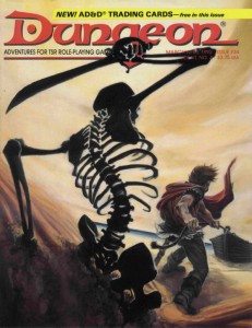
Issue 34 by Peter Clarke uses a reverse angle of the protagonist for a wickedly sinister horror movie composition. It’s not surprising then that the story this painting evokes plays out in my mind like a film: the adventurer tugs his rowboat ashore, unaware of the skeleton rising from the dunes behind him silently. With sand slowly spilling from its empty eye sockets, the undead beast raises its rusted scimitar and…
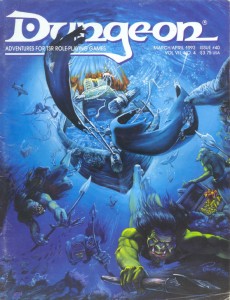
Alan Pollack’s cover for Dungeon 40 is less of a film and more of a perfect snapshot of movement frozen in time. Pollack uses the perspective so well, you can almost feel the pressure of the water around you as the koalinth hang suspended with their pilfered treasure (this is one of the only illustrations of these creatures I have seen). I also like the opportunistic sharks circling in for an easy meal. The need for dynamic composition in fantasy illustration is a point hammered home by art directors over and over – this is how it’s done.
Another cover by Peter Clarke, for issue 43. Backlit by the fiery blast from an impossibly massive dragon, an adventurer and githyanki struggle for a fabled silver sword. Freaking epic. That is all.
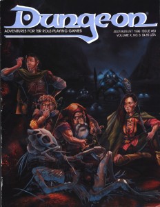
Earlier, it may have sounded like I dissed Jim Holloway, but I really like his work in the right context (his style defined the Paranoia game, those Tales from the Floating Vagabond ads were awesome, and yes he had some great Spelljammer pieces as well). Case in point: this cover for Dungeon 60, overflowing with character. I have a tendency to take myself too seriously, and Holloway is the cure for that, reminding the viewer that the game is supposed to be fun. The best part about the humor in this painting is that it doesn’t descend to the level of a ‘joke’ cover. Instead, what I think Holloway captures here is how the game actually plays out at the table. You’ve got a disparate and loosely organized band of adventurers searching for treasure(and I love the implied relationships there – the swordswoman shooting daggers at the halfling for hamming it up), completely oblivious to the kuo-toa war party sneaking up behind them (who obviously made their Stealth or Surprise checks – depending on which edition of the game you’re playing). The bio-luminescence is a nice touch too. I’m not the only one who thinks this issue is boss – Outsyder Gaming wrote a whole series of articles on it.
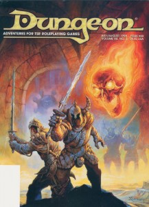
Jeff Easley only ever made a single cover for Dungeon magazine, issue 69, and I had to include it here. I don’t think it’s his greatest work (his dragon covers are much more impressive), but I included it for two reasons. First, it is just so Easley (if I can use that as an adjective). What I mean is it’s so indicative of his trademark style that you can tell it’s an Easley painting from a mile away. The highly sculptural figures, the plush rendering, the earth tones accented with bright colors… you know, so Easley (and let’s face it, an average day for Easley is a great day for anyone else). I also included this painting in the list because it showcases how different an animal a Dungeon cover is to one created for Dragon magazine. Dragon covers might have to portray a vague theme, but generally the artist is free to follow their instincts. Dungeon covers on the other hand are much more structured. Their function is to represent one of the adventures inside in a very literal and concrete way. The cover doesn’t just have to look good, but it also has to inform the viewer about the magazine’s content. Even a big name in the TSR art department can’t phone it in – this cover accurately depicts the Doom Brigade, one of the teams of antagonists from the adventure Sleep of Ages (a group of helmed horrors with two-handed swords and a flameskull in the service of an elder orb beholder).
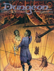
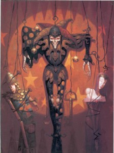
Undead and puppets, two creepy tastes that taste great together. Incredibly, this particular combination has been used for two Dungeon covers. First, on Dungeon 64 by Mark Nelson – who takes full advantage of his experience working on Clive Barker’s Hellraiser comic. It’s really the details in this painting that elevate it from creepy into a work of true horror: the intricate and painstakingly constructed clockwork marionette mechanism hints at the obsession of its creator; the desiccated flesh of the corpses contrasts against the finery of the puppets’ fancy dress; and the awkward way the dance partners are forced to hold one another brings the wrongness of the scene to a fever pitch.
The second such unsettling cover is for issue 75, by Brom. While Brom’s early work for TSR (especially his Dark Sun illustrations) was very much in the vein of Frank Frazetta, this cover represents a shift in his style towards a darker, more gothic look. I love Brom’s work in any mode, but unfortunately I think this shift (combined with his independent success) took him off course from the branding of D&D as heroic fantasy. At the end of the 2e era, Brom’s work was found in fewer and fewer products, completely disappearing from D&D (except for the odd magazine cover) by the time 3e rolled out. There is a lot of talk lately about what the art of the next edition of D&D should include. If it is to be as inspiring as the art of earlier editions, then Wizards of the Coast needs to bring visionaries like Brom, and the other artists I have highlighted here, back into the fold. It’s worth the high price tag.
In the nest installment I’ll look at the latter half of Dungeon’s print run, the 3e era.
It Came from Toronto After Dark: The Woman
February 11, 2012These It Came from the DVR articles are going to be a little bit different. As an early Christmas present to myself, I picked up a festival pass to the Toronto After Dark film festival. So the first difference is that these are new movies, on the big screen, instead of old ones and niche programming on the small screen. The second difference is that these are going to be short. I’ve got eighteen films to see in seven days (as well as dressing up for the annual zombie walk), so I’m not going to have a whole lot of time to write, and I want post these while the blood is still fresh.
Toronto After Dark is a horror and genre film festival oozing with gobs of monster and rpg inspiration, but most of the films it showcases won’t see wide release – so in addition to extracting some rpg goodness from each movie, I’ll also give them a bit of a critique, so fellow gamers can know what they need to track down and what to avoid. I’ll try and keep spoilers to an absolute minimum.
The Woman
This is a disturbing film with a bizarre premise. When a conservative, small-town family man encounters a cannibalistic feral woman in the woods, he decides to capture her and bring her home to his wife and three children so they can civilize her as a ‘family project’. Chained up in the barn, the presence of the dangerous feral woman exposes a darkness in the family that quickly erodes its whitewashed, seemingly ‘normal’, façade.
Dark Social Commentary
I should preface this review – I’ve never seen the film that precedes this one, The Offspring, but the two films are only loosely connected. The Offspring doesn’t contain any plot information critical to this film, and while the movies can be viewed as a series, The Woman also stands on its own.
The Woman cannot be easily classified. I wouldn’t call it a horror film, though there are moments when it is truly horrifying. There is humor in The Woman, but I’d hardly call it a comedy (even a black comedy). I can’t say that I enjoyed watching the film, but I also think it is a movie that is worth watching. Director Lucky McGee keeps the audience on their toes, playing with our expectations and throwing the audience a curve ball whenever you think you’ve got this strange tale sorted out.
Sean Bridgers’ portrayal of family patriarch Chris Cleek, as a sort of diabolical Ned Flanders who begins to lose control as his monolithic authority cracks, is so perfect for the film it was almost uncomfortable seeing him speak after the screening. In the Q&A, Bridgers had a very interesting view of his character when asked about the role. He said that although he was nothing like Chris Cleek, he was still able to draw on some dark, buried part of himself to fuel the role. It’s the kind of observation that I think applies to the whole film and its relationship with the audience. There is some pretty heavy violence in The Woman, including a few very uncomfortable scenes of domestic abuse and rape. Given the way that the ‘torture porn’ trend changed the landscape of horror films a decade ago, I think that McGee is confronting the audience with the ugliness of our dark psychological bits, rather than titillating them the way other horror traditions do. It’s a fine line between glorification and commentary, and everyone has a different sense of that boundary, but to me Lucky Mcgee accomplished his goals without crossing that line.
Even though her character has no real dialogue in the film, Pollyanna McIntosh gives an equally gripping performance as the titular feral woman. I was impressed with her ability to occupy the physicality of the role, and her glazed, sullen stare into the camera infuses the character with the aura of a caged animal. If Chris Cleek stands in for the controlled, oppressive violence that underlies modern society, then the feral woman reminds us of the uncontrolled brutality of the natural world. Even if the audience is cheering for the woman by the film’s climax, I’m not sure that McGee is presenting her as a viable alternative to the Chris Cleeks of the world. It’s a grim portrait of humanity that places us in a tug of war between these two poles, as savage hunters who have the choice of preying on our family units or of preying on everything not joined to us by family.
There was some controversy that came out of the Sundance festival regarding The Woman, including people walking out of screenings, which is understandable if the audience isn’t prepared for the content, but I think this has more to do with the context of Sundance than the film being too appalling to sit through. After a week of seeing decapitations, blood, and zombie cannibalism, the shock of The Woman was blunted, even if I was probably just as disturbed by it as the Sundance crowd (as far as I could tell, no one walked out of the screening at Toronto After Dark).
The Woman is recommended, but only if you’re prepared to be confronted by some alarming scenes. I can’t say that you’ll have fun watching it (and it’s about as far from being a date movie as you can possibly get), but The Woman is anything but boring and is sure to provoke a reaction.
RPG Goodness
Much like Father’s Day, the subject matter of The Woman makes incorporating material from it in an rpg difficult (unless you’re making use of a disconcerting amount of the ideas in The Book of Vile Darkness). Once its more controversial elements are removed though, I think the conflict in The Woman can be viewed in D&D terms that highlight the game’s alignment system (I’ll be using the nine-pointed alignment system, since that’s my favorite, not the three alignments of BX or the five alignments of 4e).
I think that the struggle between Chris Cleek and the feral woman is a great example of how the Lawful Evil and Chaotic Evil alignments interact with one another in D&D. It would be hard to argue one of the characters was more or less evil than the other, but it’s clear that each represents a very different kind of evil, as diametrically opposed to the other as good is to evil. For me, this is why the nine-pointed alignment system (that is, an alignment in two parts – the good vs. evil axis and the law vs. chaos axis) works so well – it handles the evil against evil conflict in a way that makes sense and provides clear motivations for NPCs (which makes it useful, the litmus test for any game mechanic). It also provides clear reasons why two good aligned characters might find themselves at odds with one another or why a good aligned party might make a temporary alliance with an evil creature against a common enemy.
Although many may disagree, I’ve never found the nine-pointed alignment system restrictive. Instead, I find its two-axis approach a simple and elegant tool to encourage roleplaying by providing clear motivations for the thinking creatures of the game world. Sure it isn’t foolproof and doesn’t cover every moral quandary a PC might find herself in, but working out the finer points of ambiguous situations is one of the exciting parts of a roleplaying game.
Taking inspiration from the film, here is a sample of practical alignment complications that can be inserted into any version of D&D:
The Enemy of my Enemy is my Friend… For Now
Both Vault of the Drow and the Temple of Elemental Evil (two of my favorite classic adventures) make extensive use of this complication. Warring factions of evil creatures will use any means they have at their disposal to eliminate one another, including a temporary alliance with good aligned adventurers. As distasteful as it is, it might be in the PCs best interest. The common enemy (the most powerful house of the drow, or an evil tyrant, secure in an impregnable fortress, for example) might be too tough for the PCs to tackle on their own, or the evil creatures might possess needed intelligence in order to proceed.
Chaotic Evil creatures will promise anything to obtain the cooperation of the PCs, and if they feel they can gain from it, will attack them as soon as the job is finished. Lawful Evil creatures can be trusted to keep a bargain, but will only agree to terms that benefit them, and will constantly try to subjugate the PCs to their will.
Thanks for the Rescue, Sucker!
Just because an NPC has been imprisoned by the ‘bad guys’ doesn’t make them a ‘good guy’. Obmi, the evil dwarf from the adventure Hall of the Fire Giant King (and reappearing throughout D&D’s history) is the quintessential example of this complication. Sometimes, creatures are imprisoned by evil societies because they are so deviant or destructive that even the morally corrupt can’t stomach them.
The temptation in this scenario is to have the prisoner rampage as soon as it is freed (which is entirely appropriate in certain circumstances), but the complication works much better when the evil NPC cooperates with the PCs against his captors. Later in the campaign, let the PCs discover the horrendous crimes the freed prisoner has committed – a great adventure hook since most players will feel at least a little responsible and will be driven to stop the former prisoner.
Try not to use this complication too often or the PCs will never want to free any captives again.
What We Have Here is a Failure to Communicate
Sometimes different good aligned groups just don’t get along. The different worlds of D&D are filled with good aligned churches that are generally tolerant of one another, but still clash over major philosophical differences (which is fairly optimistic considering how well the sects of Christianity or Islam have gotten along together on Earth). If there is an established church or state religion in the area the PCs are adventuring in, they won’t appreciate the party’s cleric waltzing into their territory and performing miracles for a rival deity (or worse, actively trying to proselytize). While good aligned organizations don’t immediately resort to violence, they will definitely make things as uncomfortable as possible while they are in town. I used the church of St. Cuthbert in this manner in both the Temple of Elemental Evil adventure and its sequel. In both cases the party contained no representatives from the church and was filled with non-lawful types. Even though they wanted the same outcome (the destruction of an evil cult), the Cuthbertines viewed the adventurers as a bunch of rowdy troublemakers while the party viewed the church as a bunch of out of touch windbags trying to tell them what to do.
Rival Schools
Old-school D&D often included groups of adventurers in the wandering monster tables – a concept that Ed Greenwood greatly expanded upon in his Forgotten Realms setting (especially during the 2e era) with its predilection for rival adventuring companies. This concept hasn’t been used all that much in modern D&D (with the exception of the excellent Shackled City adventure path by Paizo), but is a complication worth revisiting. A rival adventuring company need not be evil to oppose the PCs – good aligned NPCs might pursue the same goals as the PCs (stopping an encroaching hobgoblin army, overthrowing an evil cult, or slaying a terrible dragon for example). Rather than brining the two groups together, these similarities cause tension. The rival adventuring company wants what the PCs’ want, only they want to do it first and they have no intention of sharing the spotlight (or the glory and treasure).
Good aligned rivals won’t necessarily attack the PCs, but they aren’t above sabotaging their efforts. In fact, if they are less capable, their bumbling might make things much harder for the PCs (like a failed incursion into a dragon’s lair that makes the creature extra careful and paranoid).
The Long Arm of Justice
Adventuring often means transgressing laws and taboos (like breaking and entering, tomb-robbing, and murder). That means that at some point in a campaign a group of good aligned NPCs is going to want to redress one of these transgressions. There are many remedies these groups seek, but this complication works best if the NPCs aren’t immediately violent or threaten the PCs with imprisonment (they may seek compensation, ask for a favor, or challenge the PCs to complete a gruelling ritual of atonement).
If the PCs are strongly lawful aligned, then the reverse can happen. A group of xaositects, followers of Olidammara, or tricky fey target the PCs to discredit them and take them down a notch. They use pranks, rumours, and theft to spread chaos and vex the PCs.
I Levelled Up!
July 5, 2011There are certain recognized milestones for a D&D character’s development – a wizard learns fireball, a fighter gets a second attack, a rogue trains a skill up to +20… when it comes to personal, real life development, the milestones come with less frequency and are certainly less impressive.
But I’m proud of myself anyway. My milestone? I created my first cover. Here’s the backstory. I’ve been posting my favourite Dragon magazine covers from different eras, saturating my brain with great art. One of the reasons I create my own pictures for the monsters I produce on this website is so that I can get back in the swing of drawing regularly again (an activity that I’ve associated with RPGs since I was a kid, but exercise less and less as I get older). It’s great practice that comes with its own built-in impetus (for a guy like me, that’s the best kind of impetus); I hate monster stat-blocks without an illustration. Reminiscing over those back issues of Dragon inspired me to begin experimenting with color in my pictures.
Meanwhile, while perusing the RPG Blog alliance, I noticed that Mark at Mithril and Mages was holding a contest to design a cover for his application, Treasure Book on Demand (a very cool program that randomly generates a whole book in pdf form, with treasures for every ‘hoard class’ in the Labyrinth Lord game – that’s the same as ‘treasure type’ in 1e D&D). He was looking for an A4 sized illustration in colour – just the thing I’d been experimenting with. I thought to myself, I could do that (in a fit of un-me-ness). And I did. Here’s what I made. And it won!
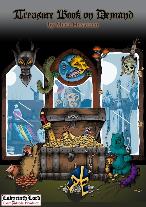
OK, there were only two people who entered, but Mark was classy enough to give us both first prize. That was awesome (and greatly appreciated), but the real milestone is that I was able to fill up that page with something, and even though I can already see a lot of things that I would like to change (I admit that time constraints made me rush the images that appear in the mirrors – and it shows), I’m very proud of the finished product. It was a lot of work, but like any adventurer who manages to make it out of the dungeon bruised, bleeding, but alive; I think I’ve learned a few tricks and expanded my skill-set.
For the basic design of the piece, I wanted a chest full of riches, with a set of mirrors reflecting different sorts of treasures (as a way to show how the Treasure Book can generate infinite combinations). Then I tried to jam in as much detail as possible, because in any haul, it’s the little things that are always the most exciting.
Seeing as Labyrinth Lord is a retro-clone, I went back to the old school masters for inspiration when gathering reference material (like I needed an excuse). Some of the tributes are obvious, others a little more obscure (especially the not-exactly D&D ones). For those who don’t like spoilers, I’m putting the sources of all the picture’s ‘Easter eggs’ in the comment section.
It might not be Dragon material, but it’s my fireball (or at least Melph’s minute meteors).
The Best Dragon Covers: 201-300
June 28, 2011As part of my ongoing celebration of Dragon Magazine’s 35th anniversary, I present the next instalment of covers, from issue 201 to 300.
These images represent quite a roller coaster ride through the ups and downs of Dungeons and Dragons. They bear witness to the development of the greatest settings the game has ever seen, the excesses and eventual decline of 2e, the demise of TSR, and the rebirth of the game in 3e under the ownership of Wizards of the Coast. Even though I had shifted to other games (namely Rifts) in the later days of 2e, I never strayed from Dragon (and even if I wasn’t in a campaign I always thought of D&D as my game). The writing, the ideas, and especially the art were always a great source of inspiration and entertainment.
I also liked the feeling of belonging to a community of gamers that came with the subscription. Yes that need has been fulfilled by the large (and vocal) gamer presence on the internet, but I don’t think anything will replace the visceral presence of a stack of physical artefacts (he says without irony while typing away on his blog – seriously, I can love my blog and the immediate and widespread distribution it has while still mythologizing the printed word, can’t I?).
One of the less positive aesthetic developments during this era was the inclusion of more text on the covers, obscuring the art. Fortunately, Dragon editors helped to mitigate this by publishing the cover art as a full page spread within the magazine. Since I’m focusing on the art of the magazine, I’ve chosen to reproduce those images and not the actual covers, even if it looks a bit strange not to see the familiar Dragon logo (as usual, click on the image for full size).
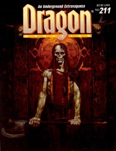
In the last article, I mentioned two of Brom’s fantastic Dark Sun images. He also painted a pair of covers for this run; two striking images of the undead. I always felt the first cover, for Dragon 211, was the perfect representation of a ju-ju zombie – an abomination created through life draining necromancy that retained some of its intelligence, could use weapons and had hard, leathery grey skin (and sadly hasn’t appeared in D&D since 2e). The halberd the creature wields also reminds me of old-school Citadel zombies (the ones armed with a cleaver-on-a-stick), which is a very good thing.
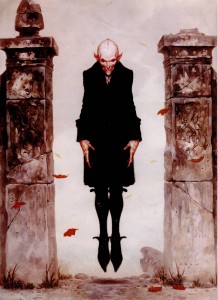
Brom’s second cover swings to the other side of the undead spectrum for Dragon 264, with a seriously creepy Nosferatu inspired vampire. Looking at the cover today, I continue to find Brom’s choice of vampire refreshing (in 1999 when this issue was published I was sick of Anne Rice copycats, today it’s the unmentionable ‘sparkly’ vampires of teen land). There is absolutely no question that Brom’s creation is a monster. With its rat-like teeth, beady eyes, and blotchy pinkish skin, the vampire is once again a living metaphor for the horrors of disease and the predatory nature of the aristocracy… not something to moon over and identify with.
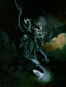
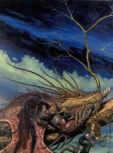
Another artist whose name should be familiar from the last article is Jeff Easley. Like the previous run, Easley was incredibly prolific in producing Dragon covers from 200-300, but these two are my favourite. Easley has painted a lot of dragons (I would say he is a master of the subject), but I think the cover to issue 225 stands out. Maybe it’s because I’ve got Caravaggio on the brain, but I love the dramatic impact of the dark, almost black tone. It really sucks you into the picture. Plus, I always appreciate it when an artist chooses to paint a dragon that doesn’t breathe fire. It’s a lot harder to visualize lightning breath, and as cool as King Ghidorah is, I’d rather have this as the go-to mental image whenever I think of blue dragons. Also, I’m not sure why undead and dragons go together, but apparently they do… and its unadulterated badassness.
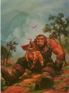
In tone, Easley’s cover for Dragon 254 is the polar opposite, and its naturalistic palette makes it seem almost like a landscape – which helps to suspend disbelief when you realize just how enormous that giant is. This cover echoes traditional fantasy renderings of giants which put into perspective just how small D&D giants are. I’ve never used a gargantua, or goriostro or similar sized monster in D&D, but I’ve always wanted to, and every time I look at this painting I feel like smacking myself for not designing that adventure yet.
There was a stretch during the middle of this run when every cover featured the magazine’s namesake. Now dragons are very cool (half of my favourite covers have them), but after a while it starts to get predictable (and if I recall, the letters column had some complaints about it). Fortunately, there are artists who can take any cliché and breathe new life into it. These covers still have the power to make me look at dragons in a different way.
R.K. Post is most well-known for his work setting the visual style for the Alternity game, but he also made several Dragon covers. The thing I love about his painting for issue 241 is how Post takes a well-travelled narrative (sneaking up on a sleeping dragon) and makes it as dark and full of twisted lines as his art. In this cover you cannot be sure of anything. The fighter in the foreground is cloaked in shadow, drawing a cruel looking blade. Is he the hero of this tale, or the villain? Instead of reclining on a bed of stolen riches, this dragon lays on a mighty tree, with which it blends seamlessly, like a creature of nature. It’s also nice to see a bard as part of the action, something you don’t often witness in D&D illustration.
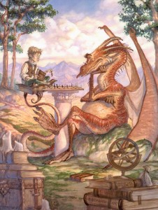
If I could use a single word to describe Tony DiTerlizzi’s cover for Dragon 242 it would be ‘charming’. DiTerlizzi helped bring the Planescape setting to life with his incredible ink and watercolour pictures. Most of those were dark and sketchy, as suited the down and dirty flavour of Sigil, but here DiTerlizzi shows us he can also work with a lighter palette and more refined lines. It’s also full of whimsical little details that ensure I’ll never get bored of looking at it – the dice on top of the D&D books, the strange orrery, and especially the dragon’s tiny spectacles. This painting helps to remind me that dragons aren’t just dumb brutes there to blindly rip apart adventurers. They are some of the most intelligent creatures in the game, have their own goals, and just maybe, indulge in the occasional game of chess.
The next pair of covers each feature paintings with interesting mounts and riders. I’ve never had the chance to play a character with a special mount (I’m usually the DM for our gaming group), but these pictures hold enough inspiration that I feel left out.
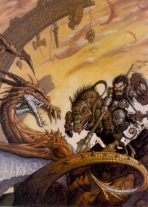
Matt Wilson is now the co-owner of Privateer Press, but in the nineties he did a bit of work for TSR, including this cover for Dragon 245. Dwarves aren’t one of those fantasy races you usually associate with cavalry, but once you see a dwarf knight on a razor tusked boar pulling a St. George, you know it’s right. Looking at this painting today, I also find it interesting to see the proto-vision of the style that would one day be associated with the Warmachine game.
I mentioned veteran Dragon artist Fred Fields last article, and you can see how much his style changed over the years from Frazetta-like heroic fantasy to a gritty photo-realistic one. When Dragon 248 came out (1998), I was playing a lot of Rifts, so I had a natural inclination to like the genre crossing for its cover (the goggles, for flying without a canopy are a nice touch). Of course in Rifts you can be a dragon, so my friends and I would joke that the guy with the machine gun was actually the dragon’s familiar.
I know a lot of people hate them, but I have always loved psionics in D&D (yes, even in 2e when they were obviously broken, but who didn’t love rolling for wild talents?). One of my favourite issues of Dragon covering the subject was 255, with a stunning watercolour cover by Rebecca Guay (I liked the issue so much it’s the only time I ever wrote to the magazine – and I had my letter published in 259!). I love the almost medieval look of her lines, and the light washes of paint make the image look ethereal – perfect qualities to depict a psionic struggle between heroine and mind flayer. This battle could easily be taking place in the physical world, the mental plane, or a blending of our perceptions of the two.
I was ignorant or Mark Zug’s work until I looked up the artist of these two long-time favourite Dragon covers. Besides depicting an awesome bat-creature acting as a guardian of a magically sealed doorway, Zug’s cover for Dragon 271 also contains a hidden message spelled out in those runes. I’ve never figured out what it says, but I like knowing that there’s a mystery to be solved. It’s this kind of Easter egg that moves a painting from being a fantasy illustration to a specifically D&D one.
Nothing signifies the transition to 3e more than this cover for Dragon 275. Yes, the magazine had switched over to the new edition in the previous issue, but Zug’s painting of a noble half-orc paladin summed up the shift in the game’s philosophy without words – no more boundaries.
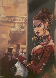
There is so much to dig about Kev Walker’s cover for Dragon 277, the multi-barrelled pistol concealed under a lace handkerchief, a badass elf in studded leather, locomotives, Victorian fog, and you have to love that half-orc with the righteous mutton chops in the background. If you have ever wanted to play a steampunk version of D&D, this painting is it.
I mentioned my love for psionics, so it’s no surprise that I included Paolo Parente’s cover for Dragon 281 in this list. It’s doubly hard to make a visual representation of mental power, both because psionics by their nature, have far few optical effects than traditional magic, and also because there isn’t a deep well of reference material for artists to plumb. Parente takes these limitations and grinds them into the ground. This picture of a group of Githzerai in meditation (as well as Rebecca Guay’s), present the best argument for the place of psionics in a fantasy setting.
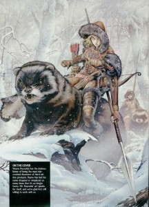
The rise of 3e is also the rise of artist Wayne Reynolds. Like Brom with Dark Sun, WAR (as he signs his pieces) was responsible for the visual style of Eberron (and with all the covers and large color illustrations he did for other 3e products, it could be argued he helped define the style of the edition itself). No run of Dragon covers that includes 3e material could be complete without a WAR painting. His work always has a dynamic sense of action that really energizes me and makes me want to start rolling dice now. I also like this piece for the things it doesn’t include: ‘boob windows’ (to use Wundergeek’s term) and adventure inappropriate clothing – art crimes WAR has definitely been guilty of in his body of work.
In the next instalment I’ll look at the bittersweet final years of Dragon.
The Best Dragon Covers: 101-200
June 15, 2011This month Dragon magazine reaches two milestones: its 400th issue and its 35th anniversary. To celebrate, they’re looking back on the magazine’s storied history and the WOTC website has created an online gallery featuring the cover art of Dragon’s first 100 issues. The covers of Dragon are a great source of gaming inspiration, and feature some of the best talent in fantasy illustration. The art was so good that TSR often reused it in its other products (which drew its share of criticism but never bothered me – it made me feel like an ‘insider’ when I recognized a painting from Dragon). For me the covers also signify something in addition to great art. My interest in Dragon magazine grew as I made the transition from player to dungeon master, developing into a very long subscription and culminating in what some would call an obsession (well, anyone who’s seen the boxes of magazines on my book shelves).
There are some excellent covers in those first 100 issues (seriously, check them out now), including Denis Beauvais’ incredible series of chess themed paintings (probably my all-time favourites), but I missed out on most of them. The very first issue of Dragon that I owned was number 87, indefinitely borrowed from my school library (don’t tell Baythorn Public School). Sure, later I acquired many pre-100 issues, but it wasn’t quite the same. I read the back issues with the eyes of a collector. When my monthly copy of Dragon came in the mail though, I absolutely devoured every page. And when I wasn’t reading, those covers stared up at me from my pile of gaming books spread across my mom’s kitchen table.
So I’m joining the celebration and over the next couple of weeks I’ll showcase some of the magazine’s stand-out covers – post issue 100. These are images that for one reason or another have stuck with me over the years, and flipping through my collection today they still have an emotional impact. It was nice to have the excuse to get reacquainted with some old friends (as usual, click on the pictures to see them full size).
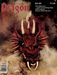
Issue 116 featured an amazing scratch-built model of a red dragon by Peter Botsis. I really love the combination of miniature painting and smoke effects – the three-dimensionality somehow makes it seem more real to me than a traditional painting. It took me a decade and a half of waiting, but in University I was finally able to combine dry ice and miniatures for my own tabletop game (thanks to a friend who works at a lab) – although instead of dragon smoke it simulated the fetid miasma of the Hive for a Planescape campaign.
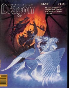
The cover of issue 115, the Antagonists by Denis Beauvais (of the chess covers) is truly a classic. Many of his covers featured the struggle between good and evil, but what I love about this painting is how the composition engages the viewer by putting them on the side of light, confronting the demonic forces of darkness face to face (almost daring you to open the cover and face the dangers within). I’m pretty sure that’s the first time I ever saw bladed wolverine style armguards as well, a look that surely influenced artists like Brom and Wayne Reynolds. Oh, and it was so badass that Ral Partha immortalized it in miniature form.
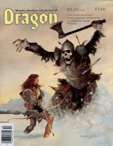
A frost giant skeleton bursting out of a snow bank hardly seems subtle, but my favourite parts of the cover of issue 126 by Daniel Horne are the small details that move your eye around the page and tell a story without words. The skeleton’s missing finger, the sword lodged in its armour, the ineffectual scattering of arrows, the empty quiver, and finally, if you look very closely, you can see that the last arrow gives off a slight glow… an arrow of undead slaying perhaps? It’s also nice to see a female character dressed appropriately for adventuring.
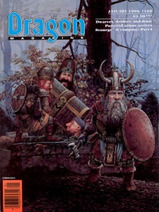
Dragon 127 and 129 are both Keith Parkinson paintings and both were reused in more than one TSR product (the Big Stash – the one with the dwarves, I remember being included in a Forgotten Realms calendar I got for my birthday when I was a kid). Parkinson was a master of atmosphere and the paintings’ multiple appearances are a testament to that. With his painterly style and slice of life (fantasy life that is) subject matter you can’t help but be drawn into the D&D game world with these covers.
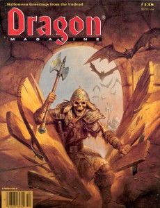
I’ve mentioned before how much I like Jeff Easley’s dragons, but the cover of Dragon 138 shows that he can do just as well depicting the undead. I really dig the earthy palette of this painting – it reminds me of a freshly churned grave (in true horror movie style with a rotting up-thrust hand of course). Dragon’s October issues had a long tradition of following a Halloween theme, and I always looked forward to them.
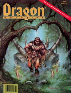
Fred Fields did a lot of work for TSR, but this cover for Dragon 142 stands out for two reasons. The first is purely nostalgic. This issue of Dragon marks the transition from 1e to 2e D&D. I was buying every issue in the local games store by then and it was soon after this that I got my subscription. The other reason I love this picture is that it represents a scene that every dungeon master has wanted to spring on his players, the classic ‘that hill you are sitting on is actually a dragon’ (which just beats out ‘that cave you walked into is actually a monster’s mouth’). I never managed to pull that one off, even though I set an adventure with a black dragon in a swamp shortly after this came out.
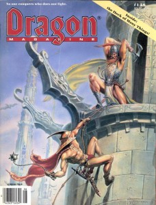
I enjoy the cover of Dragon 148 by Ned Dameron for similar sentimental reasons. This issue was awesome because it had a cardstock insert of the infamous magic item, the deck of many things. I immediately inserted it into the campaign I was running (totally disrupting it with excessive amounts of magic) and that meant keeping this issue on hand. There’s something to be said of the hard bitten everyman adventurer of old school art, but to a scrawny kid getting ready to enter high school for the first time, these were the kind of larger than life demigods that I wanted to play (I rooted for the guy with the Morningstar, since I thought he was a thief, and they were my favourite class).
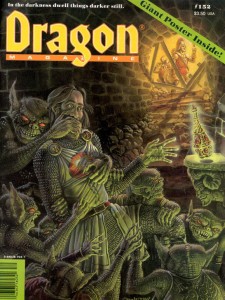
It might be the sense of dread evoked by the sickly green glow reflecting off of the bugbears’ scales (actually I’m not exactly sure what they are, but I always assumed they were bugbears because of their ears and sneaky disposition), but it’s probably just the expression on the little bastard’s face in the bottom right corner that makes me love this cover for Dragon 152 by Paul Jaquays. When I was a kid, I played with a guy whose character was always running off and trying to steal all the treasure. I wanted him to get his just desserts, like the subject of this painting.
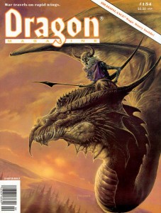
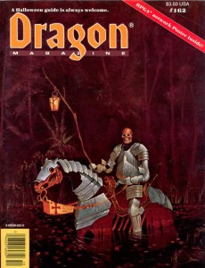
There’s not more of a reason why I like the cover of Dragon 154 by Bob Eggleton other than I think it looks like an awesome monster combination. Earthtones and undead definitely feel right together… A theme picked up by Michael Weaver for Dragon 162 (surprise, another Halloween issue). The more I stare at this painting the more I feel haunted. The hollow, rusted armour, the emotionless disembodied head, the lonely fall colouration – for some reason it all reminds me of the ravine near my mother’s house (not that its filled with the restless dead, it’s just that certain parts of the ravine had a definite character that I see in this cover).
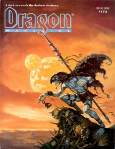
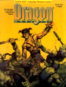
Gerald Brom’s unique paintings captured the brutal savagery of Frank Frazetta and infused them with a dark edge that twisted everything into an alien form – a style that was absolutely perfect for the Dark Sun setting. In fact, Brom’s style is so synonymous with Dark Sun that Wayne Reynolds paid obvious tribute to his work with the covers of the 4e revamp of the game world. Brom made two Dark Sun themed covers for Dragon, issues 173 and 185. The first issue, with the belgoi, had me sold on Athas, and I bought the boxed set soon after. Brom’s work was also immortalized by Ral Partha, although they used the belgoi as a model for their gith shaman.
Larry Elmore is one of the giants of fantasy illustration, and he painted a lot of covers for Dragon magazine, but looking back through my collection I have to admit that most of them didn’t really jump out at me as exceptional (unlike his product and book covers for which his reputation is well deserved). Most of Elmore’s covers were just pretty women standing idly in front of a scenic backdrop. They were well executed technically, but they didn’t inflame my imagination. Unlike those paintings, the cover of Dragon 200 lives up to Elmore’s exceptional Dragonlance work… plus it had a hologram (in the eighties if you wanted to jazz something up you made it glow-in-the-dark, in the nineties it was holograms).
In the next instalment I’ll look at Dragon’s covers post 200.
Random Encounters: Put on a Grey Ribbon
May 21, 2011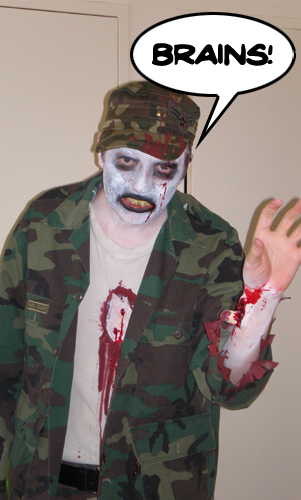 Thanks to myths and monsters week on Daily Planet, I discovered that May is Zombie Awareness month. According to the Zombie Research Society (who I guess are the ones who decided this… I wonder if they have a government grant?), the month of May was chosen because:
“Many films important to the evolution of the modern zombie are set in the month of May, from the original Night of the Living Dead, 1968, to the well received Dawn of The Dead remake of 2004. Also, because spring naturally brings with it a sense of renewal and hopefulness, May is the perfect month to emphasize continued vigilance in the face of the coming zombie pandemic.”
Well, as the picture can attest to (circa the 2008 Toronto Zombie Walk); I’m certainly not unaware of the coming zombie apocalypse (in the future, undead Canadians will look at me dressed up in that picture and be offended). And even though I’ve never really talked about the undead on this blog (hey, where’s the underwater beholder awareness month?), they are an important ingredient to any ménage à monster.
That said, zombie awareness month actually got me thinking about something else – fake undead (maybe it was the photo). During the days of 1st edition D&D (and bleeding over into 2nd), there was a popular trend of ‘gotcha’ monster design. That is, monsters that look like something they are not to trick adventurers into using ineffective tactics against them. The best example of this is probably the gas spore – a monster that looked just like a beholder, but exploded in a cloud of deadly spores if you panicked and hit it with a weapon (I happen to like the gas spore – but it probably has more to do with nostalgia and the sweet Trampier illustration than good design), but it was by no means the only one. That’s where the fake undead come in. These were a category of gotcha monsters that looked like undead (and sometimes acted like it too)… but weren’t. So while your party’s cleric was busy wasting time trying to turn undead, it was killing the rest of you in some non-undead way.
Now some people like using this kind of monster, and maybe I’ve been brainwashed by post 3rd edition thinking, but these creatures just strike me as cheesy one-shot adversaries designed solely to exploit the game’s mechanical assumptions. But complaining about the design choices of monsters from the dustbin of D&D’s history doesn’t get us anywhere. If Zak from Playing D&D with Pornstars can rehabilitate the gas spore, then perhaps some of D&D’s fake undead can be salvaged as well:
- Adherer (from Fiend Folio): This humanoid was covered in loose folds of flesh that made it look like a mummy. It secreted glue from its skin that made your weapons stick to it (I actually did use this monster in 2e, more for its sticky power than its resemblance to a mummy). Surprisingly, this monster has already been rehabilitated – by Paizo in their book Misfit Monsters Redeemed. Here they are presented as living relics of a horrible experiment conducted by phase spiders on the ethereal plane.
- Drelb (Monster Manual II): A creature native to the plane of negative energy that looks like a wraith, and is summoned to guard an area or treasure. It cannot be turned, but tricks clerics who try to do so by appearing to move away, but actually shrinks and moves forward. The drelb’s special power is as lame a
 s a monster that attacks by pretending its going down a flight of stairs. To rehabilitate it I’d get rid of the shrinking thing and quit making it imitate wraiths. Now it’s a malevolent blot of pure necrotic energy that can only manifest in the zone it was summoned to protect (using a mechanic like 4e homunculi). To keep its anti-clerical theme it could do something bad (like an attack or imposing a condition) to anyone who used a power in its aura with the radiant keyword (or someone who used a healing power instead).
 - Gambado (from Fiend Folio): This one-legged creature uses a discarded skull as a head prosthetic, digs a hole in the ground, and when some adventurer comes to investigate the skull, it jumps out at them. I’m amazed this thing survived two editions of the game. I’d take away the ambush predator aspect of this monster and instead focus on the bone stealing and collecting. Reimagined, it becomes a sort of necromantic caddisfly that forms a cocoon out of bones. It can animate its grisly shell to move around the battlefield and attack. Perhaps absorbing new bones heals it, or maybe the gambado grows weaker as its protective cocoon is shattered (yes the name comes from ‘leaping and springing’, I guess it could leap out at you and try to bite your face off it its cocoon is destroyed).
- Necrophidius (from Fiend Folio) and Yellow Musk Zombie (from Monster Manual II): OK, neither one of these monsters really needs to be rehabilitated. With the addition of knowledge checks to the game in 3e, these go from gotcha to cool. Construct made out of snake bones that can hypnotize you by swaying back and forth? Awesome. Killer plant that controls you by planting a seed in your head? Even more awesome. I’m willing to admit when my idea falls apart.
- Pseudo-Undead (from Monster Manual II): The worst culprits of the lot, pseudo-undead are humanoids that look like undead, but have none of their special abilities. Like a Scooby-Doo villain, they spend their pathetic lives hoping others will be too scared to attack them. Here’s a tidbit: “Pseudowraiths and pseudospectres cannot fly but walk so lightly as to leave no trace, and are often thought (unless closely observed) to be floating above the surface, although this is an illusion.” Like the gambado, this is going to take a bit of a stretch. First I’d call the creature something different, like a necroclone. Then, taking a bit of inspiration from the myrmarachne melanotarsa, the monster becomes a shapeshifter with a taste for rotting, undead flesh. It can mimic corporeal undead so fully (and is resistant to disease and necrotic damage) that it lives among colonies of ghouls, and packs of zombies. These are not only the necroclone’s preferred food source, but they also provide the monster with protection, since few other monsters would target a large group of dangerous undead.
That covers 1e’s core monster books, but I’m sure later supplements, as well as Dragon and White Dwarf, hold more examples. Maybe someday I’ll even get around to statting these beasts up.
Classic Monsters: Eye of the Deep
May 13, 2011Note: ‘Classic’ is a pretty subjective term, and when I use it here I mean to say: monsters that have survived through the editions of D&D that I think are cool. In this series of articles I look at the development of a classic monster over time and try to add a ‘crunchy’ piece of my own to the creature’s canon.
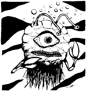 The eye of the deep, the beholder’s unloved cousin, has long held a special fascination for me. As I’ve mentioned previously, when I was a kid who didn’t know any better, flipping through my older brother’s copy of the Monster Manual, this critter caught my eye. Until I had been playing the game for some time, I mistakenly believed that the eye of the deep was a more powerful version of the beholder, since it had eye rays and giant lobster claws (lobster claws were the tentacles of the eighties). Even when I had been properly schooled in D&D lore, my initial impressions of this monster insured it would regularly surface from my subconscious any time I found myself staring down into water that was too deep to see the bottom (well, the eye of the deep and those giant tube worms from the G.I. Joe episodes with the MASS device).
I admit, I’ve never used the eye of the deep in a game. I’m not really sure why. It could have been because I’ve never ran a game that focused on water encounters. Or it could be because(as far as I’m aware), the eye of the deep was never used in a single published adventure, not even in 2nd edition’s monstrous arcana series focused on beholders and beholder-kin (Eye of Pain, Eye of Doom, and Eye to Eye). Then again, it took until 3.5 edition for me to use a regular beholder in an encounter (and no one would argue with its icon status), so I hardly think that’s a strike against it.
Possible Origins?
This is a bit of a non sequitur in an already long article, but I’ve always wondered if the character of Alpha Centauri from Doctor Who had anything to do with the inspiration for the eye of the deep. It does resemble the creature, and it did air in the Curse of Peladon serial in 1972, 5 years before the eye’s appearance in D&D.
1st Edition
While the beholder made its debut in the pages of the Greyhawk supplement for OD&D, the eye of the deep didn’t make it into the game until 1977’s Monster Manual. It has the distinction of being the very first in a long line of beholder variants the game acquired over the years. The book establishes the eye of the deep as a 3-5 foot diameter sphere (size large in AD&D), with a pair of crab-like pincers, a large central eye and a pair of eyestalks. The main eye can emit a blinding flash that stuns opponents, while the smaller eyes can work together to create illusions or cast hold monster and hold person independently.
In Dragon Magazine’s The Ecology of the Eye of the Deep, none other than Ed Greenwood expands on the creature’s lore. The meat of the article describes the creature’s reproductive cycle (they’re hermaphrodites), its hunting habits (it uses its illusion powers to lure prey close and then stuns them with its central eye), and even scientific tidbits about its physiology (the eye of the deep cannot rise to the surface without the change in pressure causing it to explode). Greenwood also adds to the eye of the deep’s attacks, giving it the ability to grab onto opponents with its claws.
 2nd Edition
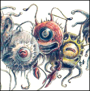
The eye of the deep next appears in 2nd edition D&D’s first volume of the Monstrous Compendium. Here it is presented as a variant of the beholder, but is otherwise almost identical to its AD&D version (although its size remains 3-5 feet in diameter, in this version of the game that makes it a small-medium size creature). Ed Greenwood’s grasping claw attack is not incorporated into the monster’s statistic block.
Late in the edition’s lifespan we are given another glimpse of the eye of the deep in the monstrous arcana supplement, I Tyrant. Although the creature gets only a short paragraph in the book, author Aaron Allston gives us a glimpse of the eye of the deep’s sociology: they communicate over long distances using the light flash from their central eye, and teach their offspring how to hunt using their ability to generate illusions (although this doesn’t really fit with Greenwood’s depiction of them randomly leaving eggs on the sea floor).
3rd Edition
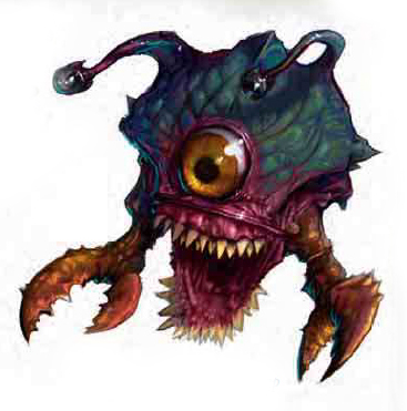 The eye of the deep isn’t updated until 3.5 edition’s Lords of Madness hardcover. In this incarnation the eye retains the ability to stun and blind with its central eye, hold monster, generate illusions, and even grab hold with its claws. It loses the ability to hold person (which makes sense since hold monster supersedes that ability in this edition), but gains the power to project a cone of cold. This edition also sees the first real size change in the creature, growing to a nine foot diameter, 6000 pound behemoth (large sized with the option to advance in hit dice to huge size).
The behaviour of the eye of the deep generally conforms to previous editions (it uses illusions to lure and confuse prey), but the authors (Richard Baker, James Jacobs and Steven Winter) made one alteration that I think illustrates the changing philosophy of D&D game design. Instead of keeping a solitary vigil over shipwrecks at the bottom of the ocean (and exploding if it ascends), the Lords of Madness eye of the deep prefers to hunt on the surface. While this approach may be less realistic (we are talking about a giant floating eye with claws) than Greenwood’s, it’s a change that puts the monster in immediate and direct conflict with the PCs and thus makes it much more useful for DMs.
4th Edition
 It seems that the only legacy of this monster to penetrate the 4th edition of D&D has been the ‘eye of’ naming convention. Then again, the eye of the deep has not been singled out in its exclusion. It seems that the long list of beholder-kin from previous editions is one of the ‘sacred cows’ the designers of the game wished to slay. It seems though, that a long list of beholder variants isn’t what the designers had a problem with per se (the compendium currently holds 17 different variety of the monster). So I guess it was the specific variants themselves they didn’t like (some of them were pretty silly – I’m looking at you director)… Or maybe they just wanted to create something new. Regardless, I can’t let the snubbing of one of my favourite beasties stand, so I present to you this unofficial entry into 4th edition canon:
Beholder Eye of the Deep
Not all beholders dwell in the twisted passages of the underdark. Some float in the lightless ocean depths, rising to the surface to terrorize and destroy any that dare cross their invisible territories.
Lore
Dungeoneering DC 15: Though they lack the sheer number of eye rays that other beholders possess, the eye of the deep compensates by way of strong grasping claws and the ability to generate illusions.
Encounters
Beholders are rarely willing to serve other creatures, and the eye of the deep is no exception. However, some eyes of the deep bully nearby sahuagin into servitude, using them as shock troops to subdue passing ships and coastal towns. The eye of the deep is a negligent master though, and over time the sahuagin invariably desert, fall in combat, or are eaten for food.
Eye of the Deep in Combat
The eye of the deep takes great pleasure in creating illusions to lure its prey in close. The cruel beasts create images of shipwreck survivors, mermaids, and anything else they think will draw their targets into the water. The eye of the deep always opens combat with a stunning blast of light from its central eye before ripping its helpless victim into digestible hunks with its claws.
Tribute to Jim Roslof (1946-2011)
March 24, 2011Old-school D&D artist Jim Roslof passed away last weekend, and given the influence early D&D art has had on my predilections, I would be negligent if I didn’t join other bloggers in paying tribute.
Wizards of the Coast have put together a thoughtful collection of memories and comments from Roslof’s friends and colleagues that is worth reading. In particular, they draw attention to his work as TSR’s art director, during which time he assembled the artistic super-team of Caldwell, Easley, Elmore, Holloway, Parkinson, and Truman. It’s an interesting story, but I’m going to focus on his work as an artist.
I have to admit up front that Roslof wasn’t my favorite artist growing up. I didn’t dislike his work, but Roslof wasn’t a name that I made a point of learning (yes, D&D artists were the first artists whose names I bothered to learn). It could have been because he often didn’t sign his works (making it harder to associate a name with him), or that his style wasn’t as immediately recognizable as an Otus or Elmore, or even that he wasn’t an artist my older brothers (who introduced me to D&D) drew my attention to. But in researching this post, going back over all the illustrations Roslof contributed to D&D products over the years, I noticed how many I remembered but had not attributed to him. When I think of D&D, it is many of Roslof’s images, still lodged in the deep recesses of my gray matter, that call out for reflection.
James Maliszewski at Grognardia has an excellent post on Roslof’s TSR cover paintings (including, in an earlier post, the iconic cover to The Keep on the Borderlands), and Mortellan at Greyhawkery showcases Roslof’s epic Thor vs. the midgard serpent illustration. Those are great pictures, but instead I wanted to focus on Roslof’s numerous black and white interior spot illustrations. These are just the kind of pictures that I mentioned earlier. They probably aren’t the illustrations that come to mind as people’s favorite, but they are immediately recognizable, and represent the visual building blocks that make up D&D.
I present in chronological order the illustrations of Jim Roslof (as usual click on the image to see it full size).
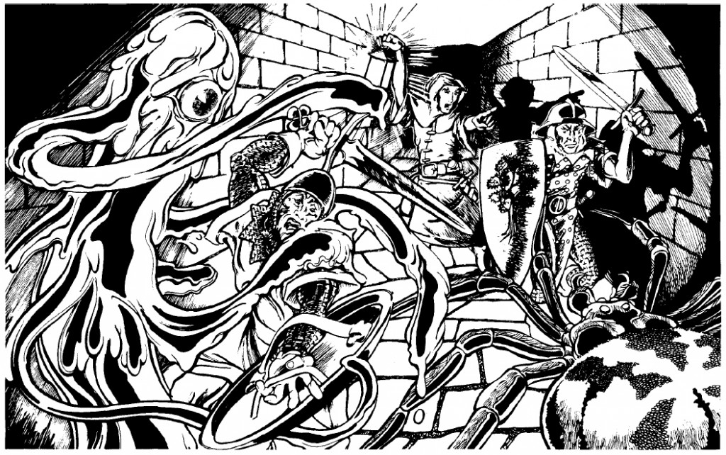
Roslof is well known for his cover painting of Queen of the Demonweb Pits, but he also did interior illustrations for the module as well, including this one depicting a yochlol and spider attacking a party of warriors. The thing I like about this picture is the focus on the party’s light source. Not only does it instantly tell the story of D&D (bringing light into the dark, unknown depths where horrible things live), it’s also a good example of game play (light sources and their durations being especially important in early D&D).
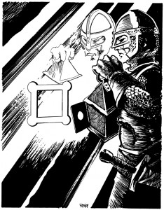
The next picture is one of my favorites that I found, although I have a hard time articulating why. It could be because The Ghost Tower of Inverness (which Roslof also painted the cover for), was one of the modules my older brother owned, and years of pouring through that booklet adds weight to all the pictures held within. It could be the play of light and shadow again. Or it could just be that the fighter pictured looks like the kind of hard bitten bad ass you wanted your character to be. He might not be superhumanly strong, but the set of his jaw, and the careful way he’s inspecting that door, give you the impression he’s seen his share of danger and bloodshed. Maybe I’m reading too much into this drawing, but I’ve always associated this guy with Nick Fury.
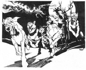
Roslof may have done all the illustrations for the Greek pantheon in Deities and Demigods, but since my mind had already been colonized by the Hercules cartoon those aren’t the images that stick with me – it’s his depiction of the master of the wild hunt unleashing his hounds. Everything works in this picture: the full moon, the sinister face hidden by shadow, the movement of the dogs. Just like the folk tales, when you see that on the horizon you don’t pull our your sword +1/+3 vs. shapeshifters (I don’t know why I choose that sword – I guess I always found it funny), you turn tail and run. Which, incidentally, is exactly what I did when I encountered him in an uber high level adventure a friend made for me in public school (well my characters didn’t run, they jetted away on flying carpets – uber high level remember).
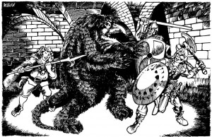
As I mentioned, Roslof is most well known for the cover of The Keep on the Borderlands, but this illustration of a party attacking an owlbear graced the cover page of that module. For me this has always been the iconic image of the owlbear (I do like what Paizo did with the creature for their Kingmaker adventure path), and even though I’ve stared at this picture thousands of times, it wasn’t until today that I realized the fellow gleefully getting ready to stick the monster with his bill-hook is a halfling. I guess I was always focused on the creature (its about to rip that shield away and gut that barbarian with its razor sharp beak – or so I’ve always thought).
![]()
Finally, I wanted to mention the module Baltron’s Beacon. Not my favorite adventure (that may be because I’ve never actually played through it and hadn’t even seen it until the nineties), but its worth noting because it’s the only book where Roslof has the sole interior art credit. The illustrations are great in this module, especially the player handouts (like they did with Tomb of Horrors and Expedition to the Barrier Peaks). I wanted to end with Roslof’s only two-page spread, depicting a party fighting a group of undead lizard men. As far as I know it’s the first picture of its type that TSR published. Is Jim Roslof responsible for pioneering the ‘wall of action’ style of fantasy illustration? Who knows? But I can easily imagine this picture catching the eye of a young Wayne Reynolds when it was published in 1985.
As a post script I should also mention that I’m incredibly jealous of Jim Roslof’s cool signature. Not the coolest signature in the world (that honor goes to Bill Willingham), but infinitely hipper than my own.
The Goblin
February 18, 2011 Goblins are weak pathetic creatures that spend most of their short lives throwing themselves onto adventurers’ swords. It’s hard to argue with that, especially since goblins have always occupied the lowest rung of the monster ladder (just a smidge above kobolds) across all editions of Dungeons and Dragons (and given the influence of D&D, many other rpgs and computer games as well). Take a look at David Trampier’s goblin from the 1e Monster Manual. Don’t get me wrong, I like this picture (especially that clean pen and ink style of his), and the goblin seems a little threatening, but his facial expression almost makes him look worried – and he should be, he’s about to be magic missiled to death. After about third level, goblins become a joke. So much so, it’s even used to comic effect in Neverwinter Nights: Hordes of the Underdark (the joke being that you have to be reminded that to your average zero level schmoe, a goblin is still dangerous).
Trampier’s goblin is good art, but it isn’t great art. For me, great art in an rpg has to either completely inspire you (sometimes suggesting an idea, or a snippet of a narrative that compels you to fill in the blanks), or blow your mind open to a new possibility. Incredibly enough, there is a picture of a goblin that does just that. Back during the 2e days, when my friend and I encountered the picture below (click on it to see it in its full glory!), it totally changed what we thought goblins could be in the game. It wasn’t a picture of a goblin, it quickly became the goblin.
A little history. I first encountered Sam Rakeland’s painting in 2e’s The Complete Book of Humanoids (although it was first used for basic D&D’s module cover, Assault on Raven’s Ruin). I have a lot of love for this book. Back in the day, using its rules, I played a misguided lawful good minotaur, my friend played an alaghi druid, and we even ran an adventure where everyone was a mongrelman living in the sewer. None of us ever played a goblin, but that picture made us fear them again.
All grown up (relatively), there’s a lot I could say about why I like this painting: the use of oils gives it a nice tactile quality, the dynamic pose directly threatens the viewer, the colors suggest the kind of cold, dark, hard bitten cave life I imagine goblins to have… but that’s academic. The savage ferocity of the creature made an immediate and indelible impression on my teenage self. It reminded me that goblins were monsters, not just 1-1 HD things that could inflict 1-6 hit points of damage. I mean look at that thing, I think your name level paladin just cowered behind his shield and crapped in his armor… from a goblin! It made such an impression, that any time we fought goblins afterward; we always wanted to know if we were tackling any old goblin, or the goblin. We never did fight the goblin, but I can’t say my characters really regretted that.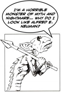
Looking at the digital paintings that grace the electronic pages of Dragon and Dungeon now, I wonder if there’s any room in D&D for this kind of illustration anymore. These days, art directors are very concerned with maintaining a certain look for all the creatures, to help maintain visual cohesiveness and develop D&D as a brand. This approach has some clear advantages to it, the most obvious being that everyone agrees on what a goblin looks like. It educates the audience to D&D’s visual language so that every picture doesn’t have to set out what a goblin looks like. The audience knows and you can just throw goblins into an action scene and the viewer still gets it. I hope that it also ensures we never see another illustration like the one for the salamander in 2e’s Monstrous Compendium (probably my most hated D&D illustration of all time). On the downside, it also leads to illustrations that have a sameness to them (something I’ve talked about before), and flattens out individual style. Maybe it’s because I’m old and jaded, or I’m too high on nostalgia, but flipping through Dragon (I guess ‘key-ing’ is more appropriate, but that’s another rant) I haven’t seen the likes of the goblin in a long time. And that’s too bad, because I think D&D needs great art, not just good, technically adept art that makes you think ‘cool’. It needs art that’s going to blow the minds of teenagers sitting around the kitchen table and leave them remembering the images until they’re old and jaded and complaining about the pictures in the tenth edition of the game.
Then again, maybe I’m getting too worked up about a painting of some 1-1 HD canon-fodder… just try telling that to the goblin.
Notes on the Artist
Far be it for me to wax hyperbolic about the painting without mentioning the artist, who it turns out is something of a mystery (in that he doesn’t really exist).
Sam Rakeland is credited in The Complete Book of Humanoids with the painting (and his signature is pretty clear), and according to the Pen and Paper RPG Database, he also did some other covers and interior pieces for TSR in the nineties, but then his work stops. I was a little disappointed, since I was hoping to see what he had been working on lately. In my quest to find some kind of gallery or homepage, I stumbled across the Internet Speculative Fiction Database, who list Sam Rakeland as a pseudonym of artist Rick Berry. I’m not familiar with Rick Berry but it turns out he’s a prolific cover artist and I’ve seen his work on bookstore shelves for the last twenty years. You can read more about him on his page here.
I can only imagine he used a pseudonym to keep his rpg and book cover work separate… maybe he was a longtime rpg fan and had always wanted to make some material for D&D, who knows? If anyone does know more, I’d love to hear.
Of course my teenage self couldn’t help pointing out to my adult self that he recognized great art, even when it was hidden behind a false name.
