Old-school D&D artist Jim Roslof passed away last weekend, and given the influence early D&D art has had on my predilections, I would be negligent if I didn’t join other bloggers in paying tribute.
Wizards of the Coast have put together a thoughtful collection of memories and comments from Roslof’s friends and colleagues that is worth reading. In particular, they draw attention to his work as TSR’s art director, during which time he assembled the artistic super-team of Caldwell, Easley, Elmore, Holloway, Parkinson, and Truman. It’s an interesting story, but I’m going to focus on his work as an artist.
I have to admit up front that Roslof wasn’t my favorite artist growing up. I didn’t dislike his work, but Roslof wasn’t a name that I made a point of learning (yes, D&D artists were the first artists whose names I bothered to learn). It could have been because he often didn’t sign his works (making it harder to associate a name with him), or that his style wasn’t as immediately recognizable as an Otus or Elmore, or even that he wasn’t an artist my older brothers (who introduced me to D&D) drew my attention to. But in researching this post, going back over all the illustrations Roslof contributed to D&D products over the years, I noticed how many I remembered but had not attributed to him. When I think of D&D, it is many of Roslof’s images, still lodged in the deep recesses of my gray matter, that call out for reflection.
James Maliszewski at Grognardia has an excellent post on Roslof’s TSR cover paintings (including, in an earlier post, the iconic cover to The Keep on the Borderlands), and Mortellan at Greyhawkery showcases Roslof’s epic Thor vs. the midgard serpent illustration. Those are great pictures, but instead I wanted to focus on Roslof’s numerous black and white interior spot illustrations. These are just the kind of pictures that I mentioned earlier. They probably aren’t the illustrations that come to mind as people’s favorite, but they are immediately recognizable, and represent the visual building blocks that make up D&D.
I present in chronological order the illustrations of Jim Roslof (as usual click on the image to see it full size).

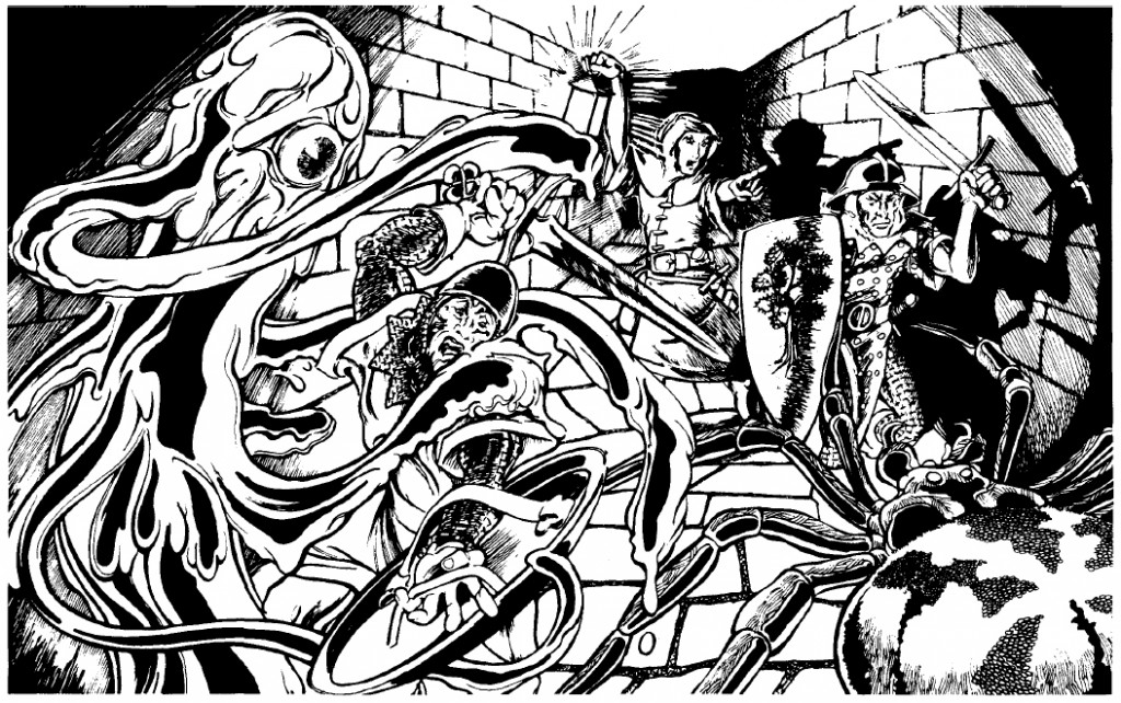
Roslof is well known for his cover painting of Queen of the Demonweb Pits, but he also did interior illustrations for the module as well, including this one depicting a yochlol and spider attacking a party of warriors. The thing I like about this picture is the focus on the party’s light source. Not only does it instantly tell the story of D&D (bringing light into the dark, unknown depths where horrible things live), it’s also a good example of game play (light sources and their durations being especially important in early D&D).

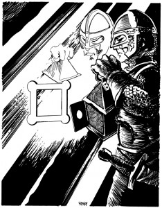
The next picture is one of my favorites that I found, although I have a hard time articulating why. It could be because The Ghost Tower of Inverness (which Roslof also painted the cover for), was one of the modules my older brother owned, and years of pouring through that booklet adds weight to all the pictures held within. It could be the play of light and shadow again. Or it could just be that the fighter pictured looks like the kind of hard bitten bad ass you wanted your character to be. He might not be superhumanly strong, but the set of his jaw, and the careful way he’s inspecting that door, give you the impression he’s seen his share of danger and bloodshed. Maybe I’m reading too much into this drawing, but I’ve always associated this guy with Nick Fury.

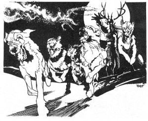
Roslof may have done all the illustrations for the Greek pantheon in Deities and Demigods, but since my mind had already been colonized by the Hercules cartoon those aren’t the images that stick with me – it’s his depiction of the master of the wild hunt unleashing his hounds. Everything works in this picture: the full moon, the sinister face hidden by shadow, the movement of the dogs. Just like the folk tales, when you see that on the horizon you don’t pull our your sword +1/+3 vs. shapeshifters (I don’t know why I choose that sword – I guess I always found it funny), you turn tail and run. Which, incidentally, is exactly what I did when I encountered him in an uber high level adventure a friend made for me in public school (well my characters didn’t run, they jetted away on flying carpets – uber high level remember).

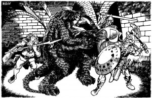
As I mentioned, Roslof is most well known for the cover of The Keep on the Borderlands, but this illustration of a party attacking an owlbear graced the cover page of that module. For me this has always been the iconic image of the owlbear (I do like what Paizo did with the creature for their Kingmaker adventure path), and even though I’ve stared at this picture thousands of times, it wasn’t until today that I realized the fellow gleefully getting ready to stick the monster with his bill-hook is a halfling. I guess I was always focused on the creature (its about to rip that shield away and gut that barbarian with its razor sharp beak – or so I’ve always thought).
![]()
Finally, I wanted to mention the module Baltron’s Beacon. Not my favorite adventure (that may be because I’ve never actually played through it and hadn’t even seen it until the nineties), but its worth noting because it’s the only book where Roslof has the sole interior art credit. The illustrations are great in this module, especially the player handouts (like they did with Tomb of Horrors and Expedition to the Barrier Peaks). I wanted to end with Roslof’s only two-page spread, depicting a party fighting a group of undead lizard men. As far as I know it’s the first picture of its type that TSR published. Is Jim Roslof responsible for pioneering the ‘wall of action’ style of fantasy illustration? Who knows? But I can easily imagine this picture catching the eye of a young Wayne Reynolds when it was published in 1985.
As a post script I should also mention that I’m incredibly jealous of Jim Roslof’s cool signature. Not the coolest signature in the world (that honor goes to Bill Willingham), but infinitely hipper than my own.
Tags: D&D, Old-School