As part of my ongoing celebration of Dragon Magazine’s 35th anniversary, I present the next instalment of covers, from issue 201 to 300.
These images represent quite a roller coaster ride through the ups and downs of Dungeons and Dragons. They bear witness to the development of the greatest settings the game has ever seen, the excesses and eventual decline of 2e, the demise of TSR, and the rebirth of the game in 3e under the ownership of Wizards of the Coast. Even though I had shifted to other games (namely Rifts) in the later days of 2e, I never strayed from Dragon (and even if I wasn’t in a campaign I always thought of D&D as my game). The writing, the ideas, and especially the art were always a great source of inspiration and entertainment.
I also liked the feeling of belonging to a community of gamers that came with the subscription. Yes that need has been fulfilled by the large (and vocal) gamer presence on the internet, but I don’t think anything will replace the visceral presence of a stack of physical artefacts (he says without irony while typing away on his blog – seriously, I can love my blog and the immediate and widespread distribution it has while still mythologizing the printed word, can’t I?).
One of the less positive aesthetic developments during this era was the inclusion of more text on the covers, obscuring the art. Fortunately, Dragon editors helped to mitigate this by publishing the cover art as a full page spread within the magazine. Since I’m focusing on the art of the magazine, I’ve chosen to reproduce those images and not the actual covers, even if it looks a bit strange not to see the familiar Dragon logo (as usual, click on the image for full size).
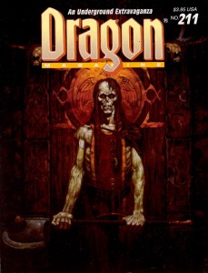
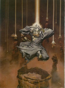
In the last article, I mentioned two of Brom’s fantastic Dark Sun images. He also painted a pair of covers for this run; two striking images of the undead. I always felt the first cover, for Dragon 211, was the perfect representation of a ju-ju zombie – an abomination created through life draining necromancy that retained some of its intelligence, could use weapons and had hard, leathery grey skin (and sadly hasn’t appeared in D&D since 2e). The halberd the creature wields also reminds me of old-school Citadel zombies (the ones armed with a cleaver-on-a-stick), which is a very good thing.
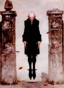
Brom’s second cover swings to the other side of the undead spectrum for Dragon 264, with a seriously creepy Nosferatu inspired vampire. Looking at the cover today, I continue to find Brom’s choice of vampire refreshing (in 1999 when this issue was published I was sick of Anne Rice copycats, today it’s the unmentionable ‘sparkly’ vampires of teen land). There is absolutely no question that Brom’s creation is a monster. With its rat-like teeth, beady eyes, and blotchy pinkish skin, the vampire is once again a living metaphor for the horrors of disease and the predatory nature of the aristocracy… not something to moon over and identify with.
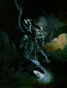
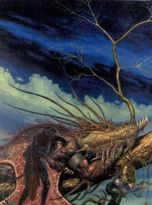
Another artist whose name should be familiar from the last article is Jeff Easley. Like the previous run, Easley was incredibly prolific in producing Dragon covers from 200-300, but these two are my favourite. Easley has painted a lot of dragons (I would say he is a master of the subject), but I think the cover to issue 225 stands out. Maybe it’s because I’ve got Caravaggio on the brain, but I love the dramatic impact of the dark, almost black tone. It really sucks you into the picture. Plus, I always appreciate it when an artist chooses to paint a dragon that doesn’t breathe fire. It’s a lot harder to visualize lightning breath, and as cool as King Ghidorah is, I’d rather have this as the go-to mental image whenever I think of blue dragons. Also, I’m not sure why undead and dragons go together, but apparently they do… and its unadulterated badassness.
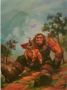
In tone, Easley’s cover for Dragon 254 is the polar opposite, and its naturalistic palette makes it seem almost like a landscape – which helps to suspend disbelief when you realize just how enormous that giant is. This cover echoes traditional fantasy renderings of giants which put into perspective just how small D&D giants are. I’ve never used a gargantua, or goriostro or similar sized monster in D&D, but I’ve always wanted to, and every time I look at this painting I feel like smacking myself for not designing that adventure yet.
There was a stretch during the middle of this run when every cover featured the magazine’s namesake. Now dragons are very cool (half of my favourite covers have them), but after a while it starts to get predictable (and if I recall, the letters column had some complaints about it). Fortunately, there are artists who can take any cliché and breathe new life into it. These covers still have the power to make me look at dragons in a different way.
R.K. Post is most well-known for his work setting the visual style for the Alternity game, but he also made several Dragon covers. The thing I love about his painting for issue 241 is how Post takes a well-travelled narrative (sneaking up on a sleeping dragon) and makes it as dark and full of twisted lines as his art. In this cover you cannot be sure of anything. The fighter in the foreground is cloaked in shadow, drawing a cruel looking blade. Is he the hero of this tale, or the villain? Instead of reclining on a bed of stolen riches, this dragon lays on a mighty tree, with which it blends seamlessly, like a creature of nature. It’s also nice to see a bard as part of the action, something you don’t often witness in D&D illustration.
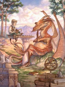
If I could use a single word to describe Tony DiTerlizzi’s cover for Dragon 242 it would be ‘charming’. DiTerlizzi helped bring the Planescape setting to life with his incredible ink and watercolour pictures. Most of those were dark and sketchy, as suited the down and dirty flavour of Sigil, but here DiTerlizzi shows us he can also work with a lighter palette and more refined lines. It’s also full of whimsical little details that ensure I’ll never get bored of looking at it – the dice on top of the D&D books, the strange orrery, and especially the dragon’s tiny spectacles. This painting helps to remind me that dragons aren’t just dumb brutes there to blindly rip apart adventurers. They are some of the most intelligent creatures in the game, have their own goals, and just maybe, indulge in the occasional game of chess.
The next pair of covers each feature paintings with interesting mounts and riders. I’ve never had the chance to play a character with a special mount (I’m usually the DM for our gaming group), but these pictures hold enough inspiration that I feel left out.
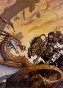
Matt Wilson is now the co-owner of Privateer Press, but in the nineties he did a bit of work for TSR, including this cover for Dragon 245. Dwarves aren’t one of those fantasy races you usually associate with cavalry, but once you see a dwarf knight on a razor tusked boar pulling a St. George, you know it’s right. Looking at this painting today, I also find it interesting to see the proto-vision of the style that would one day be associated with the Warmachine game.
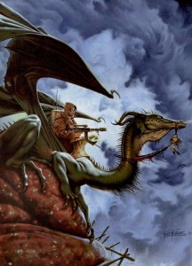
I mentioned veteran Dragon artist Fred Fields last article, and you can see how much his style changed over the years from Frazetta-like heroic fantasy to a gritty photo-realistic one. When Dragon 248 came out (1998), I was playing a lot of Rifts, so I had a natural inclination to like the genre crossing for its cover (the goggles, for flying without a canopy are a nice touch). Of course in Rifts you can be a dragon, so my friends and I would joke that the guy with the machine gun was actually the dragon’s familiar.
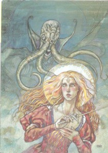
I know a lot of people hate them, but I have always loved psionics in D&D (yes, even in 2e when they were obviously broken, but who didn’t love rolling for wild talents?). One of my favourite issues of Dragon covering the subject was 255, with a stunning watercolour cover by Rebecca Guay (I liked the issue so much it’s the only time I ever wrote to the magazine – and I had my letter published in 259!). I love the almost medieval look of her lines, and the light washes of paint make the image look ethereal – perfect qualities to depict a psionic struggle between heroine and mind flayer. This battle could easily be taking place in the physical world, the mental plane, or a blending of our perceptions of the two.
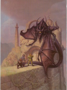
I was ignorant or Mark Zug’s work until I looked up the artist of these two long-time favourite Dragon covers. Besides depicting an awesome bat-creature acting as a guardian of a magically sealed doorway, Zug’s cover for Dragon 271 also contains a hidden message spelled out in those runes. I’ve never figured out what it says, but I like knowing that there’s a mystery to be solved. It’s this kind of Easter egg that moves a painting from being a fantasy illustration to a specifically D&D one.
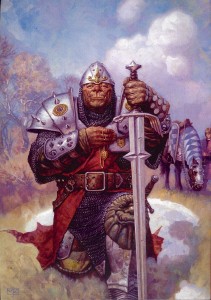
Nothing signifies the transition to 3e more than this cover for Dragon 275. Yes, the magazine had switched over to the new edition in the previous issue, but Zug’s painting of a noble half-orc paladin summed up the shift in the game’s philosophy without words – no more boundaries.
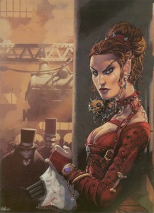
There is so much to dig about Kev Walker’s cover for Dragon 277, the multi-barrelled pistol concealed under a lace handkerchief, a badass elf in studded leather, locomotives, Victorian fog, and you have to love that half-orc with the righteous mutton chops in the background. If you have ever wanted to play a steampunk version of D&D, this painting is it.
I mentioned my love for psionics, so it’s no surprise that I included Paolo Parente’s cover for Dragon 281 in this list. It’s doubly hard to make a visual representation of mental power, both because psionics by their nature, have far few optical effects than traditional magic, and also because there isn’t a deep well of reference material for artists to plumb. Parente takes these limitations and grinds them into the ground. This picture of a group of Githzerai in meditation (as well as Rebecca Guay’s), present the best argument for the place of psionics in a fantasy setting.
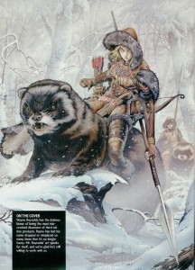
The rise of 3e is also the rise of artist Wayne Reynolds. Like Brom with Dark Sun, WAR (as he signs his pieces) was responsible for the visual style of Eberron (and with all the covers and large color illustrations he did for other 3e products, it could be argued he helped define the style of the edition itself). No run of Dragon covers that includes 3e material could be complete without a WAR painting. His work always has a dynamic sense of action that really energizes me and makes me want to start rolling dice now. I also like this piece for the things it doesn’t include: ‘boob windows’ (to use Wundergeek’s term) and adventure inappropriate clothing – art crimes WAR has definitely been guilty of in his body of work.
In the next instalment I’ll look at the bittersweet final years of Dragon.







 While Techno-Wizardry may be the