Posts Tagged ‘3e’
The Best Dragon Covers: 301-fin
July 8, 2011This is the last instalment of my celebration of Dragon magazine’s 35th anniversary, and I have to admit it’s a little bittersweet (part one is here and part two is here).
Roger Moore may have been my favourite editor, but my favourite era of the magazine is the time Dragon spent under the stewardship of Paizo publishing (with Eric Mona as editor). Paizo injected the magazine with this amazing youthful energy that made it exciting to read in a way that only an optimistic, upstart company can do. This batch of Dragons delivered consistently good material, with something in almost every issue that I wanted to incorporate into my game (it also presented a blend of ‘fluff’ and ‘crunch’ that suited my tastes perfectly – and I try and emulate on this blog). The only thing I can really hold against Paizo is that they stopped the practice of including a reprint of the cover art sans text in each issue.
And then it stopped. The cancellation of Dragon hit me pretty hard. My subscription had followed me through so many phases of my life; the thought of never getting another issue in the mail was very depressing. Yes, the online magazine has been much better than anticipated, and the incorporation of its material into both the character generator and the online compendium is tremendously useful to players and DMs alike (and would probably be impossible with a print version), but still, I think Dragon lost something when it went digital (call it gravitas). Especially the covers.
That’s not an indictment of the art, rather just an observation that in an online magazine, covers don’t really mean much (even more so that they don’t bundle the articles into a single pdf anymore). Electronic images seem so much more impermanent, without a physical presence, I quickly glance at them and scroll down the page, another ephemeral chunk of culture to be consumed without savouring. So, sadly, my celebration of Dragon covers stops with issue 359 (as usual click on the image for full size).
I mentioned Wayne Reynolds’ emergence in the last article, and if anything, his star grew even brighter during the Paizo days of Dragon, producing numerous covers and a spectacular 3.5e DM screen that was given away as a bonus with the magazine (that I’m still using). These are two of his best.
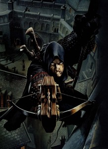
I always thought the repeating crossbow was a bit of a goofy weapon until two things changed my mind – an episode of Deadliest Warrior and the cover of Dragon 305. Rogues are one of my favourite characters to play and this painting perfectly sums up all the greatest features of the class. Lightly armoured, quiet as a shadow, and a face that leaves no doubt that this man is a scoundrel. I was the DM at the time so I never got to make this character in the game and had to settle for using this cover as my portrait in Neverwinter Nights.
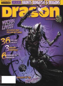
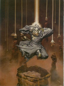
WAR might be known for big, bulky armour, and wall to wall action scenes, but here he displays his skills at rendering the undead (and check out his depiction of the Githyanki Lich Queen on the cover of Dungeon 100 if you need more proof). Vecna’s name has been in the game as a villain since (almost) the beginning, but there are few depictions of him. Not having a phonebook of visual precedents worked in Reynolds’ favour with this piece. Instead of wrapping the whispered one up in a big voluminous robe (the kind you associate with liches), WAR went for a more exotic, almost primitive look. It’s a choice that might bother some, but to me it makes Vecna look ancient and primal – more like a god and less like your garden variety undead spell-caster.
Marc Sasso probably had more Dragon covers during this era than any other artist. His style is definitely square in the ‘new-school’ of Wayne Reynolds, but as much as I admire WAR’s talents, I think that Sasso has a greater command of perspective that gives his paintings more depth.
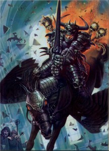
That kind of depth really isn’t in play for his cover of Dragon 312, but if an anti-paladin crashing through the stained glass of a temple on his nightmare mount while the clerics crap in their robes isn’t good enough for this list than I don’t know what is. I’ll admit I have a weakness for the little skulls moulded into the knuckles of the warrior’s gauntlets. This painting could just as easily be the cover for a metal album (and incidentally Sasso has made more than a few), which is just the place you want to go when depicting the over the top evil of an anti-paladin. I’m not what you would call a metal-head, but I’ve always had a soft spot in my heart for the aesthetic – especially vans airbrushed in full Frazetta mode (my family had a big van for years, but my father wouldn’t let us put so much as a bumper sticker on it).
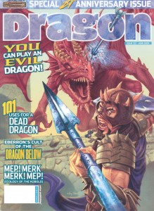
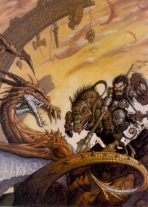
Sasso’s cover for Dragon 332 is less metal influenced, but a much better painting. I think it’s cool that he decided to go with a wild-eyed, lightly armoured, mercenary type as his Dragon slayer, rather than your traditional St. George figure. In my games at least, there were a lot more of the former than the latter. I also love his portrayal of magic – the spreading blue glow of arcane cold is subtle, but noticeable, and it fits the game accurately (in 3e, Red dragons take extra damage from cold attacks).
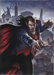
Dan Scott’s cover for Dragon 315 is memorable for me in so many ways. First, this issue, focusing on D&D’s ‘dead’ game worlds is one I go back to all the time, so it’s hard for me to separate my joy for the content of the issue when seeing that painting. Second, that’s a great depiction of Strahd. I’ve never used him in a game, but I’ve always been fascinated with him as a villain. He’s sort of like Dracula (OK, an exact clone of Dracula), a name that’s so big it’s nice to have as a legend but hard to put into an encounter and do him justice. Finally, the layout of this piece immediately brings to mind the covers of The Official Handbook of the Marvel Universe Book of the Dead series. I’ve mentioned my boundless love of the OHOTMU many times before on this blog, but when I got my first issue of the Book of the Dead as a birthday present in grade 7, I thought it was that much cooler than ever before.
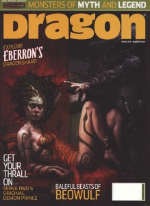
The thing that makes Scott Fischer’s cover for Dragon 329 stand out is that it looks more like contemporary art than fantasy illustration. The composition, tone, and reference to Ingres’ Odalisque, make it seem like the kind of painting your partner would let you put up in your living room (I’m lucky enough to have a gamer for a partner so there wouldn’t be a problem either way). Except that it’s also a painting of a medusa that’s just turned a guy to stone (it’s hard to see with the logo, but he’s petrified with a look of absolute horror). It’s the visual equivalent of a song by The Jam – all poppy and melodic on the surface with dark and politically charged lyrics underneath.
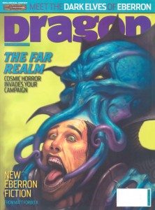
Mind flayers are one of my favourite monsters (just look at the background image for this blog), so any cover that features one already has my attention. The cover of Dragon 330 by James Ryman actually shows one in the act of devouring some poor soul’s brain. When I was a kid, Bill Willingham’s back cover piece (which showed the same activity) for Descent into the Depths of the Earth, gave me the heebie-jeebies. Ryman’s cover is a worthy successor, and the longer I stare at it the itchier my scalp gets. The emotionless face of the illithid, contrasted with the sheer terror and pain of its victim works to demonstrate just how alien these things are.
Before Steve Prescott became Paizo’s go-to guy for their Pathfinder rpg, he made Dragon covers for them. I guess the art directors at Paizo like him for the same reasons I do – his versatility. I think these two covers are his best work for Dragon, and they also illustrate his ability to work at either end of the scale spectrum.
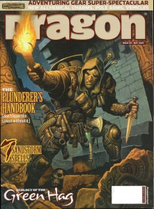
In his cover for Dragon 331 Prescott takes us to the gritty and personal street-level of adventuring. This is the kind of Nick Fury-esque adventurer that I dig. His gear is worn, and you can tell from the menagerie of weapons, climbing tools and odd mystical bits that this guy is a veteran of dungeon delving. But the best part of this picture is that Prescott is able to make the character look fully kitted out without crossing the line into parody like say, Citadel’s complete adventurer miniature.
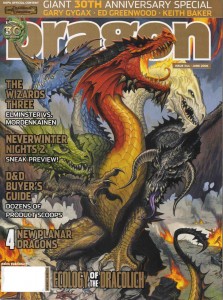
A little more than a year later, Prescott’s cover for Dragon 344 takes us from the street to the epic and he doesn’t miss a beat. As the goddess of evil dragonkind, Tiamat is awesome. Possessing a head that represents each species of chromatic dragon, she seems a much more natural progenitor than Bahamut the platinum dragon does for the metallic dragons. The stand out feature of this painting is Prescott’s attention to detail. Each of Tiamat’s heads corresponds in shape and style to the models laid out by Todd Lockwood and Sam Wood in the Monster Manual. I’m a sucker for that kind of continuity. Artists’ styles change but you get the sense that the game world is alive when what they are depicting the same creatures (say what you will about the Dungeons and Dragons cartoon, but they did the same thing with their version of Tiamat – albeit with the 1e dragon models).
I DMed a long running planescape campaign for 3e, but my love of that setting began way back in high school when the boxed set was released. R.K. Post’s cover for Dragon features Planescape’s icon, the Lady of Pain. Even though her face appeared on almost every product in the line, there were only a handful of pictures that showed the Lady’s complete figure. I talked about R.K. Post’s style last article, and with a creature as creepy and enigmatic as the Lady of Pain, it’s a perfect pairing of subject and artist (if I was wealthy beyond imagination I’d commission Clive Barker to do a painting of her). When this issue came out, my Planescape campaign had concluded (so I couldn’t use the picture in-game), but this cover brought me right back there, my mind wandering the streets of Sigil all over again.
If Steve Prescott is versatile then Andrew Hou is an absolute chameleon. He seems to move effortlessly between the anime influenced style of the new school and a more traditional style of fantasy illustration. Looking at these two covers it’s hard to believe they are painted by the same artist… that one of them features the two-headed Demogorgon seems highly appropriate.
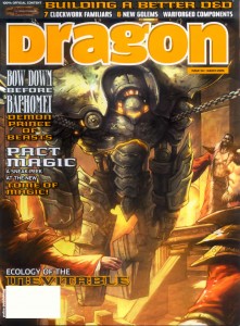
I’ve used golems as adversaries many times in D&D, and even though the rules for creating them as servants have been in the game since 1e, I have never played in a party where we crafted one. I’ve really wanted to, and my friends and I have come close a couple of times, but it just never happened. I had this issue of Dragon sitting on my computer desk for over a year, hoping that my players would be able to make use of it, but it wasn’t to be. Hou’s cover for issue 341 was never very far away when I was preparing for game sessions, its newly forged iron golem full of the promise of an iconic aspect to D&D wizardry. It’s a shame 4e has no decent golem crafting rules.
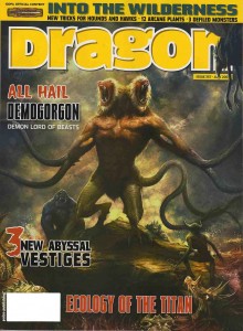
Hou’s cover for Dragon 357 is a great painting of Demogorgon (I am so glad Paizo returned Demogorgon to his baboon headed self, and didn’t use the hyena version from the Book of Vile Darkness). For some reason the style reminds me of old movie posters, full of dark atmosphere and the distant drums of action. I can just see it tucked away in the corner of an old video store (Queen Video if you’re in Toronto)… ‘Prince of Demons ‘, with animation by Ray Harryhausen, featuring a band of adventurers suddenly transported to another dimension where they witness the endless carnage and turmoil that is the abyss!
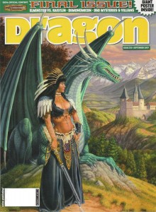
And here it is, the final cover, Dragon 359. I’m not actually that crazy about the Larry Elmore painting. There’s something jarring about the strange outfit the woman is wearing that irks me, but that electro-sword is cool, the green dragon (in reference to Dragon magazine’s first issue) is a nice touch, and as always he has created a background more beautiful than most artists’ foregrounds. Besides, it’s the last issue – its cover would deserve a place of honour even if it was a blank page.
As an afterthought, I wonder how fantasy illustration has been impacted by Dragon going digital. Looking back at my favourite covers and researching the people who made them, I see that many prominent artists made a splash in Dragon before moving on to other things (many of whom are now the primary illustrators of Pathfinder and 4e). As I mentioned at the start of the article, I haven’t been paying much attention to the digital Dragon covers, but is it occupying the same niche in the industry for artists that it once held? Hopefully it does, but if I am any indication, these new fantasy artists are not getting the attention that they deserve.
The Best Dragon Covers: 201-300
June 28, 2011As part of my ongoing celebration of Dragon Magazine’s 35th anniversary, I present the next instalment of covers, from issue 201 to 300.
These images represent quite a roller coaster ride through the ups and downs of Dungeons and Dragons. They bear witness to the development of the greatest settings the game has ever seen, the excesses and eventual decline of 2e, the demise of TSR, and the rebirth of the game in 3e under the ownership of Wizards of the Coast. Even though I had shifted to other games (namely Rifts) in the later days of 2e, I never strayed from Dragon (and even if I wasn’t in a campaign I always thought of D&D as my game). The writing, the ideas, and especially the art were always a great source of inspiration and entertainment.
I also liked the feeling of belonging to a community of gamers that came with the subscription. Yes that need has been fulfilled by the large (and vocal) gamer presence on the internet, but I don’t think anything will replace the visceral presence of a stack of physical artefacts (he says without irony while typing away on his blog – seriously, I can love my blog and the immediate and widespread distribution it has while still mythologizing the printed word, can’t I?).
One of the less positive aesthetic developments during this era was the inclusion of more text on the covers, obscuring the art. Fortunately, Dragon editors helped to mitigate this by publishing the cover art as a full page spread within the magazine. Since I’m focusing on the art of the magazine, I’ve chosen to reproduce those images and not the actual covers, even if it looks a bit strange not to see the familiar Dragon logo (as usual, click on the image for full size).
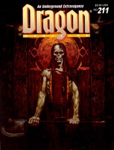
In the last article, I mentioned two of Brom’s fantastic Dark Sun images. He also painted a pair of covers for this run; two striking images of the undead. I always felt the first cover, for Dragon 211, was the perfect representation of a ju-ju zombie – an abomination created through life draining necromancy that retained some of its intelligence, could use weapons and had hard, leathery grey skin (and sadly hasn’t appeared in D&D since 2e). The halberd the creature wields also reminds me of old-school Citadel zombies (the ones armed with a cleaver-on-a-stick), which is a very good thing.
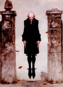
Brom’s second cover swings to the other side of the undead spectrum for Dragon 264, with a seriously creepy Nosferatu inspired vampire. Looking at the cover today, I continue to find Brom’s choice of vampire refreshing (in 1999 when this issue was published I was sick of Anne Rice copycats, today it’s the unmentionable ‘sparkly’ vampires of teen land). There is absolutely no question that Brom’s creation is a monster. With its rat-like teeth, beady eyes, and blotchy pinkish skin, the vampire is once again a living metaphor for the horrors of disease and the predatory nature of the aristocracy… not something to moon over and identify with.
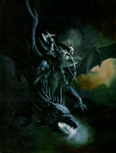
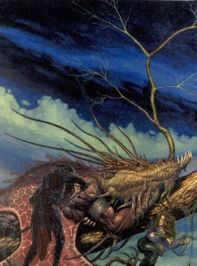
Another artist whose name should be familiar from the last article is Jeff Easley. Like the previous run, Easley was incredibly prolific in producing Dragon covers from 200-300, but these two are my favourite. Easley has painted a lot of dragons (I would say he is a master of the subject), but I think the cover to issue 225 stands out. Maybe it’s because I’ve got Caravaggio on the brain, but I love the dramatic impact of the dark, almost black tone. It really sucks you into the picture. Plus, I always appreciate it when an artist chooses to paint a dragon that doesn’t breathe fire. It’s a lot harder to visualize lightning breath, and as cool as King Ghidorah is, I’d rather have this as the go-to mental image whenever I think of blue dragons. Also, I’m not sure why undead and dragons go together, but apparently they do… and its unadulterated badassness.
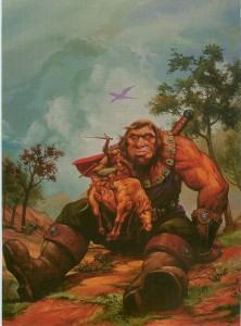
In tone, Easley’s cover for Dragon 254 is the polar opposite, and its naturalistic palette makes it seem almost like a landscape – which helps to suspend disbelief when you realize just how enormous that giant is. This cover echoes traditional fantasy renderings of giants which put into perspective just how small D&D giants are. I’ve never used a gargantua, or goriostro or similar sized monster in D&D, but I’ve always wanted to, and every time I look at this painting I feel like smacking myself for not designing that adventure yet.
There was a stretch during the middle of this run when every cover featured the magazine’s namesake. Now dragons are very cool (half of my favourite covers have them), but after a while it starts to get predictable (and if I recall, the letters column had some complaints about it). Fortunately, there are artists who can take any cliché and breathe new life into it. These covers still have the power to make me look at dragons in a different way.
R.K. Post is most well-known for his work setting the visual style for the Alternity game, but he also made several Dragon covers. The thing I love about his painting for issue 241 is how Post takes a well-travelled narrative (sneaking up on a sleeping dragon) and makes it as dark and full of twisted lines as his art. In this cover you cannot be sure of anything. The fighter in the foreground is cloaked in shadow, drawing a cruel looking blade. Is he the hero of this tale, or the villain? Instead of reclining on a bed of stolen riches, this dragon lays on a mighty tree, with which it blends seamlessly, like a creature of nature. It’s also nice to see a bard as part of the action, something you don’t often witness in D&D illustration.
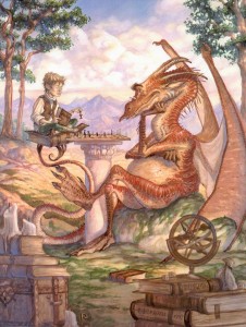
If I could use a single word to describe Tony DiTerlizzi’s cover for Dragon 242 it would be ‘charming’. DiTerlizzi helped bring the Planescape setting to life with his incredible ink and watercolour pictures. Most of those were dark and sketchy, as suited the down and dirty flavour of Sigil, but here DiTerlizzi shows us he can also work with a lighter palette and more refined lines. It’s also full of whimsical little details that ensure I’ll never get bored of looking at it – the dice on top of the D&D books, the strange orrery, and especially the dragon’s tiny spectacles. This painting helps to remind me that dragons aren’t just dumb brutes there to blindly rip apart adventurers. They are some of the most intelligent creatures in the game, have their own goals, and just maybe, indulge in the occasional game of chess.
The next pair of covers each feature paintings with interesting mounts and riders. I’ve never had the chance to play a character with a special mount (I’m usually the DM for our gaming group), but these pictures hold enough inspiration that I feel left out.
Matt Wilson is now the co-owner of Privateer Press, but in the nineties he did a bit of work for TSR, including this cover for Dragon 245. Dwarves aren’t one of those fantasy races you usually associate with cavalry, but once you see a dwarf knight on a razor tusked boar pulling a St. George, you know it’s right. Looking at this painting today, I also find it interesting to see the proto-vision of the style that would one day be associated with the Warmachine game.
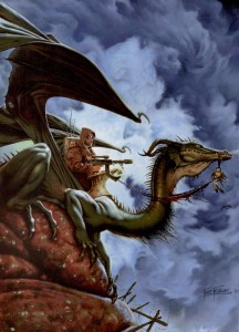
I mentioned veteran Dragon artist Fred Fields last article, and you can see how much his style changed over the years from Frazetta-like heroic fantasy to a gritty photo-realistic one. When Dragon 248 came out (1998), I was playing a lot of Rifts, so I had a natural inclination to like the genre crossing for its cover (the goggles, for flying without a canopy are a nice touch). Of course in Rifts you can be a dragon, so my friends and I would joke that the guy with the machine gun was actually the dragon’s familiar.
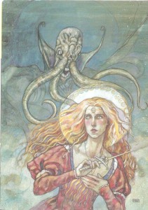
I know a lot of people hate them, but I have always loved psionics in D&D (yes, even in 2e when they were obviously broken, but who didn’t love rolling for wild talents?). One of my favourite issues of Dragon covering the subject was 255, with a stunning watercolour cover by Rebecca Guay (I liked the issue so much it’s the only time I ever wrote to the magazine – and I had my letter published in 259!). I love the almost medieval look of her lines, and the light washes of paint make the image look ethereal – perfect qualities to depict a psionic struggle between heroine and mind flayer. This battle could easily be taking place in the physical world, the mental plane, or a blending of our perceptions of the two.
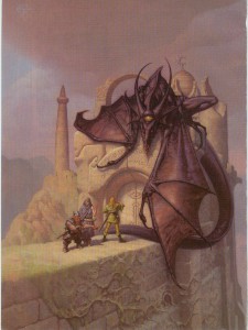
I was ignorant or Mark Zug’s work until I looked up the artist of these two long-time favourite Dragon covers. Besides depicting an awesome bat-creature acting as a guardian of a magically sealed doorway, Zug’s cover for Dragon 271 also contains a hidden message spelled out in those runes. I’ve never figured out what it says, but I like knowing that there’s a mystery to be solved. It’s this kind of Easter egg that moves a painting from being a fantasy illustration to a specifically D&D one.
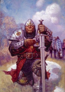
Nothing signifies the transition to 3e more than this cover for Dragon 275. Yes, the magazine had switched over to the new edition in the previous issue, but Zug’s painting of a noble half-orc paladin summed up the shift in the game’s philosophy without words – no more boundaries.
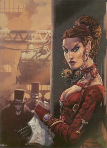
There is so much to dig about Kev Walker’s cover for Dragon 277, the multi-barrelled pistol concealed under a lace handkerchief, a badass elf in studded leather, locomotives, Victorian fog, and you have to love that half-orc with the righteous mutton chops in the background. If you have ever wanted to play a steampunk version of D&D, this painting is it.
I mentioned my love for psionics, so it’s no surprise that I included Paolo Parente’s cover for Dragon 281 in this list. It’s doubly hard to make a visual representation of mental power, both because psionics by their nature, have far few optical effects than traditional magic, and also because there isn’t a deep well of reference material for artists to plumb. Parente takes these limitations and grinds them into the ground. This picture of a group of Githzerai in meditation (as well as Rebecca Guay’s), present the best argument for the place of psionics in a fantasy setting.
The rise of 3e is also the rise of artist Wayne Reynolds. Like Brom with Dark Sun, WAR (as he signs his pieces) was responsible for the visual style of Eberron (and with all the covers and large color illustrations he did for other 3e products, it could be argued he helped define the style of the edition itself). No run of Dragon covers that includes 3e material could be complete without a WAR painting. His work always has a dynamic sense of action that really energizes me and makes me want to start rolling dice now. I also like this piece for the things it doesn’t include: ‘boob windows’ (to use Wundergeek’s term) and adventure inappropriate clothing – art crimes WAR has definitely been guilty of in his body of work.
In the next instalment I’ll look at the bittersweet final years of Dragon.
