This is the second (and final) installment of my celebration of Dungeon magazine’s 200th issue (click here for the best cover art of the first 75 issues). The latter half of Dungeon’s print run was an interesting time for the magazine. It saw the rise of 3e and the founding of Paizo. Even more importantly though, it was in the pages of Dungeon that the ‘adventure path’ format was born – a series of adventures linked together by an overarching plot (taking characters from 1st level to 20th) – a campaign in serial form. Dungeon’s adventure paths set a new standard in the industry and the format proved so successful that Paizo was able to base their entire business around publishing them when WOTC cancelled the print versions of Dragon and Dungeon …and spin that achievement into their own version of D&D at least as successful as 4e (I wouldn’t hesitate to say that the Pathfinder rpg owes its existence to the development of the adventure path).
If Dungeon is 200 why stop at issue 150? As I mentioned in my retrospective on Dragon magazine covers, cover art lost its place of cultural primacy when the magazines underwent their digital rebirth (you can see a similar phenomenon with album art in the age of iTunes). Digital covers don’t serve the same function (a combination of product packaging and advertisement), and as a result have little influence on the gaming world – the equivalent of a vestigial organ. That might sound harsh, but it’s not an indictment of WOTC’s digital initiative (I think the accessibility, low cost, and portability of PDFs are great), just a lamentation for a lost art form. Let’s take a look at some of Dungeon’s best examples and remember a time when cover art was king (click on images for full size).
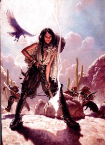
I fell in love with the cover to issue 80, by Mark Zug, the moment I laid eyes on it. The mash-up of D&D and the wild west is fantastic, irreverent and avoids descending into campiness. The two visual themes blend together so well that neither the hats nor the crossbows seem out of place (the magical bolt standing in for a smoking shotgun). But that’s not what draws the viewer’s eye immediately to the center of this piece – it’s the wicked smile of the character in the foreground (Tonja, the leader of a group of desert bandits in the adventure Fortune Favors the Dead). Imbuing a figure with real personality, as Zug has done, is extraordinarily difficult (that’s why portraiture is so demanding). That smile is so compelling I wonder how many people have overlooked that the bandit leader is supposed to be an NPC and used this cover as a character portrait.
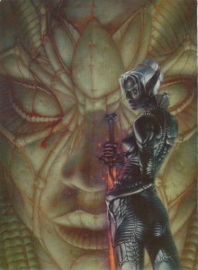
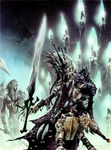
Another femme fatale, Laveth the daughter of Lolth, courtesy of Stephen Daniele for the cover of Dungeon 84. There’s a bit of cheesecake going on in this painting (especially that ‘America’s Next Top Model’ pose) but the artist’s ability to capture the essence of the drow so well elevates it above mere fan-service. Daniele is definitely channeling H.R. Giger’s biomechanical work here (always a good thing in my opinion), and it fits perfectly. Laveth’s armor looks like the chitinous shell of a spider, a great visual cue that not only ties the drow to the goddess of arachnids, but also reminds the viewer that everything about the dark elves is twisted, alien, and dangerous. The pale statue in the background, with clusters of spiders that look like bloody tears, is a nice touch as well.
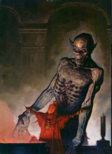
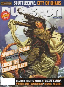
The cover for Dungeon 90 is, aside from his Dark Sun work, one of Brom’s best paintings (and there are a lot to choose from – Brom’s works have made it onto all but one of my lists of the best Dragon and Dungeon covers). It features a priestess of Loviatar and her undead ally. The devourer, rendered in pale ghostly tones is very much in (what I call) Brom’s ‘gothic mode’. The evil spirit is truly frightening, and the pathetic soul of a vanquished paladin trapped within its ribcage makes this cover a strong argument for why the devourer, added to the game during 3e, is an instant classic. What makes this painting one of my favorites among Brom’s work though, is the figure of the priestess. I love her blood red monochromatic color scheme, and the artist’s choice to give her a more exotic, non-European look is something you don’t see often in the art of D&D and it’s a refreshing departure.
It would have been easy to fill this list with nothing but Wayne Reynolds’ paintings – he created a tremendous number of Dungeon covers during the 3e period most of them were exceptional. While he still dominates this list, I opted instead for his best four (plus a bonus cover at the end). Even if you aren’t a Reynolds fan, you have to be impressed with the sheer volume of the work he put out during these years (and he still produces an impressive output for Paizo).
Reynolds’ cover for issue 94 features one of my favorite monsters, the craziest mind flayer villain of all time, Absterthelid, a creature with a taste for the brains of his own kind (a great idea made insane by a stat block that combined mind flayer and monk to take advantage of the mechanics of the extract brain special ability – truly a monster). Reynolds takes the classically cerebral image of the mind flayer and transforms it into a beast of physicality. The cast-off, brainless husk of a traditional mind flayer completes the image, giving the viewer everything they need to know about both Absterthelid and Reynolds’ larger than life approach to illustration.
Dungeon celebrated its 100th issue with ‘incursion’, an event spread between Dungeon and Dragon that saw the githyanki invading the prime material plane. It’s a very cool concept (one that I planned to incorporate into a long running Planescape campaign, but never got the chance to), and Wayne Reynolds’ painting of Vlaakith, the lich-queen of the githyanki is even cooler. Though her physical form is withered and mummified, Reynolds leaves no question as to Vlaakith’s arcane might. I especially like Reynolds’ disturbing take on the robe of eyes, a fitting accoutrement for a queen who sustains herself with the life force of her subjects. Reynolds sometimes gets flak for the awkward positioning of his female subjects, but in this case it works. Vlaakith’s pose reminds me of the contorted rigor mortis of Boris Karloff in The Mummy (and I’m happy Reynolds resisted the urge to make a ‘sexy undead’ – one of my pet peeves… female undead should be just as gross and gnarly as their male counterparts).
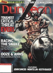
The cover for issue 105 is nostalgia heaven, plain and simple. Warduke was one of my favorite action figures growing up (him and Force Commander from the Micronauts ) so seeing him posing like he’s on the cover of an Iron Maiden album all but guaranteed I’d pick up a copy of the magazine. Reynolds not only does the venerable Warduke justice, he also gives him a few cycles of steroids – just in case your PC actually thought they could stand up to the ‘duke and survive.
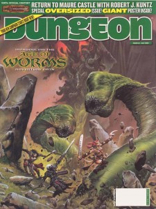
Reynolds’ cover for Dungeon 124 is at a different scale than he typically works, and it’s so energetic and vibrant it makes me wish he would use it more (spoiler: he uses it for the final cover and its excellent). This painting is a perfect snapshot of what I picture when the PCs are squaring off against huge foes. There is a real cinematic quality to the action, and the spectral image of Kyuss rising in the background almost makes it look like a movie poster (just imagine – The Age of Worms saga featuring the voice of Benedict Cumberbatch as Kyuss!).
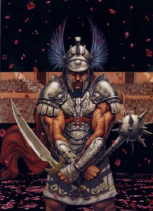
Marc Sasso invokes the blood soaked arena sands of a fantasy version of Rome for his cover of Dungeon 96. Sasso captures the high drama of the moment by keeping the viewer’s gaze in constant motion from one detail to the next: the gently falling roses foreshadowing the future spray of blood, the death motif of the armor, the grim look on the gladiator’s scarred face, and the telling inscription on the blade, ‘hate and kill’. Like Mark Zug’s bandit leader, this is the kind of painting that radiates personality and inspires player characters (and I’ve got the perfect miniature for it!), even if it wasn’t intended to.
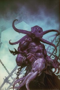
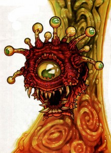
I love the thick, colorful lines and painterly style of artist Chuck Lukacs, so I had to include his beholder in this list. While issue 97 was the only cover he made for the magazine, his illustrations festooned both Dungeon and Dragon during the 3e period (and because his style is so distinct, are easy to recognize), and helped to define the look of the era. I’ve never seen a beholder rendered quite like this before, and I really dig the almost globular treatment of the protruding eyestalks.
This issue was also a major milestone for the magazine: it contained Life’s Bazaar, the opening chapter of D&D’s first adventure path. The rest, as they say, is history.
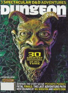
Other than the iconic monsters of the game, no other image can singularly sum up the dungeons of D&D as well as the green devil portal from the adventure Tomb of Horrors. Artist Dave Studer gives Erol Otus’ classic illustration the sculptural treatment for the cover of issue 116 and it is simply amazing. One of the things I really liked about the 3e hard covers (especially the Monster Manuals) was their sculptural design. By drawing on that aesthetic, Studer visually reminds us that the entirety of the game’s editions are our playground and a source of inspiration. I’m not sure how big the original is, but I can’t help but think it would make a kick-ass door knocker for my house.
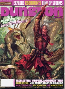
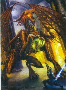
Artist Dan Scott never fails to impress me with the consistency with which he captures the spirit of adventure that defines D&D. This pair of Scott covers are perfect examples of that ability. Both capture an adventure in progress, and invite the viewer to fill in the story themselves – one of the highest achievements of fantasy illustration.
The cover of Dungeon 122 shows an elven rogue ambushed by lizardmen outside of their crumbling and vine choked, jungle temple. The great thing about this painting is how Scott tells the story through the use of his color palette. Aside from the violence, Scott’s choice of colors for the elf clearly mark him as an explorer and intruder while the naturalistically colored lizardmen are obviously native to this exotic land.
Scott tells the story of Dragotha the dracolich on issue 135 through the use scale. Again, the adventurer (a paladin this time) is clearly an intruder, only this time its David and Goliath retold. The adventurer is dwarfed not only by his opponent, but also by the massively pillared hall. Unless the paladin has some clever edge in this fight, the best he can hope for is a quick death.
As a side-note, while some might label the dracolich as one of D&D’s fringe monsters, I’ve always thought of it as part of the core brand. It was on the cover of both Pillars of Pentegarn, an endless quest book that helped draw me into the game, and Spellfire, one of the first D&D novels I read. It’s not surprising that I used a dracolich for my first real, recurring villain in the 2e game I ran in grade 8 and 9 (it lived in undermountain and its soul was eventually housed in a mechanical golem-like body).
The cover of Dungeon 146, by Tomas Giorello, is truly a beautiful painting and work of art. It wears its neoclassical inspiration on its sleeve, which isn’t a source you often see fantasy illustrators drawing from, and I love that. The sober colors, highly textural folds of fabric, and strong diagonal lines bring to mind David’s Napoleon Crossing the Alps. Giorello’s work is so nice to look at it’s easy to forget the kraken tearing through the wreckage of a ship in pursuit of the pirate captain. It’s really a shame that Dungeon had stopped the practice of dedicating a page of the magazine over to an unadulterated version of the cover art, Giorello’s work deserves it.
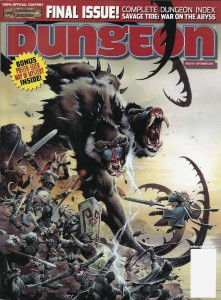
Dungeon 150, the final print issue. Wayne Reynolds’ cover, depicting the climax of the final adventure path of the magazine, seems appropriately cathartic for the occasion of the magazine’s cancellation. For the epic fight against Demogorgon, prince of demons, Reynolds pulls together all of the ‘iconics’ that Paizo used during their stewardship of Dungeon as stand-in adventurers for covers and illustrations. It sums up the body of work very well, and the iconics’ steadfastness in the face of the suicidal melee assures fans of the magazine that Dungeon will not go out with a whimper, but with a bang (fortunately we all know how well everything turned out for Paizo).
Pingback: Links for the week of June 12, 2012 | intwischa.com